#62008 closed defect (bug) (fixed)
Twenty Eleven: Previous and Next links are not clickable in Mobile Portrait mode
| Reported by: |
|
Owned by: |
|
|---|---|---|---|
| Milestone: | 6.7 | Priority: | normal |
| Severity: | normal | Version: | 3.2 |
| Component: | Bundled Theme | Keywords: | has-patch has-screenshots commit |
| Focuses: | accessibility, css | Cc: |
Description
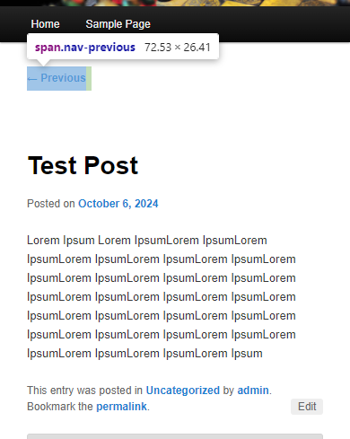
The "Previous" and "Next" links are not clickable when viewing the post in mobile portrait mode. The "Previous" and "Next" links are only clickable on desktop, iPad landscape and portrait, and mobile landscape.
Mobile devices used:
- User's device: Android SAMSUNG Galaxy A34
- I was able to replicate the issue on my test site using iPhone 15 Pro Max on both Safari and Chrome browsers. And also on Samsung Galaxy S33, Chrome.
Attachments (12)
Change History (37)
#1
in reply to:
↑ description
 @
@
10 months ago
- Keywords has-patch needs-testing needs-screenshots added
#3
 @
@
10 months ago
- Keywords has-patch added
I have checked this issue and found that issue is not in the position:static but as the nav element has the float right CSS applied on it an article element which is below overlaps the nav element and so the links are not clickable i have resolved this issue by removing the float right and added flex to it match the design
#4
 @
@
10 months ago
- Focuses css added
- Milestone changed from Awaiting Review to 6.7
- Version changed from 6.6.1 to 3.2
Thanks for the report!
- Resetting the
positionfromabsolutetostaticwas in the original import, [17669]. - Adding
float: rightin [18359] lets the entry content overlap the navigation on smaller screens, so it becomes unclickable (as noted in comment:3). - The Previous link also floats on the right on smaller screens (with left-to-right languages), but it could be better to have that on the left.
#5
 @
@
10 months ago
@sabernhardt to keep the previous link on the left we do not need to add any extra css just remove float:right and it would work fine attaching the image.
https://www.awesomescreenshot.com/image/50471114?key=26a92eae07b46c8bf1673fe6a7911242
https://www.awesomescreenshot.com/image/50471113?key=6f4c6cfd81d71eb56001bb01743e080c

This ticket was mentioned in PR #7313 on WordPress/wordpress-develop by @dhruvang21.
10 months ago
#6
#7
@
10 months ago
- Focuses accessibility added
My comment about the floating was before applying a patch (which would remove the float).
I do not think the navigation needs flex, but that would belong on #nav-single so it does not affect other nav elements. Then the patch would also need to remove display: block at the 650px breakpoint (in style.css) and float: left in rtl.css.
PR 7313 likewise would need to remove float: left in rtl.css. Note that deleting the rule in line 1798 of style.css changes the layout at any screen size.
If it is worth changing the way the navigation displays after 13 years, we could remove more style rules. Floating the navigation to the right is an accessibility bug similar to #60496, and absolute positioning for the .entry-meta also goes against the DOM order.
@
10 months ago
removing float from post navigation and removing absolute positioning from entry meta
#8
@
10 months ago
- Keywords 2nd-opinion added; needs-testing removed
In the a11y patch option, the value 1.875em equals 3.5em (the top padding for pages) minus 1.625em (the bottom padding for the post navigation).
#9
@
10 months ago
Hi @sabernhardt,
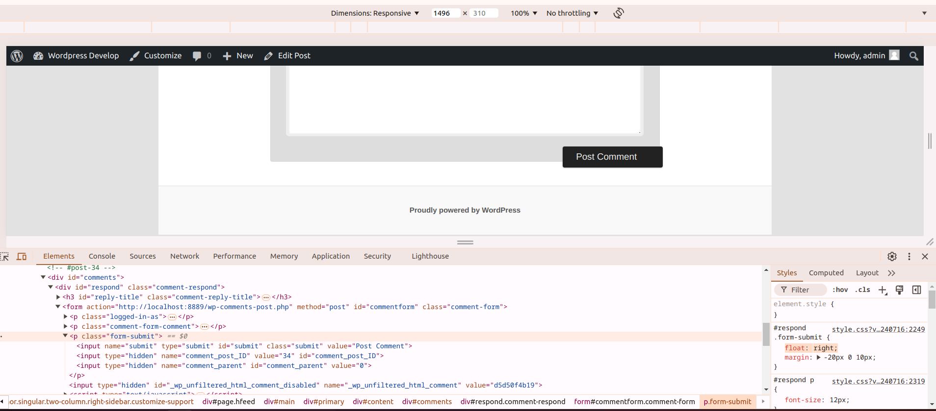
While testing your patch, which is working fine, I discovered a new issue in the theme: the post comment button overlaps with the comment box. I’ve attached an image showing the problem.
I found that the issue is caused by the float: right; CSS property in the .form-submit class within #respond. After removing this, the button works fine.
Should I create a new ticket for this issue, or should it be resolved as part of the current one?
Thanks!
#10
@
10 months ago
Thanks for testing!
The floating comment submit button is not to everyone's taste, but that design was intentional and ticket:17748#comment:34 retained it. I do not find a specific problem with that positioning, so I recommend leaving it, too.

This ticket was mentioned in Slack in #accessibility by joedolson. View the logs.
10 months ago
#13
 @
@
10 months ago
Test Report
Patch tested: https://github.com/WordPress/wordpress-develop/pull/7313
Environment
- WordPress Playground
- WordPress: 6.7-alpha-20240923.060126
- Browser: Chrome (127.0.6533.119)
- Theme: Twenty Eleven
- Active Plugins:
- None
Actual Results
- ✅ Issue resolved with patch.
#14
@
10 months ago
I missed the Edit link in 62008.a11y.diff, which would need repositioning (such as top: 0) at the 800px breakpoint. The DOM/visual order mismatch is worse with the Edit link because tabbing to and from it would jump vertically, but after trying to undo that, I think I'll let it go. Positioning the link where it belongs would be a very drastic visual change, and it still would not be accessible. Fortunately, the link only appears when users are logged in with edit access.
I would also like to fix margins for the author section in RTL languages at the same time (not strictly related, but the style changes would go in the same area of rtl.css).
#15
 @
@
10 months ago
Patch Tested: https://github.com/WordPress/wordpress-develop/pull/7313
Environment
WordPress Playground
WordPress: 6.7-alpha-20240923.060126
Browser: Chrome (127.0.6533.119)
Theme: Twenty Eleven
Active Plugins: None
Screenshot: Attached
Actual Results
- Issue resolved with patch.✅
#16
 @
@
10 months ago
Patch Tested: https://github.com/WordPress/wordpress-develop/pull/7313
Environment
WordPress Playground
WordPress: 6.7-alpha-20240923.060126
Browser: Chrome (127.0.6533.119)
Theme: Twenty Eleven
Active Plugins: None
Screenshot: Attached
#17
 @
@
10 months ago
- Keywords commit added; 2nd-opinion removed
This looks good to me. @sabernhardt I'm not seeing what margin changes you want to make in the author section; I'm not 100% certain what section you're referring to, but I don't see a margin that doesn't match the LTR experience. If you can be more specific, that would be great.
I'm going to mark this for commit; but I'm going to wait for comment a couple days.
I also think that changing the Edit link is probably unnecessary at this point. Even if it is inaccessible, it's not the only copy of that link, since the scenarios where a user has edit permissions but doesn't have the adminbar are pretty rare.
I can add screenshots when going to commit; but if @itpathsolutions has a chance to update those, it would be appreciated. The screenshots should be in a mobile viewport, since that's where changes are happening.
@
10 months ago
Edit link can overlap title between 650 and 800 with a11y patch, and RTL layout has wrong margins for author below 800px
#18
@
10 months ago
- Keywords commit removed
62008.a11y.diff still should have an iteration, and I am organizing screenshots.
- The Edit link can overlap title at widths between 650 and 800 pixels.
- Below 800 pixels, the RTL spreadsheet assigns the mirrored desktop margins, but that overrides the less dramatic negative margins at the 800px breakpoint in
style.css. That results in a horizontal scrollbar.
This ticket was mentioned in Slack in #accessibility by joedolson. View the logs.
9 months ago
#20
 @
@
9 months ago
Patch tested: https://github.com/WordPress/wordpress-develop/pull/7313
WordPress: 6.7-beta 2
Browser: Mozilla firefox (131.0 (aarch64))
Theme: Twenty Eleven
Screenshot: Attached
This ticket was mentioned in PR #7549 on WordPress/wordpress-develop by @sabernhardt.
9 months ago
#21
- Removes floating and absolute positioning from the single post navigation.
- Removes absolute positioning from the entry meta below the post title.
- Adjusts the top padding for the singular entry.
- Adjusts the
topposition of Edit links, at full width and at the 800px breakpoint. - Corrects the RTL margins for post author description at the 800px breakpoint (when the author profile has a biography and the site has multiple authors).
@sabernhardt commented on PR #7549:
9 months ago
#22
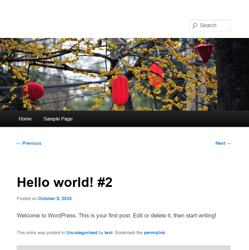
Screenshots of single posts, with an author description:
Before patch, with each language direction
With patch
Additional screenshots for an image attachment page:
#23
@
9 months ago
- Keywords has-screenshots commit added; needs-screenshots removed
This looks good. There are some minor changes to the visual appearance with these changes (e.g., having the prev/next links aligned left and right instead of grouped together on mobile), but these are relatively minor, and they are consistent with the desktop design, so I think it's fine.
@joedolson commented on PR #7549:
9 months ago
#25
In r59226
Replying to Kel DC:
@media (max-width: 650px)
{ #nav-single
  { display: block;
   position: static; // Comment this line (issue is in this line)
  }
}