Opened 12 years ago
Closed 12 years ago
#26003 closed enhancement (fixed)
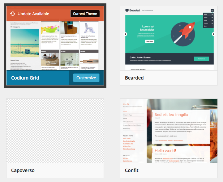
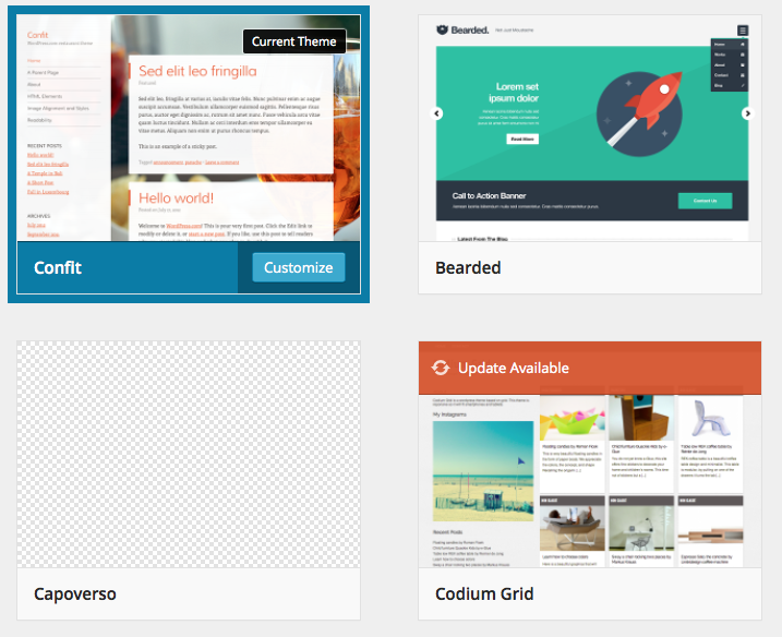
Appearance Themes: current theme on grid obscures a bit too much of the theme screenshot
| Reported by: |
|
Owned by: | |
|---|---|---|---|
| Milestone: | 3.8 | Priority: | high |
| Severity: | normal | Version: | 3.8 |
| Component: | Customize | Keywords: | has-patch |
| Focuses: | ui | Cc: |
Description
Some people mentioned the current theme information was covering too much of the screenshot. Proposing moving Cusotmize to the bottom, and using a smaller badge for current theme label.
Attachments (21)
Change History (47)
#4
 @
@
12 years ago
I like the idea of moving the Customize button to the bottom corner, makes it consistent with the other themes actions.
Pure-CSS is probably not needed, we can shift the HTML layout to make it work.
In addition to that, having a solid top box like that (which we also have for Update Available) makes the i on hover appear misaligned.
I prefer the smaller current-theme suggestion in this patch, but it still doesn't feel right.
Does anyone else have any other suggestions on how to best signify the current theme?
#5
 @
@
12 years ago
Agreed. We can keep iterating and refining this, of course, but in the meantime how do you feel about committing this part? I quite like the balance between clarity and not obfuscating the theme we reached here.
I think CSS is a bit better of a solution because we keep the structure we have for non-active themes consistent.
#6
@
12 years ago
The more I looked at it, the more I preferred the full width to a small corner item.. and then another aspect is the Update Available overlay:

After more fiddling, I came to a conclusion: Is the Current Theme badge needed at all? eg, removing the current theme label works quite well IMHO (26003.2.diff)

#7
@
12 years ago
Another option for the Update notification I played with was to simply display a round circle with the update icon in it, that takes up far less real estate, but is also very easy to miss.
#8
 @
@
12 years ago
Color and placement alone should probably not be used to represent the current theme. Even screen reader text may be insufficient — is placement alone obvious enough in general? I am not sure.
#9
 @
@
12 years ago
I added yet another highlight style for active themes in 26003.4.diff. This matches the "Current Theme" label to the badge style that appears in the detail modal, and adds an 8px outline to the active theme so it stands out from the rest in the grid:

If the active theme has an update, the badge shows up overtop:

And, if we want to keep the concept of a "highlight color," we could use the current scheme's color for the outline.

#11
@
12 years ago
26003.5.diff adjust the styling of the active theme again:
- Removes the outline
- Truncates the title if needed
- Removes the "ugly" dark rgba behind the button ;)
- Swaps the blue bg behind the title with black
- Moves the current badge above the screenshot with a simpler style
- Fixing some alignment/spacing issues of the button at various breakpoints.

#12
follow-up:
↓ 13
 @
@
12 years ago

How about going back to the simpler idea of the highlighted blue with Customize button at the bottom, and just add an "Active" label to the theme title? With longer titles and smaller screen sizes, it can just behave like the other screenshots (the button would slide over top of the title).
#13
in reply to:
↑ 12
;
follow-up:
↓ 14
@
12 years ago
Replying to kwight:
How about going back to the simpler idea of the highlighted blue with Customize button at the bottom, and just add an "Active" label to the theme title?
I like that. That was actually my first take on it for THX. If we swap the blue to the dark grey, I'd be fine with this. The current label has proved to be a pain to get right.
#14
in reply to:
↑ 13
@
12 years ago
Replying to matveb:
Replying to kwight:
How about going back to the simpler idea of the highlighted blue with Customize button at the bottom, and just add an "Active" label to the theme title?
I like that. That was actually my first take on it for THX. If we swap the blue to the dark grey, I'd be fine with this. The current label has proved to be a pain to get right.
Cool, will do up a patch.
#15
@
12 years ago
This may be worse for i18n, though. The "current" label may be all that is displayed in some cases.
#16
follow-up:
↓ 23
@
12 years ago
Something like this would be OK:
/* translators: current theme. %s is the theme name */
__( 'Current: %s' )
What would the some cases be?
#17
@
12 years ago
26003.6.diff moves the Customize button to the bottom, while adding a "Current:" label to the theme name (which has the dark gray background).

While the same effective color of the theme name background, .theme-actions (the button container) is slightly transparent, so text flows underneath like other themes at narrower widths.

#18
follow-up:
↓ 19
@
12 years ago
26003.7.diff includes the previous patch, while tidying up button positioning at tablet and lower screen widths.
26003.6.diff:

26003.7.diff:

#19
in reply to:
↑ 18
@
12 years ago
Replying to kwight:
Hiding the theme name has always been the worst part of the theme grid. I've always dealt with it previously by telling myself that its only when hovering over a theme. For the active theme, its different: the customize button is always there. Adding more text in front of the active theme title means thats it more likely that the title is obscured by the button. I think this is bad, and should be avoided.
Also, if the theme name does run into the customize button, it should truncate gracefully with an ellipsis. Running under the button just looks like a bug.
#20
@
12 years ago
I like that that all themes, including the current one, have the same behaviour this way: the title is truncated to ensure it stays one line, and if buttons overlap at certain widths, so be it (but indicate that with the transparency).
#21
@
12 years ago
I do still prefer the "Active:" label too; it is physically a little shorter to minimize any name hiding, and ties in with other button language ("Activate").
#22
follow-up:
↓ 24
@
12 years ago
We could also wrap the label in a span and display: none it at the worst widths (and have the Customize button only on hover for really narrow widths too).
#23
in reply to:
↑ 16
@
12 years ago
Replying to nacin:
What would the some cases be?
Was thinking of just long translated strings that made the whole title, potentially, hidden.
Following kwight's concepts, I recall at one point we had something like this:

And on hover:

We left it out because we wanted to put more emphasis on the customizer. Worth revisiting?
#24
in reply to:
↑ 22
@
12 years ago
Replying to kwight:
We could also wrap the label in a
spananddisplay: noneit at the worst widths (and have the Customize button only on hover for really narrow widths too).
26003.8.diff builds on kwight's diff, and wraps the "Active" label in a span (lets stick with Active). I then changed the font-weight to help separate the label from the title, and hid the label at smaller screens. Also, why not truncate the title if needed? The ellipsis looks so much better (and more intentional) than the overlap:

CSS only patch attached.