#32254 closed defect (bug) (fixed)
List Table: avoid adjacent links pointing to the same resource
| Reported by: |
|
Owned by: |
|
|---|---|---|---|
| Milestone: | 4.3 | Priority: | normal |
| Severity: | normal | Version: | 4.1 |
| Component: | Administration | Keywords: | has-patch ui-feedback ux-feedback |
| Focuses: | ui, accessibility | Cc: |
Description
In the list table of for example wp-admin/edit.php there are two adjacent links to edit.
One for the post title and one in the row-actions.
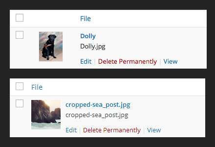
In the Media Library (upload.php) there are three adjacent links to edit.
One for the file/image, one for the file title and one in the row-actions.
For usability this is confusing and it's generating a lot of extra noise for screen reader users.
Suggestion:
- remove the edit link in the row-actions in both cases
- hide the link on the file/image with aria-hidden (we need to test if this works on a link)
Combining the file/image with the file title would be the best http://www.w3.org/TR/WCAG20-TECHS/H2.html, but probably will break a lot of plugins.
Attachments (6)
Change History (45)

This ticket was mentioned in Slack in #accessibility by rianrietveld. View the logs.
9 years ago
#3
 @
@
9 years ago
- Keywords has-patch added
First pass patch.
About the Media Library attachment thumbnails, I've tested a bit with Firefox + NVDA and Chrome + ChromeVox, adding aria-hidden=true to the thumbnail link hides everything for screen readers but the link is still focusable. All keyboard users will still be able to focus the thumbnail. NVDA gets a bit confused too and will read out "out of table, blank", a bit weird since it's still inside the table.
At this point we should add tabindex=-1 to the thumbnail link so it will be out of the tab order but honestly I'm not so sure about this and would like to hear the accessibility team opinion.
#4
follow-up:
↓ 5
 @
@
9 years ago
I agree that the image should be removed from tab order; it's a duplicate link, so I don't think it helps anything for it to be in the tab sequence.
That's exactly the expected behavior using aria-hidden on a focusable object, since all it does is hide the *content* of the object - the object still needs to be focusable for non-screen reader users. Removing the object from the tab flow will be a better experience, I think.
#5
in reply to:
↑ 4
 @
@
9 years ago
Replying to joedolson:
I agree that the image should be removed from tab order; it's a duplicate link, so I don't think it helps anything for it to be in the tab sequence.
Also, noticed in the Users screen the user images are not linked so there's a bit of inconsistency in the UI. WordPress users shouldn't be forced to learn new, different, UI interactions for each screen: I'd say either link all the images or don't. Alternatively, was looking at this W3C suggested technique but that would mean removing the thumbnails column entirely, probably not an option because of plugins etc.

This ticket was mentioned in Slack in #accessibility by afercia. View the logs.
9 years ago
#7
 @
@
9 years ago
- Milestone changed from Awaiting Review to 4.3
- Owner set to afercia
- Status changed from new to assigned

This ticket was mentioned in Slack in #core by joedolson. View the logs.
9 years ago
#9
 @
@
9 years ago
Removing the link does seem better. Adding tabindex=-1 feels like a hack where removing the link for UI consistency feels much cleaner.
It will result in a UI change that some people will be annoyed with, if they're accustomed to being able to click on the image to edit media. But I'm not sure that's something to worry about much.

This ticket was mentioned in Slack in #accessibility by afercia. View the logs.
9 years ago
#11
 @
@
9 years ago
Removing the link on the images doesn't seem a good idea to me.
Most sighted users are used to click the image to edit it.
It will cause a lot of irritation if an image isn't clickable anymore.
The best option would be to combine the link with the title the link with the image and put them all together in one link, giving the image the alt tag of the image and the link the title. But that might cause problems with plugins.
Since we can't merge the 2 columns and we can't remove the link, the only option I see for now is aria-hidden + tabindex=-1

This ticket was mentioned in Slack in #accessibility by rianrietveld. View the logs.
9 years ago

This ticket was mentioned in Slack in #core by afercia. View the logs.
9 years ago
#15
 @
@
9 years ago
Just noticed this comment on a related ticket, thanks to @helen https://core.trac.wordpress.org/ticket/29993#comment:7
what if the thumbnail were just in the title column all the time
there's some consensus about removing the thumbnail column see also the screenshot after comment 15 in that ticket and Helen will give that a try, see https://wordpress.slack.com/archives/core/p1432906221000754
#17
 @
@
9 years ago
Related #32509 is no more relevant now that the icon was moved into the title column, see r32687. This allow us to move the image inside the existing link. The plan is to apply a very simple technique: http://www.w3.org/TR/WCAG20-TECHS/H2.html and have just one "Edit" link.
#18
 @
@
9 years ago
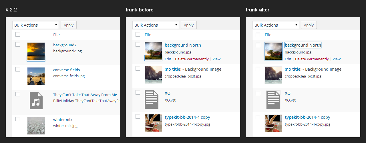
Worth updating the screenshot related to the media icon column to illustrate how the media library screen looks after r32687 (note: the different font rendering is because "before" was taken on a Mac and "After" on Windows).
The plan now is the have just one "Edit" link.
#19
 @
@
9 years ago
- Keywords dev-feedback ui-feedback added
Updated patch after r32687, first pass.
- remove the row-actions "Edit" link where it is a duplicate of the item title link
- Media Library: merge the icon and the media title in just one link, see http://www.w3.org/TR/WCAG20-TECHS/H2.html
- restore the focus style on the media icon
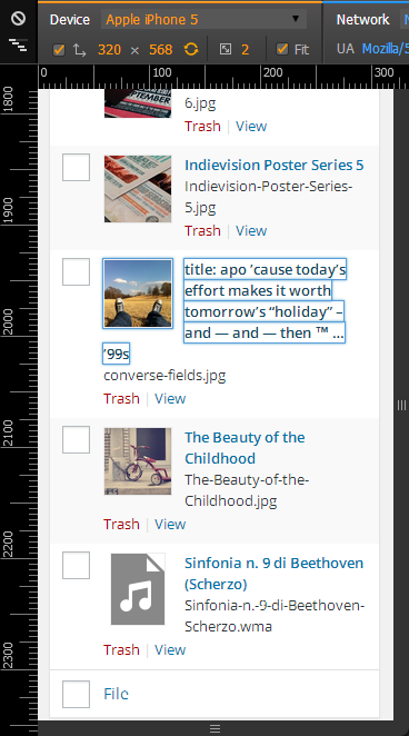
About the CSS part, just implemented a basic way to restore the focus style, since in the media library the previous absolute positioning makes the box-shadow on focus a bit weird. Different implementations and any feedback more than welcome. Also, should the text wrap on smaller screens? See screenshot:

This ticket was mentioned in Slack in #design by afercia. View the logs.
9 years ago

This ticket was mentioned in Slack in #design by helen. View the logs.
9 years ago
#24
 @
@
9 years ago
- Keywords needs-refresh added; commit removed
raw inline PHP is an awful template-ing language, but I would stay consistent with the rest of the file - step in and out of PHP instead of echo-ing everything. The main advantage here is syntax highlighting in our IDEs.

This ticket was mentioned in Slack in #accessibility by rianrietveld. View the logs.
9 years ago
#26
 @
@
9 years ago
- Keywords needs-refresh removed
32254.4.patch is a refresh of the CSS and removes the echo lines and change them to step in and out of PHP.
Patch made at WordCam Europe 2015
#28
follow-up:
↓ 29
 @
@
9 years ago
- Keywords ux-feedback added
Is removing the edit link really the best way to handle this? I can imagine it causing a ton of confusion for users, and them assuming they can't edit it because of the lack of the link. Especially since everywhere else in the admin it's still present.
#29
in reply to:
↑ 28
;
follow-up:
↓ 30
 @
@
9 years ago
Replying to obenland:
Especially since everywhere else in the admin it's still present.
Worth considering the patch removes "duplicate edit links" in all the screens, not just in the Media Library. For "duplicate" we mean screens where the item title is a link to edit and also the adjacent row-actions link is a link to the same edit page. They're duplicate.
Consider a typical List Table has by default 20 items per page. That makes a total of 40 "edit links". The Media Library used to have 3 edit links per item (image, title, row-actions) for a total of 60 "edit" links. That's a terrible amount of noise for screen reader users.
Please also consider the vast majority of users use a mouse, and to actually make the current row-action edit link appear they have to hover on the item title which is already a link to edit. I guess at that point is convenient to click on the title :)
#30
in reply to:
↑ 29
 @
@
9 years ago
Replying to afercia:
Worth considering the patch removes "duplicate edit links" in all the screens, not just in the Media Library. For "duplicate" we mean screens where the item title is a link to edit and also the adjacent row-actions link is a link to the same edit page. They're duplicate.
I understand that there are multiple anchor elements with the same target per item. I'm just saying that I can see users being confused by not seeing the text "Edit" anywhere, and therefore assuming that item is not editable.
#31
follow-up:
↓ 32
 @
@
9 years ago
Sorry I missed your reply. Hm yeah, if users see these links as sort of "permissions indicators" that would probably confuse them. Not sure though. Would be nice to have some real usage data about these links. @helen any thoughts from a UI perspective?
#32
in reply to:
↑ 31
 @
@
9 years ago
Replying to afercia:
Would be nice to have some real usage data about these links.
Should we move it for now and continue with it in 4.4? Still needing ux and ui feedback after beta2 is not a confidence booster.
#33
follow-up:
↓ 34
 @
@
9 years ago
@obenland was thinking to split out the image + link issue in a separate ticket and keep in this ticket just the redundant row-actions Edit links for further consideration. If we do, would you agree to give the new image + link ticket a chance for 4.3?
#34
in reply to:
↑ 33
;
follow-up:
↓ 35
 @
@
9 years ago
Replying to afercia:
would you agree to give the new image + link ticket a chance for 4.3?
It depends on the patch and how much we'd have to change?
#35
in reply to:
↑ 34
 @
@
9 years ago
Replying to obenland:
and how much we'd have to change?
Just a little :) having the image and title grouped inside one link would decrease noise and it would be a small, nice, improvement. Also, the focus style for the thumbnails which was fixed in 32476 it's now broken again after recent changes. Worth noting the thumbnails should be centered and currently they're left aligned. Not a big deal, we should just make a decision. The updated patch centers them again. See screenshot:
#36
follow-up:
↓ 38
 @
@
9 years ago
I've been observing my own habits for a little while, it seems that I still click on the "Edit" link myself, and I usually figure that I'm not unique. Post links in the admin are confusing (link to edit? link to view?), I think there's still a case right now to be made for the edit link telling you what you can do with the post in the first place.
#38
in reply to:
↑ 36
 @
@
9 years ago
Replying to helen:
I think there's still a case right now to be made for the edit link telling you what you can do with the post in the first place.
Thanks @helen, agreed. Maybe we can think of a way to hide the redundant Edit link just for screen readers. For 4.4 :) Will open a separate ticket.


Worth considering there are also other screens where the edit link in the row-actions is redundant:
In the following screens instead, it's needed because the item title is not a link: