Opened 12 years ago
Closed 12 years ago
#21260 closed defect (bug) (wontfix)
Twenty Twelve: Block Quotes
| Reported by: |
|
Owned by: | |
|---|---|---|---|
| Milestone: | Priority: | normal | |
| Severity: | normal | Version: | |
| Component: | Bundled Theme | Keywords: | has-patch |
| Focuses: | Cc: |
Description
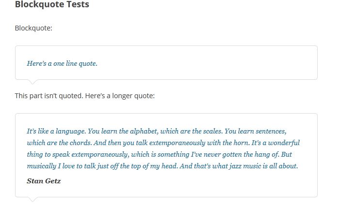
The blockquotes need some lovin' methinks. Just an proof of concept...don't pick on where I added the CSS etc :) I'm sure no one will like it haha
Attachments (4)
Change History (25)
#3
in reply to:
↑ 2
;
follow-up:
↓ 4
 @
@
12 years ago
Replying to nacin:
Before/after screenshots?
Apologies. Still getting used to Trac and the workflow! Hopefully I'll improve :)
#4
in reply to:
↑ 3
;
follow-up:
↓ 5
 @
@
12 years ago
Replying to sennza:
Replying to nacin:
Before/after screenshots?
Apologies. Still getting used to Trac and the workflow! Hopefully I'll improve :)
No problem. Screenshots are helpful in this case because Twenty Twelve is of course going to be a subjective design, so a number of people may need to weigh in on A versus B, and to do that without needing to apply the patch is best. By the bug report, I couldn't quite tell if you were reporting a bug (blockquotes are unstyled, overlapping, messed up, etc) versus some kind of enhancement (I think the blockquotes should be styled a different way), and a screenshot can help with that.
#5
in reply to:
↑ 4
@
12 years ago
Replying to nacin:
Replying to sennza:
Replying to nacin:
Before/after screenshots?
Apologies. Still getting used to Trac and the workflow! Hopefully I'll improve :)
No problem. Screenshots are helpful in this case because Twenty Twelve is of course going to be a subjective design, so a number of people may need to weigh in on A versus B, and to do that without needing to apply the patch is best. By the bug report, I couldn't quite tell if you were reporting a bug (blockquotes are unstyled, overlapping, messed up, etc) versus some kind of enhancement (I think the blockquotes should be styled a different way), and a screenshot can help with that.
Awesome. Thanks for that Nacin! I'll screenshot everything from now on. To be honest I'm not sure if any of the stuff I'm working on in the Layout Test for Twenty Twelve is a bug or enhancement seeing Twenty Twelve seems raw in many ways to my untrained eyes...and I'm pretty much a Trac virgin.
I'm working on styling the <table>'s at the moment. I'll add the rest of my CSS as an enhancement seeing Matt would've worked through a lot of this stuff as the theme was born.
I'd like to get involved in 3.5 somehow and I'm guessing I'd probably be best on the UI team but I know I'm not gonna be very good at handling the P2 blogs cause I prefer coding to talking about what could be done. If seeing patches and screenshot tickets from me is gonna be annoying then let me know.
I'll be in your country for WordCamp San Francisco so you can slap me into line as required in a month :D
#6
follow-up:
↓ 7
 @
@
12 years ago
If it goes the route of the speech bubble look (not convinced - it seems a little over-styled to be used for a large variety of sites), the triangle should be done with CSS borders instead. HiDPI friendly and no image needed.
#7
in reply to:
↑ 6
@
12 years ago
Replying to helenyhou:
If it goes the route of the speech bubble look (not convinced - it seems a little over-styled to be used for a large variety of sites), the triangle should be done with CSS borders instead. HiDPI friendly and no image needed.
Good points on all fronts! :) Happy to do a http://cssarrowplease.com/ style arrow if anyone likes it!
#8
follow-up:
↓ 9
 @
@
12 years ago
I like it. Where do you suggest the arrow to point? The <cite> content?
#9
in reply to:
↑ 8
@
12 years ago
Replying to obenland:
I like it. Where do you suggest the arrow to point? The
<cite>content?
Yeah the arrow should point down to the <cite> but I've realised after your comment that if there is no <cite> it's never gonna work. It's probably best closing this ticket. My bad!
#11
follow-up:
↓ 12
@
12 years ago
- Resolution invalid deleted
- Status changed from closed to reopened
I think discussion could still be had for *other* styling of the blockquotes. For instance, a border to the left like the aside format has, or some differentiation for the <cite>.
A ticket isn't necessarily tied to a specific solution :)
#12
in reply to:
↑ 11
@
12 years ago
Replying to helenyhou:
I think discussion could still be had for *other* styling of the blockquotes. For instance, a border to the left like the aside format has, or some differentiation for the
<cite>.
A ticket isn't necessarily tied to a specific solution :)
My bad...I'm new to this so I'm getting used to how it's supposed to work haha :) Give me 3 mins and I'll probably have another ticket for something else ;)
#13
follow-up:
↓ 16
@
12 years ago
In this case I'd like to propose the addition of
blockquote cite:before {
    content: '\2014 \00A0';
}
I always like prepending an — to the <cite> element. :)
#15
 @
@
12 years ago
Thanks for helping sennza! The blockquote was intentionally minimally styled, and I'd vote we keep it as is.
#16
in reply to:
↑ 13
@
12 years ago
Replying to obenland:
In this case I'd like to propose the addition of
blockquote cite:before {
    content: '\2014 \00A0';
}
I always like prepending an
—to the<cite>element. :)
While this is a good idea, I'm not sure *everyone* would want the — in every instance. My vote would be to leave it up to the user to insert the dash manually if desired.
Before/after screenshots?