Opened 11 years ago
Closed 4 years ago
#28599 closed defect (bug) (fixed)
Better Visual Focus Indication in Admin Menu
| Reported by: |
|
Owned by: |
|
|---|---|---|---|
| Milestone: | 5.7 | Priority: | normal |
| Severity: | normal | Version: | 3.8 |
| Component: | Administration | Keywords: | has-screenshots has-patch commit |
| Focuses: | ui, accessibility | Cc: |
Description (last modified by )
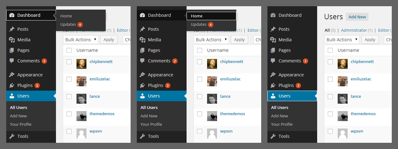
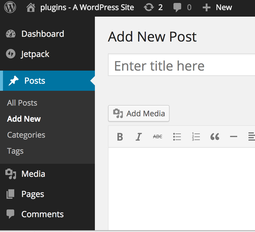
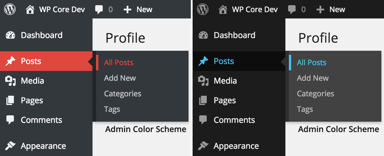
Breaking this issue away from #28267 "Unify focus styles across the admin." The left navigation menu system now uses color changes to indicate visual focus. In the default scheme, when the main menu item is selected the background goes from dark gray to black and when a submenu item is selected the text goes dark blue, both hard to discern. Color alone cannot be the only indicator. For those who cannot perceive color changes, a secondary marker is required. For instance, in the situation where a blue glow is used to show focus on an input, there is the color and the shading in the glow: two elements. The solution should work in the eight available admin color schemes.
Some suggestions have been made including:
- Helen reports that a blue glow does not look good
- White outline around menu item with white outline also around selected submenu item
- Reversing the colors coupled with another undefined indicator element
- Triangle to the left of main menu item and selected submenu item
- Underline under main menu item and selected submenu item (might be mistaken for links)
Tracking label: #a11y-color
Attachments (13)
Change History (139)

This ticket was mentioned in IRC in #wordpress-ui by accessiblejoe. View the logs.
11 years ago

This ticket was mentioned in IRC in #wordpress-dev by celloexpressions. View the logs.
11 years ago
#4
 @
@
11 years ago
- Keywords needs-patch added
- Milestone changed from Awaiting Review to Future Release
- Version changed from trunk to 3.8
Setting version to 3.8, although this was probably also an issue before mp6/3.8.
I like the color-inversion approach better than adding a border, as it looks more intentional for non-keyboard users.
#5
 @
@
11 years ago
- Summary changed from Visual Focus Indication in Left Navigation to Better Visual Focus Indication in Admin Menu

This ticket was mentioned in Slack in #accessibility by accessiblejoe. View the logs.
11 years ago
#7
 @
@
11 years ago
- Keywords has-patch reporter-feedback dev-feedback needs-testing added; needs-patch removed
I made a quick patch, but it still needs lots of work
What it does
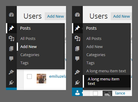
:focus now mimics the :hover behavior of the non-default color schemes: The background color becomes the highlight color, icon and text are white. I adapted the same behavior for the submenu links.
In the submenu this works in most cases, but we may need to define another color variable for text of focused links in submenu, because in some color schemes white doesn't work so well. Also in several color schemes some colors are not defined, and the default doesn't work well either. (You will see what I mean, when you test the color schemes.)
The Arrow
The arrow looks really bad (especially in the non-default color schemes), when the focus is on the element of the submenu that is next to the parent. (I guess that's why they did the highlighting in the way it is implemented now.)
Feedback, please. :)

This ticket was mentioned in Slack in #accessibility by florianziegler. View the logs.
11 years ago
#9
 @
@
11 years ago
I was working on src and so all kinds of stuff ended up in the oldest patch. Best to ignore it. :)
I created a new one, that only changes the focus highlighting behavior for the default color scheme.
Right now it still breaks the focus highlighting for some of the other color schemes, but you should get the idea of what I was trying to do here.
#10
 @
@
11 years ago
@florianziegler, thanks for the patch.
I think it's a big improvement. Agree on only fixing this for the default theme.
I still miss the colour change on the collapse menu.
Wondering if we should also change this for the hover state, because its' so much better now on focus and we could make that uniform.
#11
follow-up:
↓ 13
 @
@
11 years ago
hi @florianziegler, your latest patch is 864 KB, it includes also .rtl and .min files, that's really not necessary.
Please read the WordPress Core Handbook Working With Patches
You should install the latest WordPress development version via Subversion (SVN) and then you should create your patches from the root directory of your WordPress SVN install.
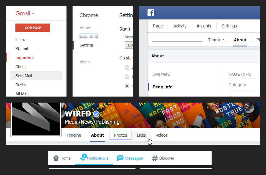
Please allow me to remember the point of this ticket is about to provide additional visual cues on focus for links or controls where color alone is used to identify them.
Quoting @AccessibleJoe
Color alone cannot be the only indicator. For those who cannot perceive color changes, a secondary marker is required.
So we need a marker, or "shape", or something (outline, border, arrow, whatever...) to clearly indicate focus besides color changes. Preserving aesthetics too, and that's the difficult part :)

This ticket was mentioned in Slack in #accessibility by rianrietveld. View the logs.
11 years ago
#14
 @
@
11 years ago
Alright. I think, I was way to quick with my "patch". :)
I did a bit of catching up on what was discussed in the past and it seems like it just went nowhere. Ticket #28267 was closed without a solution for the admin menu, even though some suggestions were made around here: https://core.trac.wordpress.org/ticket/28267#comment:18
Will a border (not talking about the technical details yet) proposed here, solve this issue?

This ticket was mentioned in Slack in #accessibility by michael. View the logs.
11 years ago

This ticket was mentioned in Slack in #accessibility by ginsterbusch. View the logs.
11 years ago

This ticket was mentioned in Slack in #accessibility by ginsterbusch. View the logs.
11 years ago
#20
 @
@
11 years ago
- Keywords ui-feedback added; reporter-feedback needs-testing removed
Hi everyone, followed meetings and discussion on Slack and this ticket, I'm currently working on an alternate patch.
Before going ahead though, I'd like to involve everyone in the discussion, including lead devs and contributors and listen to any thoughts and feedback.
It makes no sense to spend a lot of time on the patch without a wide consensus :) especially because we're going to propose to (slightly) change the default blue color scheme.
So, the screenshots below are not mockups: they're screenshots of a working patch, that means what you see it's doable and already working but not ready to be attached here for now.
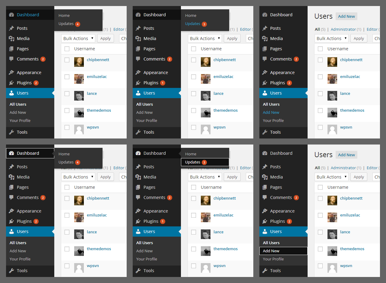
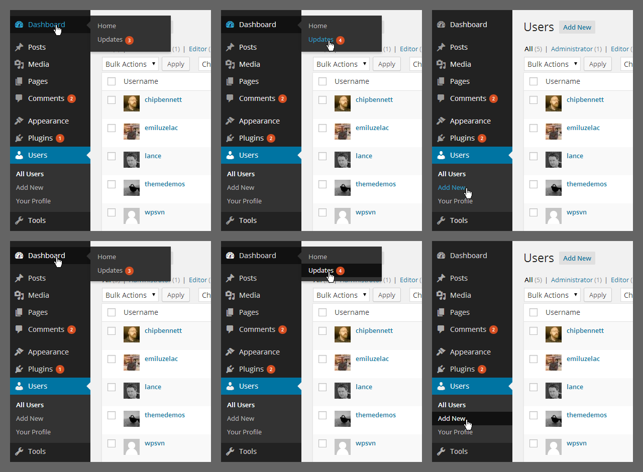
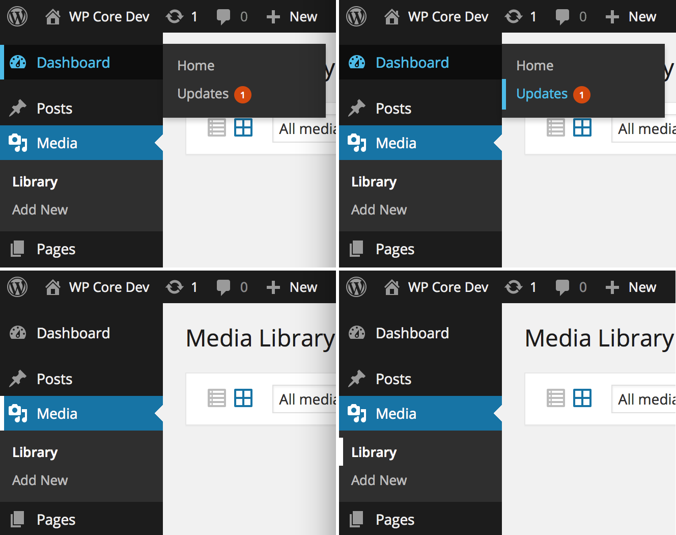
Following the border idea proposed in the Make Accessible blog by @accessiblejoe and others, it would be nice to have the border just on focus, not on hover (technically, it's not a CSS border but it's a box-shadow so it's not supported by IE 8). That's because I would try to respect the current design as much as possible and at the same time have a better level of accessibility.
For now, I would recommend to focus on the general idea, not the technical details. Hope the screenshots are clear enough, let me know.
Focus: 1 - 2 - 3 before the patch, 4 - 5 - 6 after the patch
Please notice the icon and the arrow, now they work consistently on focus too.
Hover: 1 - 2 - 3 before the patch, 4 - 5 - 6 after the patch
Things to consider:
- focus arrow alternate version (maybe nicer?)
- focus on fly-out sub item when it's near the arrow (ugly?)
- focus on the current parent (looks ok to me)
#21
 @
@
11 years ago
@afercia +1
I think this solves it all.
About the things to consider: maybe someone who knows design can take a look at that.

This ticket was mentioned in Slack in #accessibility by rianrietveld. View the logs.
11 years ago
#23
 @
@
11 years ago
Uploading the patch I'm working on so the Accessibility Team can test it in their testing session. Please notice it's not ready for production and for now it works just with the default color scheme.
#24
follow-up:
↓ 25
 @
@
11 years ago
- Keywords has-patch dev-feedback ui-feedback removed
My initial comment that the "blue glow" wasn't a good look also applies to this white border, which is exactly the same thing, just white. I am a no on this approach. Also actively seeking further design feedback.
#26
follow-up:
↓ 27
 @
@
11 years ago
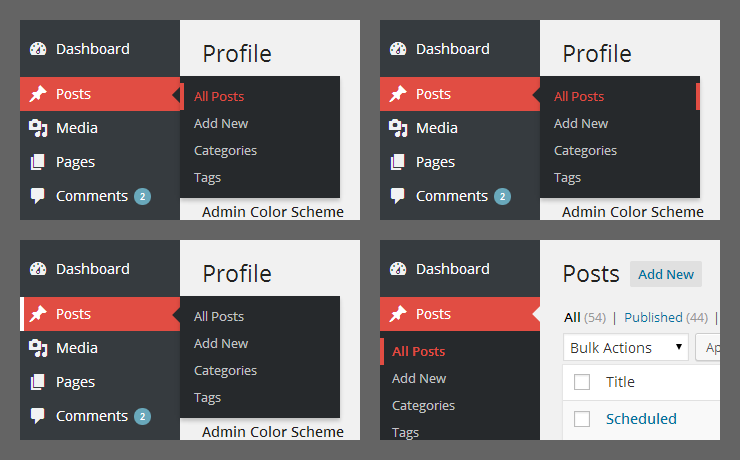
We could try something with just a left border and maybe a background/color color change. Here's a super quick mockup:
With a transition, it would add a little motion, a contrast from other hover/active states, and work pretty well throughout the side nav. For the top nav, I would go with a bottom border (via box-shadow to avoid repaint) instead.
#28
follow-up:
↓ 29
 @
@
11 years ago
I would propose to be open to explore other options, there's no hurry and we need feedback from all the accessibility team members. It would be great to involve in the discussion as many lead developers and contributors as possible, when they have a chance.
Different ideas were discussed on Slack during the accessibility meeting session.
I agree with @helen that design-wise, what @michaelarestad proposed is better than an outline. Besides accessibility considerations, I see a couple of potential issues with the border on the left, see screenshot below, it's just a quick in-browser editing, please don't focus on colors:
- the menu has at least 3 views: desktop, folded/auto-folded and mobile; when folded, is there enough space to shift the icon on the right?
- shifting the item text on the right could break the text in 2 lines just when focused; we can't predict the item text length and having a line of text that breaks in 2 lines when focused looks pretty bad
Thoughts?
 @
@
11 years ago
partially explores Michael Arestad idea, no padding/shifting and color changes for now, just to have an idea
#30
in reply to:
↑ 29
;
follow-up:
↓ 31
 @
@
11 years ago
Replying to usability.idealist:
Replying to afercia:
The line-break already happens as soon as you use non-english languages. Last week I wrote a plugin as part of a job and added i18n - I always use English for i18n reasons, no matter that it aint my native language - and as soon as the German translation was in, several menu items broke into two lines.
The point is, using padding just on focus, a long text will be in one line when not focused and will break in two lines when focused.
#32
follow-ups:
↓ 33
↓ 38
 @
@
11 years ago
Quick note, we can add visual borders without influencing the box parameters (padding, margin, border). Using pseudo elements, box-shadows, or other techniques we can avoid forcing a line-break.
#34
follow-up:
↓ 35
 @
@
11 years ago
I like the "left border" on focus approach (however it will be achieved technically). We would have to experiment with different colors and make sure contrast is sufficient. It definitely looks better than the white border!
Question is: Would this solution be enough to count as an "additional visual cue" in respect to WCAG criteria?
IMHO the behavior of hover and focus should be identical. This makes for a more streamline experience.
#36
in reply to:
↑ 35
;
follow-up:
↓ 37
 @
@
11 years ago
Replying to usability.idealist:
But you know, some folks might find it not "visually appealing" (aka artsy) enuff :-/
This is my kind request we not make derogatory comments about other disciplines or people, no matter how covert. I think we are a strong and well-developed enough project to be able to balance visual design and usability for the majority with affordances for sizable minorities. There is no need to put down one or the other, and we should not and will not tolerate it.
#38
in reply to:
↑ 32
;
follow-up:
↓ 39
 @
@
11 years ago
Replying to Michael Arestad:
Quick note, we can add visual borders without influencing the box parameters (padding, margin, border). Using pseudo elements, box-shadows, or other techniques we can avoid forcing a line-break.
That's what the patches are actually doing. Since the beginning I tried to avoid touching the box model, so the only solid options were outline or box-shadow. Nice idea considering CSS generated content too. In the future, maybe, CSS filters.
#39
in reply to:
↑ 38
 @
@
11 years ago
Replying to afercia:
Nice idea considering CSS generated content too. In the future, maybe, CSS filters.
Yep!
BTW: The arrows are already "CSS generated", so I don't see why we couldn't harness that to display :focus and/or :hover as well. Browser support is there as well.
(The ::after pseudo element is already taken by the arrow, though, so ::before would be the choice here.)
#40
 @
@
11 years ago
I agree with @florianziegler that this is a beautiful solution. According to WCAG rules the focus should be visible. If the contract ratio between background-left border line and background-text is 1:4.5 or more, I think this is a good solution.

This ticket was mentioned in Slack in #accessibility by rianrietveld. View the logs.
11 years ago
#42
 @
@
11 years ago
i like @michael-arestad's design mockup followed up by what @afercia designed with a "left border" approach most and think it correlates best with WCAG.
#43
 @
@
11 years ago
To quickly recap what was discussed in slack earlier today:
- The bar was declared a sufficient, additional visual cue.
- Contrast has been addressed separately in ticket #30323
#44
 @
@
11 years ago
After last Wednesday's discussion, I (gave it another try and) created a patch. Use "grunt patch" to apply it.
With the patch applied, you should now see the "focus bar" on hover & focus on the left hand side of the respective menu item.
Screenshot:
Behavior of hover & focus is identical.
I also added a transition (like Michael Arestad suggested).
At this point it only works with the default color scheme: I had to include the color scheme's body class ("admin-color-fresh") as a selector in order not to affect the other color schemes. Once the other schemes are adjusted, we can get rid of the body class selectors.
While working on this, I realized that the body class is not updated on the fly, when using the color picker on your profile page, thus causing problems when switching to any other than the default color scheme. I added that (missing) functionality to user-profile.js. (Let me know if this should have its own ticket.)
Please test away and tell me, what you think. :)
#45
follow-up:
↓ 46
 @
@
11 years ago
Wondering if currentColor can be used here instead of tweaking all color schemes. Ref: https://developer.mozilla.org/en-US/docs/Web/CSS/color_value#currentColor_keyword
#46
in reply to:
↑ 45
;
follow-up:
↓ 48
 @
@
11 years ago
Replying to azaozz:
Wondering if
currentColorcan be used here
Hello @azaozz, it would be great if we could use currentColor though I guess IE 8 is still officially supported, any update on this?
@florianziegler hi, it would be great if you could also take care of the fly-out "triangle", it should work also on focus. See my previous patch.
#47
 @
@
11 years ago
New patch.
Amazing idea by @azaozz, using "currentColor"!
It now works out of the box for all color schemes! But we need to check if IE8 is an issue/needs to be supported as @aferica mentioned. Anyone?
@aferca: Thanks for the input on the triangles/arrows: They now show up on focus. For them we still need the body class selectors, as to not interfere with the non-default color schemes. Can't use currentColor here, unfortunately. :)
#48
in reply to:
↑ 46
;
follow-up:
↓ 49
 @
@
11 years ago
Replying to afercia:
...I guess IE 8 is still officially supported, any update on this?
It is supported but with (slightly) "reduced functionality" here and there.
28599-currentcolor-arrow.diff looks good. It won't work in IE8 anyway, no support for box-shadow there.
#49
in reply to:
↑ 48
 @
@
11 years ago
Replying to azaozz:
Replying to afercia:
...I guess IE 8 is still officially supported, any update on this?
It is supported but with (slightly) "reduced functionality" here and there.
great, thanks!
It won't work in IE8 anyway, no support for box-shadow there.
I forgot to mention that :)
#50
 @
@
11 years ago
Tested 28599-currentcolor-arrow.diff on focus and on hover with latest Safari, Chrome and Firefox in Yosemite. Works good.
#51
follow-up:
↓ 53
 @
@
11 years ago
There are some small issues, for example when the menu is folded, the fly-out "triangle" should be smaller, the JS part is not needed, the SASS files need to be updated and other minor things but before going into details... idea:
the "focus bar" looks pretty bad when it's close to the fly-out triangle (1),
what about making it appear on the right only for fly-out sub items (2),
while keeping it on the left in all other cases (3 and 4)?
Designers, a11y team, and anyone's feedback welcome.

This ticket was mentioned in Slack in #accessibility by afercia. View the logs.
11 years ago
#53
in reply to:
↑ 51
;
follow-up:
↓ 54
 @
@
11 years ago
Replying to afercia:
the "focus bar" looks pretty bad when it's close to the fly-out triangle (1),
Yes. Yes it does. Good catch!
what about making it appear on the right only for fly-out sub items (2),
That's a thought. It's not perfect, but works and is still useful for tabbing.
while keeping it on the left in all other cases (3 and 4)?
If we put it on the right side, we should probably do it for all of them rather than just sub navs.
#54
in reply to:
↑ 53
;
follow-up:
↓ 56
 @
@
11 years ago
Replying to Michael Arestad:
If we put it on the right side, we should probably do it for all of them rather than just sub navs.
Then you have the same problem with the arrow, just "inverted": the arrow would be displayed on top of the bar, which also looks kind of bad.
I tried the bar on the right side for the (flyout) submenus: It solves the problem with the triangle/arrow, but it doesn't work as well in providing the additional visual cue. It is there, but the effect is somewhat lessened by the fact that is much further away from the corresponding text.
I corrected the arrow size on the collapsed menu. (Thanks @aferica for pointing that out.)
We should discuss further tonight (rather all of you, because I am not sure, if I will be able to make it due to our local WP meetup) and then I can combine the suggestions/fixes in another patch.

This ticket was mentioned in Slack in #accessibility by rianrietveld. View the logs.
11 years ago
#56
in reply to:
↑ 54
 @
@
11 years ago
Replying to florianziegler:
Replying to Michael Arestad:
I tried the bar on the right side for the (flyout) submenus: It solves the problem with the triangle/arrow, but it doesn't work as well in providing the additional visual cue. It is there, but the effect is somewhat lessened by the fact that is much further away from the corresponding text.
After some testing, I totally agree: on the right is less effective from an accessibility point of view.

This ticket was mentioned in Slack in #accessibility by accessiblejoe. View the logs.
11 years ago

This ticket was mentioned in Slack in #design by afercia. View the logs.
11 years ago

This ticket was mentioned in Slack in #design by afercia. View the logs.
11 years ago
#60
follow-up:
↓ 61
 @
@
11 years ago
I was just reading from the Trac mailing list when I came across comment 44 and wanted to jump in and let you guys know I opened ticket #30488 to address the body class not updating after a scheme change earlier today before I knew about this ticket. I think my patch might be a better place for that fix and also a slightly different approach. If we could get some traction on that patch then everyone could benefit from the change a bit earlier, as this tickets been open for a while and the missing body class should be fixed sooner rather than later. Thanks guys.
Cheers,
Derek
#61
in reply to:
↑ 60
 @
@
11 years ago
Replying to valendesigns:
I think my patch might be a better place for that fix and also a slightly different approach. If we could get some traction on that patch then everyone could benefit from the change a bit earlier, as this tickets been open for a while and the missing body class should be fixed sooner rather than later. Thanks guys.
Tested. Looks good to me. The sooner we get this fixed, the better.
I'll leave the respective code in my next patch for now, so that people can actually test it. Will remove once #30488 is committed.
#62
 @
@
11 years ago
- Keywords ui-feedback added
There is still the issue of "focus bar in combination with the submenu arrow", as pointed out by aferica.
The only thing I could come up with, was getting some separation between the bar and the arrow, by adding a border in the same color as the arrow and (slightly) adjusting the background-color of the submenu. It looks like this:
Only done via in-browser editing for now. This adds a 6 pixel border to the left side of the submenu, so this might be a deal-breaker.
Please share your ideas.

This ticket was mentioned in Slack in #accessibility by accessiblejoe. View the logs.
11 years ago

This ticket was mentioned in Slack in #accessibility by rianrietveld. View the logs.
11 years ago

This ticket was mentioned in Slack in #accessibility by rianrietveld. View the logs.
11 years ago

This ticket was mentioned in Slack in #core by rianrietveld. View the logs.
11 years ago

This ticket was mentioned in Slack in #design by joedolson. View the logs.
11 years ago

This ticket was mentioned in Slack in #accessibility by rianrietveld. View the logs.
10 years ago
#70
 @
@
10 years ago
I like the look of this most recent suggestion - it seems elegant and yet very clearly visible. Would love to see a patch with this.
 @
@
10 years ago
Add an additional border on the left side to get some separation between the admin menu and the focus bar
#71
 @
@
10 years ago
I put the latest ideas into a new patch.
I hope we can get a few more people to look at this solution and decide if this is actually a viable option (from a design perspective).
Known bug: When the admin menu is folded, focusing/hovering on the current menu item, the submenu is missing the border and has a wrong background color.

This ticket was mentioned in Slack in #accessibility by rianrietveld. View the logs.
10 years ago
#75
follow-up:
↓ 76
 @
@
10 years ago
Mobile screenshots, please.
Someday soon, I want submenus to go away entirely. :-)
#76
in reply to:
↑ 75
 @
@
10 years ago
Replying to ryan:
Mobile screenshots, please.
Someday soon, I want submenus to go away entirely. :-)
Related mobile chat and screenshot.
https://wordpress.slack.com/archives/accessibility/p1421870414000441

This ticket was mentioned in Slack in #accessibility by rianrietveld. View the logs.
10 years ago
#78
 @
@
10 years ago
Here's a quick look at the patch in action on a Nexus 5 with a couple preliminary impressions.
https://make.wordpress.org/flow/2015/01/27/admin-menu-visual-focus-indication-28599-nexus-5/
#79
 @
@
10 years ago
- Component changed from General to Administration
- Focuses administration removed
- Keywords has-patch added

This ticket was mentioned in Slack in #accessibility by afercia. View the logs.
10 years ago

This ticket was mentioned in Slack in #core by afercia. View the logs.
10 years ago
#82
 @
@
10 years ago
Waiting for UI feedback, maybe some popular "menu bars" examples can be useful for the visual part. Vertical and horizontal bars: though they're not used for the "focus" state but for the current active menu. See screenshot.
I'm not a designer but I can see there's a common detail in all of them: more space between the bar and the menu item text. White space is good :)

This ticket was mentioned in Slack in #core by afercia. View the logs.
10 years ago
#85
 @
@
10 years ago
Can we get some screenshots of whatever the latest iteration is in various states (expanded and collapsed, narrow screens if different there, active/focus/hover), or point me to the attachments so we can more easily solicit design feedback? It's much easier to get that feedback across the board when you don't have to apply patches and navigate around yourself :)

This ticket was mentioned in Slack in #accessibility by accessiblejoe. View the logs.
10 years ago

This ticket was mentioned in Slack in #core-customize by afercia. View the logs.
10 years ago

This ticket was mentioned in Slack in #core by drew. View the logs.
10 years ago
#89
 @
@
10 years ago
- Milestone changed from 4.2 to Future Release
I agree with @helen in comment:85: the first thing we're going to need to move this ticket forward is screenshots with the latest iteration of the patch applied.
I think we're too advanced into the cycle to get this done right in 4.2, maybe we can tackle this early in 4.3.

This ticket was mentioned in Slack in #accessibility by accessiblejoe. View the logs.
10 years ago

This ticket was mentioned in Slack in #design by helen. View the logs.
10 years ago

This ticket was mentioned in Slack in #accessibility by accessiblejoe. View the logs.
10 years ago

This ticket was mentioned in Slack in #accessibility by afercia. View the logs.
9 years ago

This ticket was mentioned in Slack in #accessibility by afercia. View the logs.
9 years ago

This ticket was mentioned in Slack in #design by karmatosed. View the logs.
8 years ago

This ticket was mentioned in Slack in #core-editor by afercia. View the logs.
8 years ago

This ticket was mentioned in Slack in #design by karmatosed. View the logs.
7 years ago
#100
 @
@
7 years ago
In order for this to have a design review we need to have the screenshots asked a little while ago, hopefully this is possible.
#101
 @
@
7 years ago
@florianziegler - This ticket came up in design ticket triage today. I tried to apply your latest patch from 3 years ago, but I get errors and it doesn't seem to apply. Do you think it's easy to update the patch so it works with the current WP version? If so, I'd be happy to test and create some screenshots so people can give feedback and we can move this ticket forward :)
#103
 @
@
7 years ago
On a side note / Offtopic: I'm sorry, but is there any way to REALLY block notifications from this ticket? Trac says I've blocked notifications, but I'm still receiving them.
I've not been interested in this for a long time, mostly because people tend to interpret my comments however they like, bending and intentionally misinterpreting it (and also ignoring the fact that I'm not a native English speaker).
cu, w0lf.
#104
 @
@
7 years ago
Maybe you can unsubscribe via the email footer, or click on the Watching ticket button below? I'm not sure otherwise.
Anyway, to get this ticket started up again in lieue of a working patch, I did a mockup of Florian's latest design in Sketch. I tried to interpret it as best I could from the screenshot: https://sketch.cloud/s/Yy0lv. It was the same idea I had when I started reading this ticket for the first time today, so I'm glad this ticket went with that design.
After that I wanted to see if I could find an even cleaner version of it. The extra line felt a bit noisy. And along the way I ran into some other considerations:
- Using the admin theme color can present problems with contrast, as the default blue isn't AA compliant with the admin menu color.
- That arrow often gets in the way.
- The difference in background color between focus and (sub) item is distracting.
- First-level menu items are very prominent while active sub items are not.
- Any differences in color between the active first-level item focus bar and the sub item focus bar are not great.
- Some colors just make it look like something is broken.
So after some exploration with @karmatosed and @boemedia we settled on an iteration that I personally like very much.
Interactive prototype:
https://sketch.cloud/s/g7Yeg/all/page-1/menu-unfocused/play
Or, to view all the desktop and mobile pages separately:
https://sketch.cloud/s/g7Yeg
What do you think of this?

This ticket was mentioned in Slack in #accessibility by rianrietveld. View the logs.
7 years ago
#109
 @
@
6 years ago
- Milestone changed from 5.0.3 to 5.1
Hello,
5.0.3 is going to be released in a couple of weeks.
It doesn't appear this ticket can be handled in the next couple of weeks. Let's address it in 5.1 which is coming in February. Feel free to ask for changing the milestone if you think this issue can be quickly resolved.
Cheers,
Jb
#110
 @
@
6 years ago
- Milestone changed from 5.1 to Future Release
Realistically, this ticket can't be addressed in 5.1 coming in February. It still needs consensus on the proposed design changes. While the previous explorations were almost there, the patch needs a substantial refresh. I'd also consider to make the admin menu a bit larger, as there's no reason why it should be only 160 pixels wide. Moving to Future Release.

This ticket was mentioned in Slack in #accessibility by robert.vidrine. View the logs.
6 years ago
#112
 @
@
6 years ago
I agree with this issue. I have compromised vision, and the color change of just the text is not sufficient to indicate the focus difference. An example of good focus indication can be found at gov.uk in the header. When the logo and the url 'gov.uk is highlighted in the header (with the tab key for instance, so the link is not followed, just focused), a solid border is placed around the entire element. Dani Hooven and I are working on some examples of CSS that may achieve a border for this element that will not increase the overall size of the element. Several others in the accessibility team are working on figuring out this CSS snippet.
#113
 @
@
6 years ago
I've tested the following CSS.
This seems to work. It doesn't change the size of the element and adds the correct ratio of color contrast, making the tabbable elements easily visible when receiving focus. The color (accent yellow) is from the WordPress style guide.
Can someone from the design team please review?
outline: solid #FFB900 .15rem;
outline-offset: -.15rem;

This ticket was mentioned in Slack in #design by estelaris. View the logs.
5 years ago
#116
 @
@
5 years ago
- Keywords ui-feedback needs-screenshots needs-design-feedback removed
Looks like this ticket has some good design proposals and consensus around them. I think it just needs patch refresh to move forward.
#117
 @
@
5 years ago
In the latest proposal from @danihooven. It would be great if you could also take care of the fly-out "triangle", it should work also on focus - as @afercia said.
#118
 @
@
5 years ago
- Keywords needs-patch added; has-patch needs-refresh removed
Worth noting a proposal for a border / outline was already made 6 years ago, see https://make.wordpress.org/accessibility/2014/06/25/visual-focus-indication-in-left-navigation/
It was discussed and design feedback wasn't in favor of it, see from comment:14 to comment:20
#119
 @
@
4 years ago
- Keywords needs-design-feedback has-screenshots has-patch added; needs-design needs-patch removed
Resurrecting this old ticket, since as far as I can tell the approach is still valid, but it stalled out from lack of screenshots. The patch doesn't apply anymore, so I grabbed the basic idea of it and made a new patch. This new patch adds a 4px border (box shadow) to hover and focus, plus adding a spacer between the side of the submenu "flyout". Thanks to currentColor and transparent borders, we don't actually need to change the color scheme sass base, it behaves correctly in all schemes.
So, screenshots. I have plenty of those: https://cloudup.com/cdWzjq0yvuq
There are a handful of focus and hover states across every color scheme - top level menu items, submenu items, with default desktop menu, collapsed menu, and on a small screen. Those are all labelled. Then I took a few across different languages, including RTL. Lastly, some Windows high contrast screenshots. The hover state is invisible here, but there already was an outline focus state. A surprise benefit (IMO) is that the transparent border now highlights where the submenu is, though I wish we had a media query to fix the awkward arrow-box.
Tagging for design feedback 🙂
#120
 @
@
4 years ago
- Milestone changed from Future Release to 5.7
All of this looks really great to me 😍
I'm moving this ticket to milestone 5.7. The screenshot look great, but I added this to my todo-list to hopefully be able to review it tomorrow.
Thanks!
#121
 @
@
4 years ago
- Owner set to ryelle
- Status changed from new to assigned
also, let's give this ticket a proper owner :)

This ticket was mentioned in Slack in #design by estelaris. View the logs.
4 years ago
#123
 @
@
4 years ago
- Keywords needs-design-feedback removed
From the Design triage today, We agreed that a new patch from @ryelle looks great :)
I have removed the needs design feedback label.
#124
 @
@
4 years ago
- Keywords commit added
@ryelle I tested your last patch and it looks great to me as well.
I think it would be nice to commit it early so it can be widely tested during the Beta cycle.
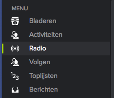

I'm a really big fan of reversing background and foreground colors, so in the dark default admin scheme, I'd want to see something like a blue background with black/dark grey text for th currently focused element. It's got to really "pop" for sighted keyboard navigators. triangle indicators are very nice as added features for onhover but I'd argue that they're too subtle for focus highlighting. Ditto for underlines. General rule of thumb: if you have to visually hunt for the currently focused element, then you need something else. Get it right and keyboard navigation becomes so much easier.