Opened 10 years ago
Last modified 7 years ago
#37971 new defect (bug)
Menus screen: improve the responsive view
| Reported by: |
|
Owned by: | |
|---|---|---|---|
| Milestone: | Awaiting Review | Priority: | normal |
| Severity: | normal | Version: | |
| Component: | Menus | Keywords: | has-screenshots needs-patch |
| Focuses: | ui | Cc: |
Description
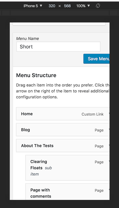
Noticed while working on #37969, the responsive view of the Menus screen needs some improvements. Not sure if there's already a specific ticket (haven't found one).
Some CSS rules used in this screen work just in the "Desktop" view: 100% widths+margins, some floats, the 13em spacing between menu item titles and controls and probably more stuff need to be reset/adjusted.
Not sure it nesting the menu items can work on very small displays, probably needs a different approach. Any thoughts welcome!
Attachments (2)
Change History (6)
#3
 @
@
9 years ago
- Keywords needs-patch added; has-patch needs-testing removed
Doesn't work for screens below 410px (tested in Chrome)
EDIT: Nvm, was another patch that interfered.
Still does not fix the dragging and dropping issue.
#4
 @
@
9 years ago
Not sure a drag-and-drop UI will ever work nicely on touch devices and small screens. Maybe it can work in a decent way when moving single items in a flat list, but when moving a group of nested items or when a group of items need to respond to a drag and drop action, then I'm not sure there's a possible "fix". Also, not so ideal for accessibility: not operable with a keyboard and it's basically a device-dependent interface. Ideally, it should be device-independent, I mean operable with any pointing device, keyboard, or any other device.
I'd consider to improve just the CSS issue for now.

Dragging and dropping isn't working well on mobile devices at all (tested on Android - Chrome). Once I start dragging the windows scrolls all the way down.