Opened 9 years ago
Closed 9 years ago
#38660 closed defect (bug) (fixed)
Customizer: Edit shortcuts buttons: consider to don't use flexbox
| Reported by: |
|
Owned by: |
|
|---|---|---|---|
| Milestone: | 4.7 | Priority: | normal |
| Severity: | normal | Version: | 4.7 |
| Component: | Customize | Keywords: | has-screenshots has-patch commit |
| Focuses: | Cc: |
Description
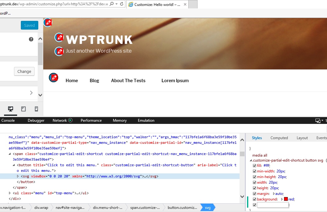
Testing the new edit shortcut buttons in IE 11, the positioning of the icons is a bit off (red background is just for testing purposes):
I'd consider to don't use flexbox at all, and use a more traditional layout model instead.
- theoretically, the Customizer should still support IE 9+
- have a look at the known flexbox bugs on caniuse.com
- Firefox does not support flexbox in button elements, as far as I understand this is going to be solved soon
Is there really the need to use flexbox? browsers already horizontally center anything inside buttons.
About vertical centering, the buttons and icons have fixed width so it's just a matter of ensuring the buttons have always box-sizing: border-box and then use padding: 3px
Attachments (4)
Change History (15)
#4
 @
@
9 years ago
@afercia I'm having trouble getting IE set up to test this properly but I have created a PR to replace flexbox here: https://github.com/xwp/wordpress-develop/pull/197 It seems to work well in Mac OS Safari, Firefox, and Chrome.
I will attach a patch version of the PR here. If you have a moment could you try it out and see how it looks in IE?

This ticket was mentioned in Slack in #core by helen. View the logs.
9 years ago
#6
 @
@
9 years ago
Hello @sirbrillig, my patch did not remove flexbox, I had changed the margin only, sorry. I tested your patch and it works correctly in IE, Safari, Chrome, Firefox and Opera for Windows. I made 2 more adjustments in CSS because as you can see in the images ( and
), the menu edit button, in monitor with resolution of 1280x1024px, was hidden. In addition I also changed the top and left of the header edit button.
#7
 @
@
9 years ago
@MarcosAlexandre Nice! Thank you.
the menu edit button, in monitor with resolution of 1280x1024px, was hidden.
Do you mean that it is cut off on the edge of the viewport? If so, I think that's better addressed in #38651. In my opinion bringing the icons closer to their elements looks worse for elements like the site title and tagline. It is a challenging issue, and one that we should explore thoroughly, but I don't think it should block this issue (removing flexbox).
#8
 @
@
9 years ago
@sirbrillig I tested the patch from @MarcosAlexandre in IE11 and it appears that the icons are centered. I also think that, at least for Twenty Seventeen, the locations are appropriate enough to let people know what is going to be edited.
The only issue I saw was if you go down to the mobile sizes the menu icon is hidden partially on the left
and not close to where the menu is. That being said I don't think it's a huge deal. It depends on how picky we want to get. This happens in Chrome and IE11. I'm guessing it will happen in all browsers as well.
#9
 @
@
9 years ago
- Keywords commit added
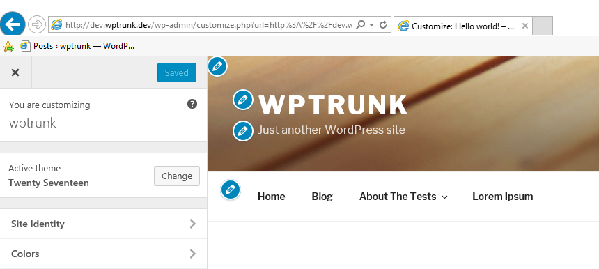
@sirbrillig just tested 38660.2.diff in IE11 and looks good to me, see below:
@Fencer04 @MarcosAlexandre thanks! Had a look at 38660.3.diff and it misses a px unit for the padding, not a big deal just a typo but also I'd agree the icons position is better addressed in #38651 so I'd recommend to commit 38660.2.diff


388660.patch