Opened 7 years ago
Closed 7 years ago
#46093 closed defect (bug) (fixed)
User profile checkbox margin issue.
| Reported by: |
|
Owned by: |
|
|---|---|---|---|
| Milestone: | 5.2 | Priority: | normal |
| Severity: | normal | Version: | 3.3 |
| Component: | Users | Keywords: | has-patch |
| Focuses: | accessibility, administration | Cc: |
Description
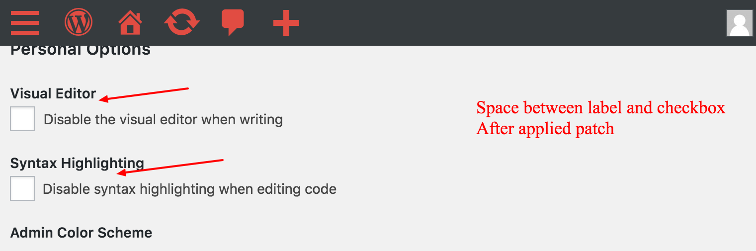
I found normal style issue in User profile admin area. There is no margin applied some of checkbox due to different HTML. I have added style for it copied from other checkbox generic styles. I will attach pictures to easily identify issue.


Attachments (7)




Change History (11)
#1
 @
@
7 years ago
- Focuses accessibility added
- Keywords needs-refresh added; needs-testing removed
- Milestone changed from Awaiting Review to 5.2
- Owner set to afercia
- Status changed from new to assigned
- Version changed from trunk to 3.3
@punit5658 thanks for your report. This is an interesting case.
As you've noticed, the markup is different. The "Show Toolbar when viewing site" checkbox is wrapped in a <fieldset> element (with a legend) even if it's only one checkbox. Instead, <fieldset> should only be used to group a set of related form controls together.
Turns out a few years ago, when the toolbar was still called "Admin Bar", there were two checkboxes (see attached screenshot). Then, in [18700] this option was simplified to have only one checkbox. However, the fieldset and legend survived to that change.
As there's now no reason to use a <fieldset> and a <legend>, I'd suggest to simply remove them instead of changing the CSS. This would also solve the margin issue in the mobile view.
Image 1 - Spacing issue between label and checkbox