Opened 4 years ago
Closed 5 months ago
#51751 closed enhancement (maybelater)
Update page header design
| Reported by: |
|
Owned by: | |
|---|---|---|---|
| Milestone: | Priority: | normal | |
| Severity: | normal | Version: | |
| Component: | General | Keywords: | needs-design-feedback has-screenshots |
| Focuses: | ui | Cc: |
Description
There is a proposal to create a block directory. With that proposal comes an idea for a new header pattern that could be applied to all wp-admin pages.
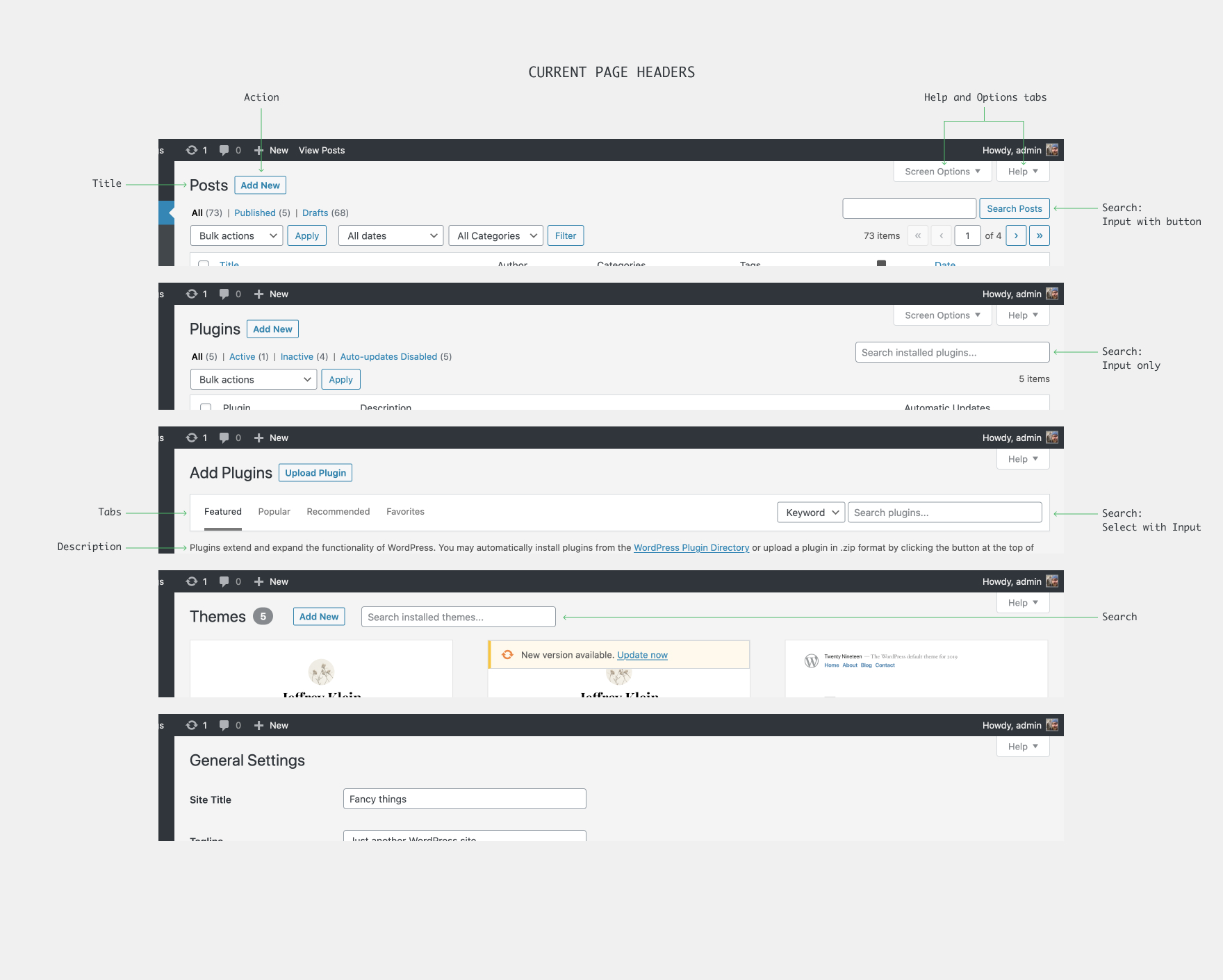
Here is a sample of current page headers:
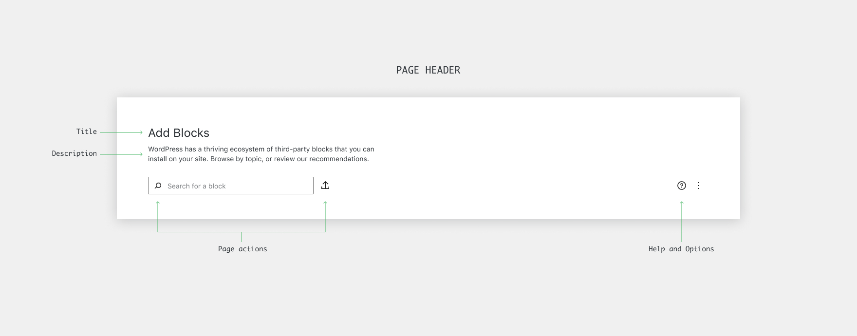
Here is the page header pattern in the proposal:
The page header is made up of the following:
- Title - A short title of the page.
- Description - These will be both informative and inspiring. We will need some quality copywriting here.
- Actions - These can include search fields and button actions. In the following prototype, it is used primarily for Search, Upload, and Add New actions.
- Help and Options buttons - These will replace the "Screen Options" and "Help" tabs at the top of the pages.
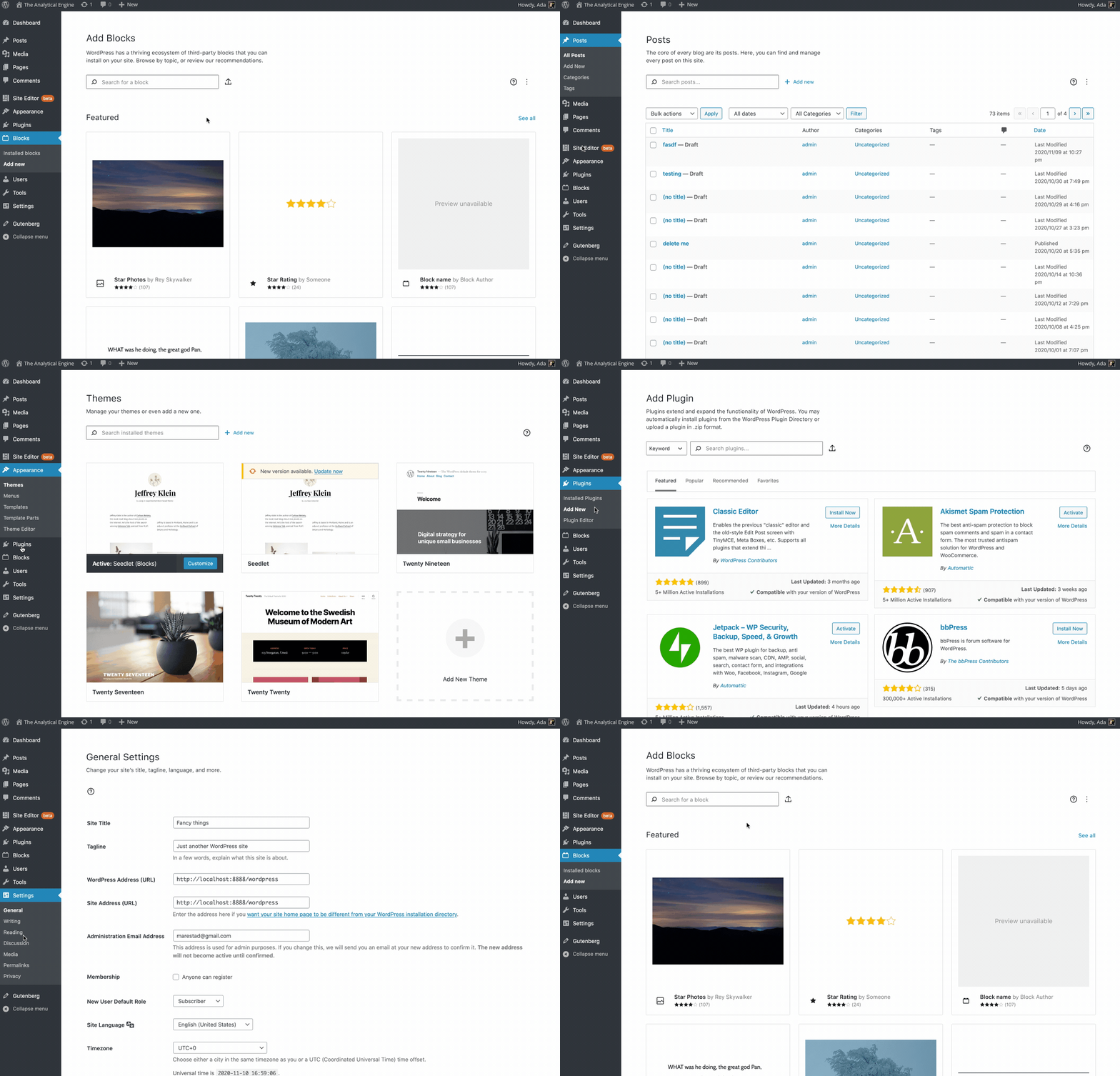
It was initially designed in the context of a Block Directory page. In an effort to test it out, I mocked it up on a variety of pages. I made a prototype to easily move between the pages in order to get a better feel for it.
You can also peruse this Cloudup gallery for static images.
In the above prototype, I made two notable changes: I made the background white and I increased the padding of the center column to 64px instead of 20px. The design is not contingent on these changes, but certainly looks nicer with them in my opinion. For the curious, here is a gallery with a grey background and no padding change.
As for implementation, I hope to use some of the styles from the relevant Gutenberg components including the toolbar buttons. I also hope to use the SVG icons. It would be a good first step in aligning the styles of wp-admin with Gutenberg.
What do you think?


I think it does a great job adding visual focus to what really matters, especially on plugin & block views. I am a fan.
A couple things from me: