Opened 12 years ago
Last modified 7 years ago
#26605 new enhancement
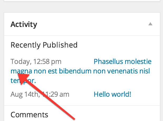
Appearance of recent/future posts in dashboard looks off on mobile.
| Reported by: |
|
Owned by: | |
|---|---|---|---|
| Milestone: | Future Release | Priority: | normal |
| Severity: | normal | Version: | 3.8 |
| Component: | Administration | Keywords: | has-patch has-ui-feedback needs-screenshots needs-refresh |
| Focuses: | ui | Cc: |
Attachments (7)
Change History (22)
#2
 @
@
12 years ago
- Component changed from Appearance to Administration
- Keywords ui-focus has-patch 3.9-early added
- Milestone changed from Awaiting Review to Future Release
- Version set to 3.8
#4
 @
@
11 years ago
- Keywords ui-feedback added
This behavior is still present almost two years later. I agree that this isn't exactly ideal. I almost would have expected the title content to wrap at an indent as the design looks and feels kind of like a table, whether that was intentional or not.
Would be nice to get some UI feedback and either a new patch or a wontfix.
#5
 @
@
11 years ago
- Component changed from Posts, Post Types to Administration
- Focuses administration removed

This ticket was mentioned in Slack in #design by karmatosed. View the logs.
10 years ago

This ticket was mentioned in Slack in #design by karmatosed. View the logs.
9 years ago
#9
 @
@
9 years ago
@mattheu Hey, any chance you're still interested in working on this? Could you add screenshots of what your patch does?

This ticket was mentioned in Slack in #design by karmatosed. View the logs.
8 years ago
#12
 @
@
7 years ago
Hi team :)
Just added a new patch and some screenshots. Not sure if this is the right approach on mobile and if this the correct breakpoint (Currently I'm using the max-width: 799px breakpoint).

This ticket was mentioned in Slack in #design by boemedia. View the logs.
7 years ago
#14
 @
@
7 years ago
- Keywords has-ui-feedback added; ui-feedback removed
Hi Tsiger,
Thanks for working on this ticket! We discussed the given solution during today's design triage.
We really like the solution given. However, we wondered if we could look at displaying the content from a broader perspective. As we've noticed, there are some similarities in the information given in the Events Widget and this one. But the events widget has different styling. We're unsure why, but think it may be a good idea to align these widgets and maybe use the styling and layout from the (newer) events widget to create better consistency.

Perhaps less of a proplem, but this issue is actually still present on desktop when very long titles are used. I propose a more robust way to lay out the 2 columns to prevent this. I'm addding a second patch added that also does this.