Opened 11 years ago
Closed 11 years ago
#31326 closed defect (bug) (fixed)
Edit comment screen: misplaced-missing labels
| Reported by: |
|
Owned by: |
|
|---|---|---|---|
| Milestone: | 4.3 | Priority: | normal |
| Severity: | normal | Version: | 4.1 |
| Component: | Comments | Keywords: | has-patch commit |
| Focuses: | ui, accessibility | Cc: |
Description
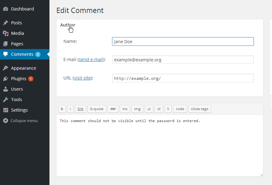
In this form, neither "Name:", "E-mail:" or "URL:" are labels.
The only label is the title "Author" associated with the "Name:" field. Pretty weird. See screenshot.
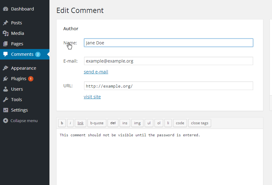
Once fixed, links can't be inside labels, it's pretty confusing. I'd propose to move them below the form fields. I'd say the proposed elements order makes sense when tabbing, e.g.:
E-mail > {someone @ somewhere.org} -> send email
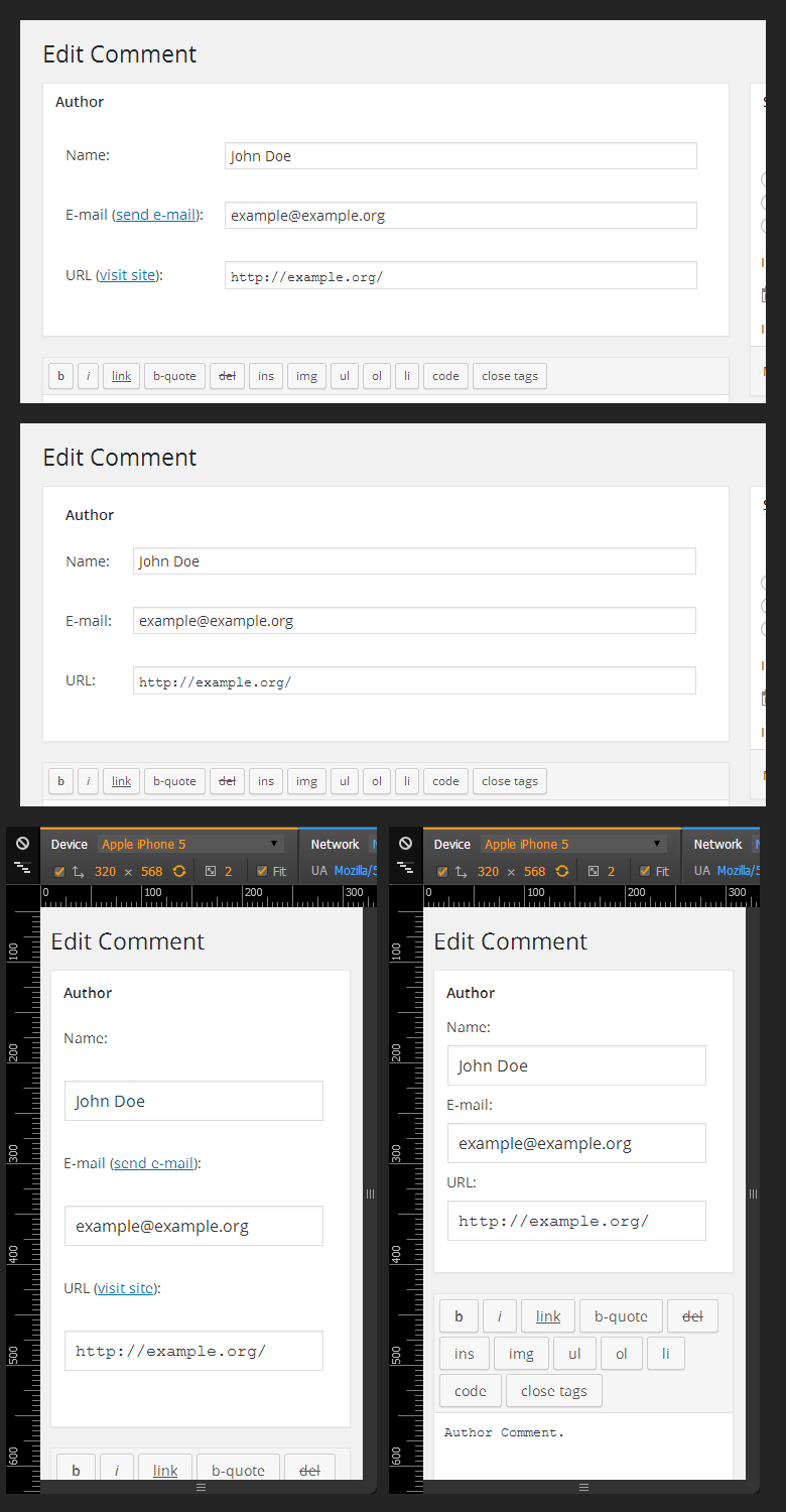
The three form fields are now grouped in a <fieldset> and "Author" is the fieldset's <legend>. Added also a screen-reader-text'ed label for the comment's textarea. See screenshot:
Attachments (9)
Change History (39)

This ticket was mentioned in Slack in #accessibility by rianrietveld. View the logs.
11 years ago

This ticket was mentioned in Slack in #accessibility by rianrietveld. View the logs.
11 years ago

This ticket was mentioned in Slack in #accessibility by rianrietveld. View the logs.
11 years ago
#7
in reply to:
↑ 5
;
follow-up:
↓ 9
 @
@
11 years ago
Replying to rianrietveld:
Jeff de Wit
Labels for those fields read out fine in Chrome. The links are a bit context-less now though. While I personally understand the connection between the Email field and the "send email" link (and similarly, the URL field and the "visit site" link), not everyone might while just listening to it as they tab through ("Send email to where?"). Maybe include the email address in the link (as screen reader text or otherwise)?
Not too sure what to do about the visit site link, especially since it'll take you to the commenter's website (whatever it is they've filled in). It seems redundant to read it out loud again, but maybe refer back to the URL field?
Maybe just remove them? Need feedback from the UI team.
Heather Migliorisi (@hmig):
The only thing I noticed (out of scope for the ticket), clicking edit (for date/time on the right hand side) makes the tabbing order start over on the page instead of taking you into the content that was revealed.
Interesting point and noticed in several parts in the admin, maybe worth a general ticket about focus handling?
Remark Rian: About the remarks of the markup buttons of the editor, this is not part of the patch, but the testers tested it anyway. Labeling the buttons properly maybe worth a separate ticket?
Definitely yes, we could try to add aria-label for each button, see /wp-includes/js/quicktags.js

This ticket was mentioned in Slack in #core by afercia. View the logs.
11 years ago
#9
in reply to:
↑ 7
 @
@
11 years ago
- Keywords ui-feedback added
Replying to afercia:
Replying to rianrietveld:
Jeff de Wit
Labels for those fields read out fine in Chrome. The links are a bit context-less now though. While I personally understand the connection between the Email field and the "send email" link (and similarly, the URL field and the "visit site" link), not everyone might while just listening to it as they tab through ("Send email to where?"). Maybe include the email address in the link (as screen reader text or otherwise)?
Not too sure what to do about the visit site link, especially since it'll take you to the commenter's website (whatever it is they've filled in). It seems redundant to read it out loud again, but maybe refer back to the URL field?
Maybe just remove them? Need feedback from the UI team.
I'd also be interested to hear from the UI team on just removing those links, the email link is just a mailto link and visit site link is I suppose nice-to-have though odd, especially in the context of having to move it below the input to fix the labels.
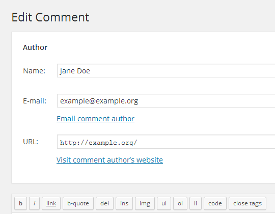
If we decide to keep the links, we should camel-case the text now that they've lost their context of being part of the pseudo-label.
- See 31326_no_links.png for what it would look like with the links removed.
- See 31326_casing.png for what it would look like with the link text camel-cased.
#11
 @
@
11 years ago
Attached 2 new patches for both options
- Camel cased links
- No links
Removed also a stray </span>
Aside: just noticed, the link to check IP addresses points to whois.arin.net which gives results just for North America IPs.

This ticket was mentioned in Slack in #accessibility by joedolson. View the logs.
11 years ago
#13
 @
@
11 years ago
Suggest changing the link text to "Email commenter" and "Visit commenter's web site", or something equivalent, so that the link context is more transparent.

This ticket was mentioned in Slack in #accessibility by afercia. View the logs.
11 years ago

This ticket was mentioned in Slack in #core by afercia. View the logs.
11 years ago
#18
 @
@
11 years ago
- Keywords ux-feedback 4.3-early added; ui-feedback removed
- Milestone changed from 4.2 to Future Release
- Priority changed from high to normal
Let's pick this up again in 4.3-early. It would be nice to get some UX feedback in the mean time.
#21
 @
@
11 years ago
- Keywords changed from has-patch, ux-feedback to has-patch ux-feedback
I'd be interested in hearing @helen's take on links vs no links here, see comment:9.

This ticket was mentioned in Slack in #accessibility by afercia. View the logs.
11 years ago
#24
 @
@
11 years ago
Refreshed patch without links as per Helen's suggestion, with some markup and CSS tweaking mostly from patch 3.
#26
 @
@
11 years ago
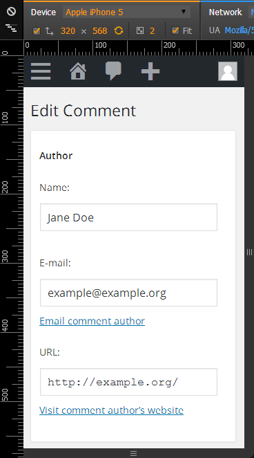
Why is the CSS so specific? Seems like the type of thing that should be quite generic to form elements. The wide spacing was noted in the screen sweep the UI team is currently doing, so it will be good to fix that.
Results WPa11y test team:
Tina Tedesco
Screen reader: JAWS 15
I was able to read the form and the labels seemed to be in the correct place.
I clicked on 1 of the buttons “b” and wasn’t sure where I ended up. I arrowed down until I could figure it out. Despite my confusion,it seemed to read out fine with the labels properly placed.
@badeyes
Screen reader: NVDA 2011, IE11, Windows 7
Didn't have a problem navigating between the edit fields until we come to the comments area, I find this with a lot of areas like this and that is I cant get to the body without having to tab through all of the code snippets, very annoying.
After the author edit field and before the code shortcuts I'd like the next tab to be the comment I need to edit.
Ruud van den Bercken
Windows 7 64 bits, Internet explorer 11, supernova 14.04 (speech + braille)
All fields are labeled (clear).
I can Edit without a problem, +1 from me.
Kim van Iersel
JAWS 15
Edit of a comment was without any problem.
Jeff de Wit
Screen reader: NVDA
Labels for those fields read out fine in Chrome. The links are a bit context-less now though. While I personally understand the connection between the Email field and the "send email" link (and similarly, the URL field and the "visit site" link), not everyone might while just listening to it as they tab through ("Send email to where?"). Maybe include the email address in the link (as screen reader text or otherwise)?
Not too sure what to do about the visit site link, especially since it'll take you to the commenter's website (whatever it is they've filled in). It seems redundant to read it out loud again, but maybe refer back to the URL field?
Additionally, the only button on the comment editor that makes any sense when read by NVDA is the "Close Tags" button. Everything else ("b button b", "i button i", "del button del", etc) is a bit weird.
Heather Migliorisi (@hmig):
Labeling looked good.
The only thing I noticed (out of scope for the ticket), clicking edit (for date/time on the right hand side) makes the tabbing order start over on the page instead of taking you into the content that was revealed.
Susan Grossman
Code review, JAWS
The labels are associated to the inputs just fine.
Remark Rian: About the remarks of the markup buttons of the editor, this is not part of the patch, but the testers tested it anyway. Labeling the buttons properly maybe worth a separate ticket?