Opened 10 years ago
Closed 7 years ago
#31604 closed defect (bug) (fixed)
Weird selection blue in the Theme Editor
| Reported by: |
|
Owned by: |
|
|---|---|---|---|
| Milestone: | 4.9 | Priority: | lowest |
| Severity: | trivial | Version: | |
| Component: | Administration | Keywords: | has-patch ui-feedback |
| Focuses: | ui | Cc: |
Description
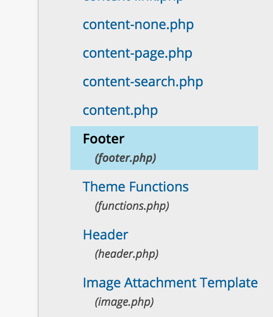
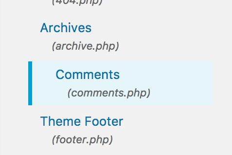
The theme editor uses a background color to show which file is selected. By default, it's this weird light blue that doesn't really blend with anything.
The entire selection style is weird, but that blue just feels off. Hugo has some ideas about a better color.
Attachments (11)
Change History (45)

This ticket was mentioned in Slack in #design by hugobaeta. View the logs.
10 years ago
#4
 @
@
10 years ago
- Changed the highlight background to 75% tint #BFE7F3
- Changed the color of the filename (class=nonessential) to #585858 to improve contrast
Colors passes WCAG 2.0 AA
#5
follow-up:
↓ 6
 @
@
10 years ago
Hi @kekkakokkers, I think that screenshot might be private. Can you upload it as an attachment to the ticket? Thanks!
#6
in reply to:
↑ 5
 @
@
10 years ago
Replying to melchoyce:
Hi @kekkakokkers, I think that screenshot might be private. Can you upload it as an attachment to the ticket? Thanks!
Updated the screenshot
#7
 @
@
9 years ago
Created a patch based on @kekkakokkers color values - #BFE7F3 for the background color (span.highlight), and #585858 for (.nonessential). I stumbled upon one other view to be considerate of (slight variation in colors) when choosing these highlight colors, which can be seen in Plugins -> Editor. (screenshot attached above).
#9
 @
@
8 years ago
- Component changed from Themes to Administration
- Keywords ui-feedback added
- Milestone changed from Awaiting Review to Future Release
Perhaps something that should change depending on the color scheme?
#10
 @
@
8 years ago
I would suggest, to change the background-color and make it a bit darker . so the contrast is a bit higher.
I addition we could ad a style like on the plugin site. In this way the design is more consistent and the selected file is a easier to see.
#templateside .highlight {
    border-left: 4px solid #00a0d2;
}

.highlight {
    background-color: #CDEFFB;
}
#11
 @
@
8 years ago
How about:
Background: #BFE7F3 (Blue tint 75%)
Border: #00A0D2 (Medium blue)
Title: #23282D (Dark gray)
Filename: #555D66 (Dark medium gray)
Background + Title contrast ratio: 11.28:1
Background + Filename contrast ratio: 5.07:1
Colors pulled from https://codepen.io/hugobaeta/pen/RNOzoV. Attaching image after comment.
#12
 @
@
8 years ago
The filename is still a little muddy — may need to swap to a bluer grey. @Travel_girl or @hugobaeta if you have any suggestions there, please chime in.
#13
follow-up:
↓ 14
 @
@
8 years ago
@melchoyce looks good.
Yes I also think the filename is not clear enough and the contrast between background and fourground is not high enhough for a good accessibility --> http://www.etre.com/tools/colourcheck/
I think the question is: how important is the different between filename and title. The filename can be darker, but I´m not sure, how different it would be to the title.
#14
in reply to:
↑ 13
 @
@
8 years ago
Replying to Travel_girl:
@melchoyce looks good.
Yes I also think the filename is not clear enough and the contrast between background and fourground is not high enhough for a good accessibility --> http://www.etre.com/tools/colourcheck/
I think the question is: how important is the different between filename and title. The filename can be darker, but I´m not sure, how different it would be to the title.
AFAIK, we're only trying to pass AA, not AAA. 5.07:1 should be sufficient contrast: https://make.wordpress.org/core/handbook/best-practices/coding-standards/accessibility-coding-standards/#color-contrast
@afercia can you chime in?
#15
 @
@
8 years ago
Yep, the minimum contrast ratio we aim for is 4.5:1 (level AA for normal text). About background and border, why not simply use the notice notice-info notice-alt classes? Quickly tried without touching the text color, margin, padding, etc. that should be adjusted as suggested above, of course:
Also: is the italic style really necessary? To me, it's a bit disturbing and doesn't add any important information.
#16
 @
@
8 years ago
@afercia and @melchoyce thanks for the links and the explanation.
I find the current background color not dark enough to have an highlight and I think just the border is not visible enough.
I'm not sure with the italic. I think it makes the different between title and description a bit more clear.
#17
 @
@
8 years ago
notice-alt is only for white backgrounds. On grey backgrounds, it blends in with the page. I'll upload a version that uses the regular notice class, for comparison.
I'm fine either way re: italics on the filename. It's probably there to provide more hierarchy, but it between the color and the size I think it's fine without being italic.
#18
 @
@
8 years ago
@melchoyce I think the last version (https://core.trac.wordpress.org/attachment/ticket/31604/Screen%20Shot%202017-03-21%20at%206.39.52%20PM.png) is the best so far.
Did you just changed the class or also css?
#19
 @
@
8 years ago
@Travel_girl I added the notice notice-info classes to the container li, and removed the highlight class from the span inside of it.
I'm kind of torn — on one side, I think this is an improvement on the existing highlight. On the other side, this isn't a notice, so should we be repurposing the notice styles here? I'm leaning towards "maybe it's not a big deal to reuse those styles here."
#21
follow-up:
↓ 23
 @
@
8 years ago
We can probably change the highlight class itself, we'll just want to check and see where else it's used.

This ticket was mentioned in Slack in #design by melchoyce. View the logs.
8 years ago
#23
in reply to:
↑ 21
 @
@
8 years ago
Replying to melchoyce:
We can probably change the
highlightclass itself, we'll just want to check and see where else it's used.
Can you check this? I'm not sure where to start with this task.
#24
 @
@
8 years ago
The use or notice makes a lot of sense. I do agree its a little odd as not a notice, visually though it is less jarring. In this case reusing to me makes sense.
https://core.trac.wordpress.org/attachment/ticket/31604/Screen%20Shot%202017-03-21%20at%206.39.52%20PM.png gets my +1 vote.
#25
 @
@
8 years ago
Thanks @karmatosed, let's go with re-using the notice classes then.
I'll take a look later today to see where else highlight is used.
#26
 @
@
8 years ago
Just checked — the highlight class only seems to be used in the theme and plugin editors in core.

This ticket was mentioned in Slack in #design by travelgirl. View the logs.
8 years ago
#28
 @
@
8 years ago
- Milestone changed from Future Release to 4.9
- Owner changed from hugobaeta to melchoyce

This ticket was mentioned in Slack in #design by karmatosed. View the logs.
7 years ago

This ticket was mentioned in Slack in #design by melchoyce. View the logs.
7 years ago
#31
 @
@
7 years ago
Tweaked some spacing in highlight-test.2.diff.
I tried to move the highlighted file 12px to the left in the Theme Editor, but for the life of me can't get it to move without messing up other elements. Attaching a before/after of what I'm looking to do, if anyone can hop in and help.
The top margin between theme and plugin editors is also a little inconsistent, if someone wants to fix that.
#32
 @
@
7 years ago
Did some iterations in highlight-test.3.diff.
- Adding margin - to the class
- Removed link class and highlight class on the plugin editor that isn't needed


I'm a weird blue!