#31654 closed defect (bug) (fixed)
List table: Select All shouldn't be a column header
| Reported by: |
|
Owned by: |
|
|---|---|---|---|
| Milestone: | 4.3 | Priority: | normal |
| Severity: | normal | Version: | 4.1 |
| Component: | Administration | Keywords: | has-patch |
| Focuses: | ui, accessibility | Cc: |
Description
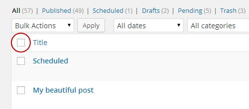
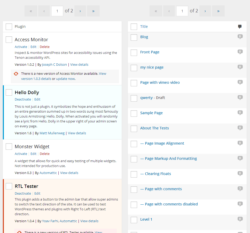
Column headers make perfectly sense when they represent the data type of their columns but the content of this th is just a checkbox with a "Select All" label.
See screenshot for reference:
As it is now, it sets a relationship with all the checkboxes in its column, we're basically saying that all the checkboxes are someway related to "Select All".
Any software, including screen readers, will get this relationship. Screen readers in fact read out the column headers content for each row in the table so when you're in the second, third row etc. they will read out:
"Select All"
"Select {Post name}" <-- or "Select Comment" etc. depending on the various screens
"Select All"
"Select {Second Post name}"
"Select All"
"Select {Third Post name}"
...
That's not only redundant but it's also conveying a wrong information.
This was also reported by @bramd (Bram Duvigneau) during one of the accessibility testers group testing sessions:
"The "select all" checkbox shouldn't be marked as column header. This causes NVDA, and probably other screen readers as well, to announce (Select all, select Post name) when tabbing through the table"
Proposed patch just changes the Select All th in a td, a very little change that greatly reduces noise for screen readers giving also a correct information. Includes CSS tweaking as required.
Attachments (12)
Change History (48)
#2
 @
@
11 years ago
Just noticed a small issue in 31654.patch.
This line:
echo "<$th_or_td $id $class $style>$column_display_name</th>";
The closing tag is always a th, should be changed to a td when needed. You can't just use $th_or_td though, because it will be th scope="col" instead of just th.

This ticket was mentioned in Slack in #accessibility by afercia. View the logs.
11 years ago
#5
 @
@
11 years ago
Updated patch to fix the mistake noticed by @jdgrimes, thanks :)
Forgot to mention this issue was reported also by Michelle DeYoung during our testing sessions, was a while ago, I forgot, sorry.
The Select All heading (label for checkbox) is being announced by the screen readers at the start of the first data cell in each row of the table.
“Row one column one Select All checkbox not checked”
“Row two Select All column one Select {Post name} checkbox not checked”
This could possibly be confusing for screen reader users to hear “Select All” and then Select... checkbox.
If the column heading was just “Select All” I don’t think it would be that much of an issue, but since the column heading is Select All with a checkbox, that seems to make it more specific to that item (the select all checkbox) and not as a header for the whole column.
#6
 @
@
11 years ago
I made some modifications to the previous patch in 31654.3.diff, as it was missing mobile and IE support. I also refactored the PHP and removed anything that changed the styles, as the intention is to use a td instead of a th for the checkbox in the table header and footer not update the padding & margin for that checkbox which could have UI implications in some browsers.
#7
 @
@
11 years ago
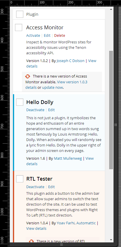
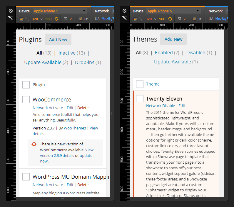
Hi @valendesigns thanks for reviewing the patch and for the improvements to PHP and IE support. About mobile, I've actually tested the patch and those little changes to paddings were meant to fix the current wrong alignments in the plugin screen, see screenshot below where it's clear they're misaligned. Maybe worth re-adding them? :)
#8
 @
@
11 years ago
I fixed the plugins table checkbox in 31654.4.diff with only one style modification. Which is probably something that could be allowed, though it's not up to me in the end.
To clarify, your previous patch only addressed the plugins table and it did not fix any of the other tables in mobile so they were collapsed at the bottom of the row and the checkbox was touching the border.
I've attached some screen shots from real devices to demonstrate it's now fixed.
#9
 @
@
11 years ago
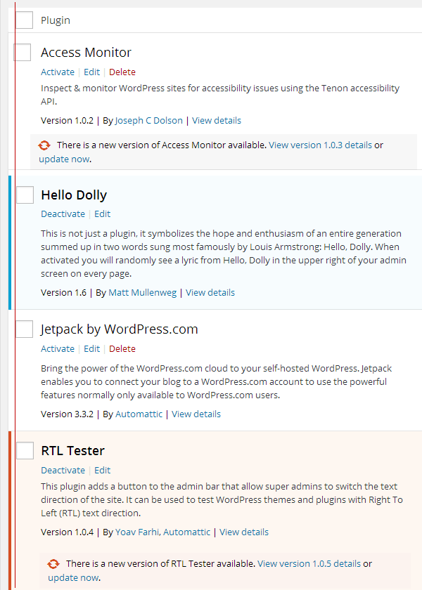
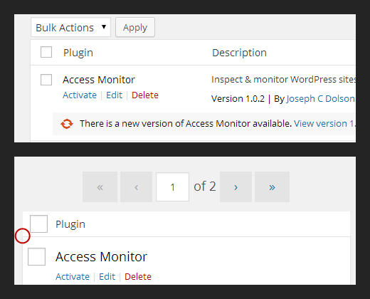
Thanks for the clarification. Looks like there are still some small details to fix, for example the "inactive update" plugin checkbox needs some more padding. Also, a small 1px difference in alignments, see first screenshot below.
Noticed also the plugins <thead> and <tfoot> should have borders like in all other tables, but since they're absolutely positioned out of the main table, they "look" without borders, see second screenshot. I'm really not sure why they're absolutely positioned, is that really needed? I don't see any reason for that but maybe I'm missing something. In the proposed, refreshed, patch they're back in place and have borders.
Also, the plugins table <thead> and <tfoot> have a smaller height compared to all the other tables, it would be nice to be consistent and have the same height.
See final result in the animated gif, a comparison between the plugins table and the pages table.
Worth noting the current CSS forces to use crazy selectors, I'm not so proud of what I had to code here :) Waiting confidently for the CSS roadmap to sanity :)
Small screens with patch # 4:
Large screens, borders; small screens, no more borders:
Patch # 5 result:
#10
 @
@
11 years ago
- Keywords dev-feedback added
@afercia My concern here is that it will not make it into 4.2 if we try and fix the UI beyond the tickets intended purpose. Not that I don't 100% agree that there are deficiencies here, just that we should focus only on the bug so it's an easier pill to swallow in the short amount of time we have left. Fixing the UI is an enhancement, but converting the th into a td fixes an accessibility bug. Mixing the two may slow down the buy-in from a committer.
#11
 @
@
11 years ago
@valendesigns got your point but that's not something you and me can make a decision about :) Up to committers. Now they have a choice between two patches. :) I think with a little effort it's very easy for leads and committers to go through the proposed changes. Thanks very much.

This ticket was mentioned in Slack in #accessibility by joedolson. View the logs.
11 years ago

This ticket was mentioned in Slack in #accessibility by afercia. View the logs.
11 years ago
#15
 @
@
11 years ago
- Summary changed from List tables: Select All shouldn't be a column header to List table: Select All shouldn't be a column header
#16
 @
@
11 years ago
- Milestone changed from Awaiting Review to 4.3
- Owner set to afercia
- Status changed from new to assigned

This ticket was mentioned in Slack in #core by joedolson. View the logs.
11 years ago
#18
 @
@
11 years ago
- Keywords dev-feedback removed
Refreshed patch fixes Network Themes and Network Plugins table headers on small screens, now they look the same. See screenshot below. Please notice there would be several things to improve about List Tables CSS, overly complicated CSS, misalignments, visual inconsistencies, etc. by the way pixel-perfection is outside the scope of this ticket.
Making the "Select All" cell a TD instead of a TH greatly improves the way screen readers read out the table content, avoiding unnecessary repetition and it's also more semantic code.
See related #25408. Maybe it would make sense to coordinate these two tickets.
#19
 @
@
11 years ago
I did my best to test in all screens with List Tables and in different scren sizes. For the ones willing to test, here's the affected screens list:
- Posts/Pages
- Categories
- Tags
- Media Library (list mode)
- (Link Manager, now a plugin)
- Comments
- Plugins
- Users
- Network Sites
- Network Themes
- Network Users
#21
follow-up:
↓ 22
 @
@
11 years ago
I really dislike naming a class for an element. It's easy to make mistakes or mistake the CSS for one or the other and amounts to trickery. I also don't see why somebody else would want a generic .th class, anyway. Is .widefat thead .check-column not qualified enough?
#22
in reply to:
↑ 21
 @
@
11 years ago
Replying to helen:
I really dislike naming a class for an element. It's easy to make mistakes or mistake the CSS for one or the other and amounts to trickery.
Agreed
Is
.widefat thead .check-columnnot qualified enough?
Will have to check, especially in the plugins table, but for sure we'd need to double that for every rule in order to target also the tfoot:
.widefat thead .check-column,
.widefat tfoot .check-column {}
That's why I tried to use a class. Maybe a different class name? how about .check-all?

This ticket was mentioned in Slack in #design by afercia. View the logs.
11 years ago

This ticket was mentioned in Slack in #design by helen. View the logs.
11 years ago
#25
 @
@
11 years ago
.check-all seems fine, though I don't really overly mind the rule doubling either since it's really specific to this one use case. Unless there's some slightly more generic use that I'm overlooking :)
#26
 @
@
11 years ago
Refreshed patch after 32724 also avoids to introduce a new CSS class as per Helen's suggestion. Would greatly appreciate some help to check all the screens involved.
Side note: it would be nice to get rid of all the small inconsistencies and misalignments of the checkboxes, see for example #29990. This would also greatly simplify the List Tables CSS but it's out of this ticket's scope. Will open a new ticket.
#28
 @
@
11 years ago
- Keywords commit added
Refreshed patch removes the leftover th CSS class applied on the check-column cell and tries to keep up with the latest changes. Would propose for commit consideration.

This ticket was mentioned in Slack in #design by afercia. View the logs.
11 years ago
#31
 @
@
11 years ago
- Keywords needs-patch added; has-patch commit removed
[32984] broke the colspan value for Quick Edit rows, the number is one too low.
Affected lines: trunk/src/wp-admin/js/inline-edit-tax.js@31996#L57 and trunk/src/wp-admin/js/inline-edit-post.js@32869#L134.
#32
 @
@
11 years ago
- Keywords has-patch added; needs-patch removed
Quick patch to fix Bulk and Quick Edit colspan change.
thin atdfor better semantics and to reduce noise for assistive technologies. CSS tweaking.