Opened 10 years ago
Last modified 4 years ago
#33107 assigned enhancement
Add a Menu button: when clicked the icon does not rotate around center point
| Reported by: |
|
Owned by: | |
|---|---|---|---|
| Milestone: | Future Release | Priority: | low |
| Severity: | normal | Version: | 3.9 |
| Component: | Customize | Keywords: | needs-patch 2nd-opinion |
| Focuses: | Cc: |
Description
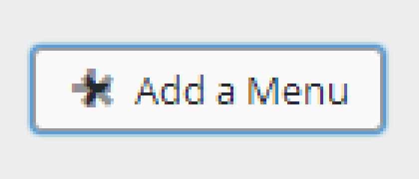
When clicking the "Add a Menu" button in the Menus area of the customizer, the icon doesn't quite rotate around its center point. On some browsers like Chrome and Firefox the icon is also misaligned and pulled up too high.
Here's the icon in Firefox for example:

Screenshot of the rotated icon combined with its original position:
Here's some short videos of how the icon rotates when clicked:
Firefox 39 (OS X)
https://cloudup.com/cBb9kdrvjNZ
Chrome 43 (OS X)
https://cloudup.com/ciNZeSgbab7
Safari 8 (OS X)
https://cloudup.com/cUmIW81nSht
Safari is the only one that looks correct. The issue is partly caused by the "add" icon not a perfect square (it appears 1px wider in some browsers). By using the transform-origin CSS property we can improve how the icon rotates.
Because of the icon being rendered 1px wider in some browsers it's not possible to get it exact, but it's certainly an improvement. Shown below are some videos of how they would look after some CSS adjustments using the transform-origin CSS property. Best viewed at normal size with the patch, but you get the idea:
Firefox 39 (OS X)
https://cloudup.com/ca2OWHuGe8q
Chrome 43 (OS X)
https://cloudup.com/c_5AROy460x
Safari 8 (OS X)
https://cloudup.com/c1YdWYfyMqd
Also tested in IE 11 on Windows.
First patch coming.
Attachments (3)
Change History (13)
#1
 @
@
10 years ago
On Windows, this is very noticeable in Chrome too. See below, where I've just overlaid two screenshots, zoomed to 600% and made the upper layer semi-transparent:
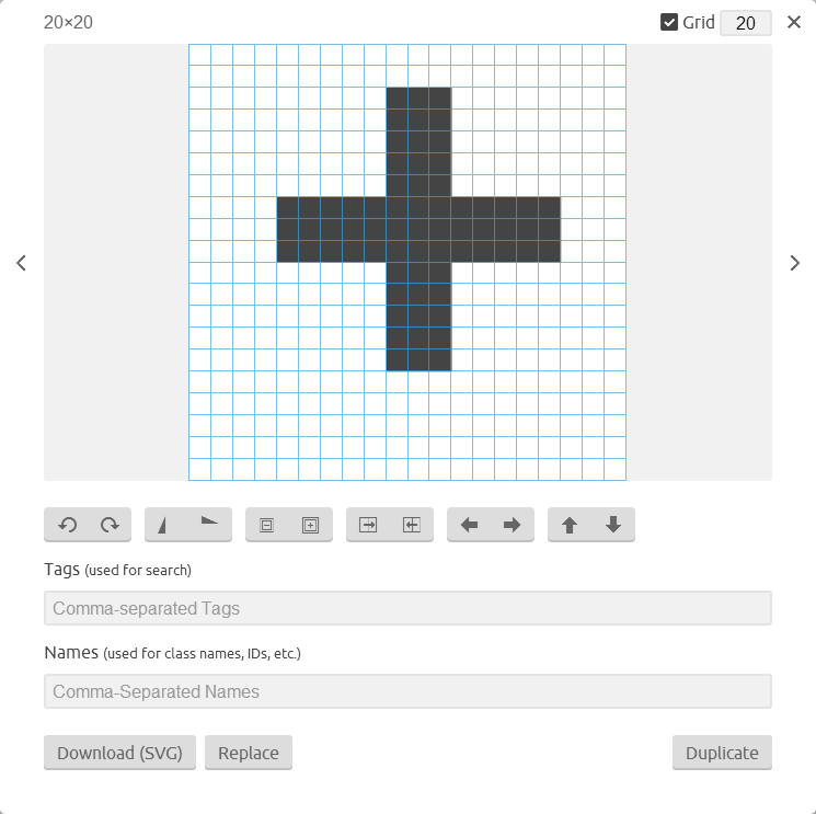
Operating systems have different font rendering. Browsers have different sub-pixel rounding algorithms. Hardware acceleration may be triggered or not depending also on hardware type and drivers. Not everyone has a device with a GPU. Too many variables to predict and IMHO dashicons should have centered glyphs in the first place. See the screenshot below, it's the dashicon glyph loaded in the icomoon app. (Can't center a 3px wide bar in a 20px grid though).
For a CSS fix maybe the transform-origin should be 11px 9px for all browsers?
I've played a bit with the will-change CSS property and seems it can help a bit. Should be used sparingly though.

This ticket was mentioned in Slack in #design by afercia. View the logs.
10 years ago

This ticket was mentioned in Slack in #core by obenland. View the logs.
10 years ago
#4
 @
@
10 years ago
- Milestone changed from Awaiting Review to 4.3
- Owner set to westonruter
- Status changed from new to assigned
#5
 @
@
10 years ago
- Keywords needs-patch added
- Milestone changed from 4.3 to Future Release
- Priority changed from normal to low
- Type changed from defect (bug) to enhancement
- Version changed from trunk to 3.9
I think we should remove the icon from the button. Anyway, this issue isn't new, we are using the same button/icon for adding widgets.
 @
@
8 years ago
I've created a patch, where I removed the use of the dashicon for the + icon and replaced it with css version of the plus so that the centering issue is easily avoided.
#7
 @
@
8 years ago
- Keywords needs-testing added
- Owner westonruter deleted
Patch needs testing in the supported browsers.
#8
 @
@
8 years ago
Tested on local dev, with the patch applied in Version 57.0.2987.133 (64-bit) of Google Chrome on Ubuntu Desktop, it does seem to fix the issue.
#9
 @
@
8 years ago
- Keywords needs-patch added; has-patch needs-testing removed
I'm seeing changes to the left/right padding in the button with the changes in 33107.2.patch. See before-after.png.


Note, the -moz-transform-origin property comes after the other two CSS properties and does not using a percentage for the first value due to a current bug in Firefox whereby it cannot calculate the origin using percentages. Since the latest release