#35050 closed defect (bug) (fixed)
Remove title attributes: Plugin Cards
| Reported by: |
|
Owned by: |
|
|---|---|---|---|
| Milestone: | 4.5 | Priority: | normal |
| Severity: | normal | Version: | 4.4 |
| Component: | Plugins | Keywords: | has-screenshots, has-patch, title-attribute |
| Focuses: | ui, accessibility | Cc: |
Description (last modified by )
See related #24766 and all the following tickets about title attributes.
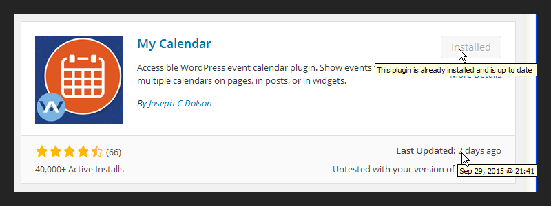
In the Plugin install screen, plugin cards have some title attribute that have little or no benefit. Screenshot:
The button text already says users the plugin is "Installed" and it's already clear it's up to date because when it's not, the button text is "Update Now".
About the "Last updated" date and time, if this is a relevant information then it should just be displayed in plain text in the Plugin Card. If not, just removed.
Attachments (4)
Change History (25)

This ticket was mentioned in Slack in #accessibility by afercia. View the logs.
9 years ago
#6
in reply to:
↑ 4
 @
@
9 years ago
Replying to Cheffheid:
Agreed on the button.
and gives you a reasonable indication of how old the most recent update is
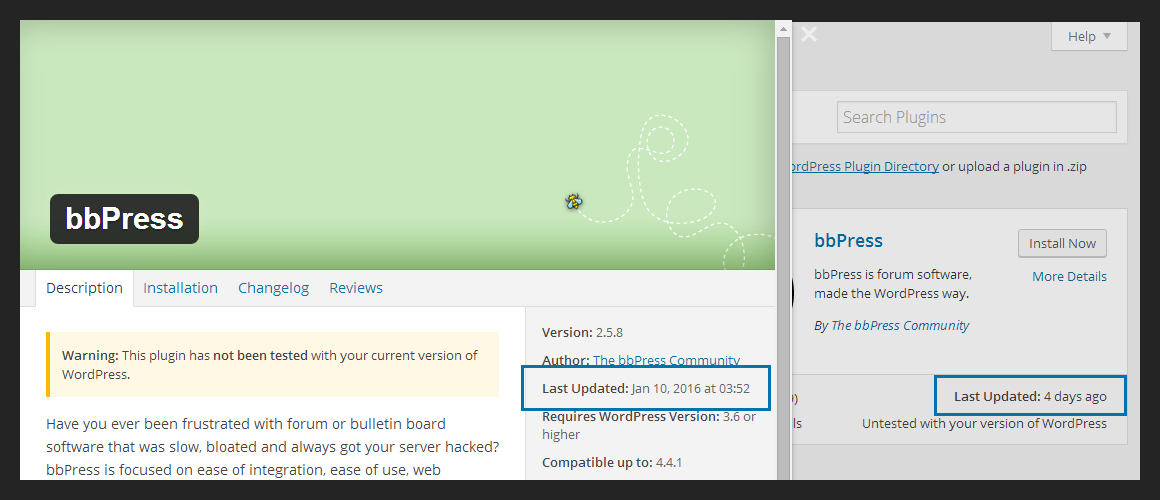
Yep I'd agree. Moreover, the same detailed date is available (again in a title attribute) in the Plugin details modal after users click on "More Details" where maybe it should be displayed in plain text because it's in the... detailed Plugin information. :)
#8
follow-up:
↓ 10
 @
@
9 years ago
Apologies if its bad practice to comment on a closed ticket. I'm fairly new. Please advise if I should handle this differently.
I think its a common UI expectation to see an absolute date as a tooltip of a relative date. I know that in terms of a11y we are moving necessary information out of title attributes in favor of showing it on screen without need for a cursor hover, but I wonder if maybe this is a valid exception.
I agree that the absolute date/time is not necessary, so putting it on screen is not the right choice. But providing it as a tooltip offers a familiar UI feature for cursor users.
Here's some examples of websites which are very familiar to most people and how they handle this:
#9
 @
@
9 years ago
I think its a common UI expectation to see an absolute date as a tooltip of a relative date.
I had the same thought. Not a strong opinion, but one nonetheless.
#10
in reply to:
↑ 8
 @
@
9 years ago
Replying to khag7:
I think its a common UI expectation to see an absolute date as a tooltip of a relative date.
I tend to agree.
#11
 @
@
9 years ago
- Resolution fixed deleted
- Status changed from closed to reopened
After [35953] $date_format seems to be unused and should be removed.
#24766 was about links, in this case we have no links, so what's the reason for removing the title attribute for the date?
Isn't the human time some type of an abbreviation for the full date? Would <abbr> make sense in this case, see 35050.2.patch?
#12
 @
@
9 years ago
In short: why we're conveying this info to just some users and not to all users?
TL;DR
Well it's not just about links :) I really see title attributes as a thing of the past, with a very limited utility for all users, and I think I'm not the only one.
About accessibility, screen readers won't read out title attributes when used on not-focusable elements. Or, at least, I can't make the screen readers I test with read out that title attribute :) This is true also for the established practice to use a title attribute to expand <abbr> see for example #35064 where the proposed patch expands the abbreviation in plain text.
I'd suggest to make an effort to have an approach that's not just "visual" but more focused on semantics and the way data are made available to users. If this is a relevant information for all users, then it should be visible for all users :)
I think it's a common UI expectation
Yep, but just for mouse/trackpad/alternate pointing devices users. Not for mobile and tablet users as well as assistive tech users. So basically we're conveying a small piece of information that's available just for some users while we should make it available for all users.
In this specific case I'm not saying the absolute date should be completely removed. By the way, the "Plugin Cards" are by their own nature a "summary" of the Plugins features. I think 80% of users will be happy with a relative date. If interested in the details, there's a "More Details" link for that. See #35111 where the proposal is to display the absolute date below (or instead of?) the relative one.
I'd also like to say that actually I'm glad there's some conversation about the general usage of title attributes. There's no rush: we're just at the beginning of a release cycle so there's time to share ideas and different points of view if the goal is to improve things with a pragmatic approach avoiding academic debates.
Finally, I've recently had the opportunity to attend a conference where I've heard that if using title attributes there's something lacking in your interface to begin with :) https://videopress.com/v/YYVkXSx7?at=1269 so I'd rather make the interface beautiful and complete than rely on HTML features which usage is currently discouraged
#13
 @
@
9 years ago
What about something like the bootstrap tooltip function? Here is a jsfiddle that shows an example of something that could work for us. The benefit of this example is that the text has a dotted underline which tells a user that more information is available. It works on mobile via a click, or on desktop via a hover.
Also, if we're against using an attribute named "title" we can make use of a data attribute called data-title instead.
#14
 @
@
9 years ago
@khag7 there are probably better ways to make "tooltips" see for example what GitHub does using aria-label (which is accessible) and using the aria label content to fill the displayed "tooltip". It's also almost pure CSS, JavaScript is used I think just for the tooltip positioning.
By the way, the positioning is tricky. Nearly impossible to predict the length of the content, how much the tooltip will be close to the viewport sides and would need to be repositioned, danger to overlay other content, etc. Also, RTL languages, touch devices, small screens.
I think "tooltips" were discussed at length in the past (I was not actively contributing at that time but I've read something about that) and not adopted for some good reasons. Someone more experienced than me could maybe give some background.
Personally, I still think relevant information should simply be displayed in plain text :)
#15
 @
@
9 years ago
Looking back at this, unless there's interest and consensus in building accessible tooltips for WordPress (à la Twitter or GitHub), I'd say to keep it simple and just show in plain text what users need. Following what I guess the design intent was here (Plugin Cards = summary view and Plugin Modal = detailed view) I'd propose to keep just the human friendly date in the Card and show the full date and time in the modal. Also, remove the unused $date_format :)
Side note: it's 5:59 PM UTC January 13, 2016 now and the human friendly date says "4 days ago", but in my time zone Jan 10 was just 3 days ago :)
#16
 @
@
9 years ago
The detailed updated date is useful mostly on larger values - when the last updated value is within a few days, it doesn't matter; but once it starts saying "2 years ago", that value is significantly rounded, and may be significantly different from 2 years. Whether that's really valuable information I'm not sure about; I absolutely look at last updated information, but all that's important to me is a general sense of time - the difference between 2 years and 3 years is pretty insignificant at that scale.
I'm personally comfortable with removing that title attribute, since the information is available elsewhere and of questionable value.
The button title attribute seems totally unnecessary; definitely would favor removing it.

This ticket was mentioned in Slack in #accessibility by afercia. View the logs.
9 years ago
#18
 @
@
9 years ago
Discussed a bit this ticket during today's a11y bugscrub on Slack and agreed to consider it in combination with #35111. In our mind, the plugin "cards" are meant to display to users a short, quick, summary of the plugin features while a detailed view is available in the detail modal dialog. Thus, our proposal is to use the human time date in the plugin card and the extended, detailed, date in the details modal.
About the <abbr> element: though is a common practice, we think it's basically wrong. Any shortened form of a word is an abbreviation, for example, etc. for etcetera, Oct. for October, and ex. for example. In English, there are also acronyms and initialisms, they are both abbreviations.
Acronym: the resulting abbreviation needs to be pronounceable as a word, example: NASA (National Aeronautics and Space Administration).
Initialism: the resulting abbreviation is not pronounced as a word, rather you say the individual letters, example: FBI (Federal Bureau of Investigation).
I'd say the human time "2 days ago" doesn't use any part of, for example, "Sep 29, 2015 @ 21:41" so it's not an abbreviation in the first place. It's just a different "format".
We'd also recommend to don't use the "@" sign and always use "at" instead, see for example the Comments screen.


Agreed on the button.
I'm inclined to say remove the date too. "x days ago" is simpler to read and understand than the date written out and gives you a reasonable indication of how old the most recent update is. It'll get messy if we display both.