#35111 closed defect (bug) (fixed)
Remove title attributes: the Plugin details modal.
| Reported by: |
|
Owned by: |
|
|---|---|---|---|
| Milestone: | 4.5 | Priority: | normal |
| Severity: | normal | Version: | 4.4 |
| Component: | Administration | Keywords: | has-patch, has-screenshots, title-attribute |
| Focuses: | ui, accessibility | Cc: |
Description
See related #24766 and all the following tickets about title attributes.
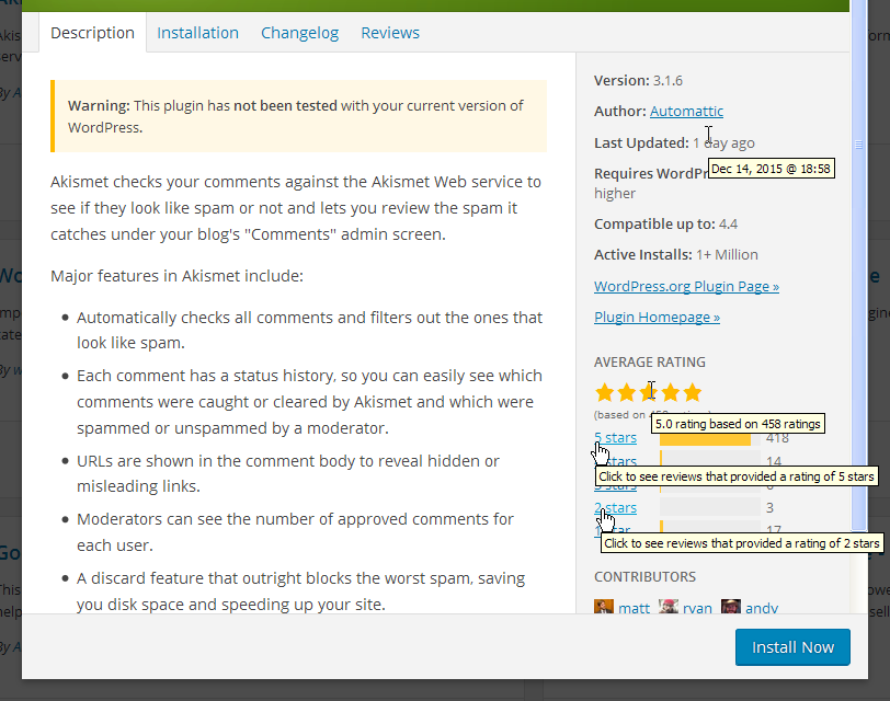
In the Plugin details modal there are four title attributes, see screenshot below:
I'd probably consider to show the expanded date in plain text.
Star rating: probably in a screen-reader-text and hide the current "(based on 458 ratings)" with aria-hidden
5 stars, 4 stars, etc.: probably as above and I'd remove the word "Click to". They also open in a new tab/window and there's already a ticket for that.
Attachments (4)
Change History (25)
#3
 @
@
9 years ago
@bravokeyl see also the discussion on #35050. The proposal is to remove the title attribute and only show the date in plain text. I tend to consider the plugin modal as a "detailed view" so I'd propose to show in plain text the date currently used for the title attribute.
#4
 @
@
9 years ago
So to recap:
- the star rating was fixed in [36092]
- the last updated date will hopefully be fixed as part of #35050
Would be nice to find a way to fix the "5 stars, 4 stars, etc." links. It would be trivial to change the title attributes in aria-label attributes but that wouldn't solve all the issues here. For example, no indication is given that clicking on a link will bring users to the wordpress.org web site. The wording should be changed to make the link destination clear. Also, this information should also be visually clear. Worth reminding tablet, mobile, keyboard users won't see title attributes as well as screen reader users.
I'd be inclined to add a short sentence visible in plain text. Suggestions and any thoughts more than welcome.

This ticket was mentioned in Slack in #accessibility by afercia. View the logs.
9 years ago
#6
 @
@
9 years ago
Concerning the reviews:
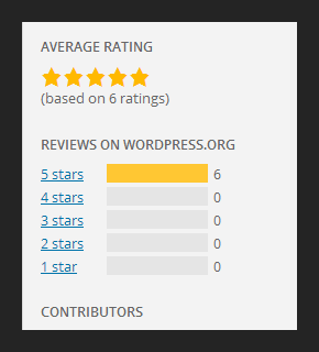
What about adding a heading View reviews and after that the ratings in a list, instead of in separate div's.
It would need a bit of tweaking in the css but not much i guess. Screenshot is of the code below, without CSS changes
<h3>View reviews</h3>

<ul>
	<li class="counter-container">
		<span class="counter-label"><a href="https://wordpress.org/support/view/plugin-reviews/hello-dolly?filter=5" target="_blank">5 stars</a></span>
		<span class="counter-back">
			<span class="counter-bar" style="width: 38.964705882353px;"></span>
		</span>
		<span class="counter-count">36</span>
	</li>
	<li class="counter-container">
		<span class="counter-label"><a href="https://wordpress.org/support/view/plugin-reviews/hello-dolly?filter=4" target="_blank">4 stars</a></span>
		<span class="counter-back">
			<span class="counter-bar" style="width: 2.1647058823529px;"></span>
		</span>
		<span class="counter-count">2</span>
	</li>

	<li class="counter-container">
		<span class="counter-label"><a href="https://wordpress.org/support/view/plugin-reviews/hello-dolly?filter=3" target="_blank">3 stars</a></span>
		<span class="counter-back">
			<span class="counter-bar" style="width: 1.0823529411765px;"></span>
		</span>
		<span class="counter-count">1</span>
	</li>

	<li class="counter-container">
		<span class="counter-label"><a href="https://wordpress.org/support/view/plugin-reviews/hello-dolly?filter=2" target="_blank">2 stars</a></span>
		<span class="counter-back">
			<span class="counter-bar" style="width: 0px;"></span>
		</span>
		<span class="counter-count">0</span>
	</li>

	<li class="counter-container">
		<span class="counter-label"><a href="https://wordpress.org/support/view/plugin-reviews/hello-dolly?filter=1" target="_blank">1 star</a></span>
		<span class="counter-back">
			<span class="counter-bar" style="width: 49.788235294118px;"></span>
		</span>
		<span class="counter-count">46</span>
	</li>
</ul>
#7
 @
@
9 years ago
A new small heading makes sense to me :) Not sure about the text "View reviews". Also, the 5 links should make clear they point to wordpress.org (also visually).

This ticket was mentioned in Slack in #accessibility by rianrietveld. View the logs.
9 years ago

This ticket was mentioned in Slack in #accessibility by afercia. View the logs.
9 years ago
#11
 @
@
9 years ago
About the "Last Updated" date, discussed this during today's a11y bugscrub on Slack and agreed to consider this ticket in combination with #35050.
In our mind, the plugin details is a "detailed" view so, while in other places it make sense to show a short, human readable, date (e.g. in the plugin "cards") in this view we see the expanded date more appropriate. It's very likely that users who follow a "more details" link and intentionally open the details modal, thery're interested in detailed information. Patch coming soon :)
#12
 @
@
9 years ago
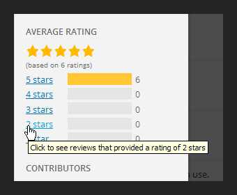
Additionally, when there are no reviews yet, those links point to a page on wordpress.org that just says "No reviews yet! Be the first to review this plugin!", for example:
https://wordpress.org/support/view/plugin-reviews/monster-widget?filter=2
so the title attributes convey a wrong message:
Here's an example of the new heading proposed by @rianrietveld
Lastly, those links should inform users that they open a new window.
#13
 @
@
9 years ago
First pass, would appreciate some feedback especially about translatable strings. Note for myself: the new heading and paragraph should not be printed out when there are no reviews, need to move them within the conditional :)
#14
 @
@
9 years ago
- Keywords has-patch has-screenshots added; needs-patch removed
Refreshed patch. Based also on the discussion on #35050, the details modal should really be a "detailed view" so was thinking instead of removing something, to show both dates in plain text. This way users would have the best of both worlds: a short, informative, date (e.g. "3 years ago" ... oh dear it's too old, I'm not going to install this stuff), and the extended, detailed date just one line below. See screenshot, highlighting also the other proposed changes.
Would greatly appreciate some feedback on the wording. The shorter, the better.


#35141 , in this ticket @afercia has taken care of
aria-hiddenandscreen-reader-text.@afercia, What kind of date format you are proposing , is it for the title attribute or for the main text.