#35661 closed defect (bug) (fixed)
Color contrast and other improvements for the WP badge
| Reported by: |
|
Owned by: |
|
|---|---|---|---|
| Milestone: | 4.5 | Priority: | normal |
| Severity: | normal | Version: | |
| Component: | Administration | Keywords: | has-screenshots color-contrast has-patch commit |
| Focuses: | ui, accessibility | Cc: |
Description
See related #31713.
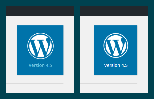
The WP badge on the About/Credits/Freedoms screens has a version number with a low contrast:
Also, the "W" mark should be updated to the most recent one and maybe the placement of the badge could be improved a bit.
Attachments (3)
Change History (16)

This ticket was mentioned in Slack in #design by afercia. View the logs.
9 years ago
#3
 @
@
9 years ago
Hello. I attached a screenshot of the version number in white. Let me know what you all think. I also took the current logo from https://wordpress.org/about/logos/ and it looks identical to the one on the welcome screen.
Please let me know if I'm missing something.
Thank you.
#4
 @
@
9 years ago
Hello @liljimmi! the version number in white is definitely more readable. About the logo: cc @hugobaeta :)
#5
 @
@
9 years ago
Would you like me to create a patch for the contrast, or wait for feedback on the logo and make a patch for the whole thing?
#6
 @
@
9 years ago
@liljimmi not sure about the logo, @hugobaeta mentioned he wanted to update it with the latest version, see: https://wordpress.slack.com/archives/design/p1454081141000448
 @
@
9 years ago
Patch to fix text color, adjust proportions of the badge, and replace svg (uploading updated fallback png separately)
#7
 @
@
9 years ago
Yes, I've been wanting to update the logo there with the revised new version (you can find it on the new Design Handbook: https://make.wordpress.org/design/handbook/foundations/identity/).
Uploaded a patch to change the text color to white, and used the opportunity to tweak the proportions of the patch slightly. Also updated the image files (SVG and PNG fallback) with the new version of the logo mark. Here's a preview:


Assigning to @hugobaeta since he's far more familiar with WordPress branding than me :)