#36474 closed enhancement (wontfix)
Revamp meta boxes
| Reported by: |
|
Owned by: | |
|---|---|---|---|
| Milestone: | Priority: | normal | |
| Severity: | normal | Version: | |
| Component: | Editor | Keywords: | |
| Focuses: | ui, accessibility | Cc: |
Description
This would be a pretty big user facing enhancement.
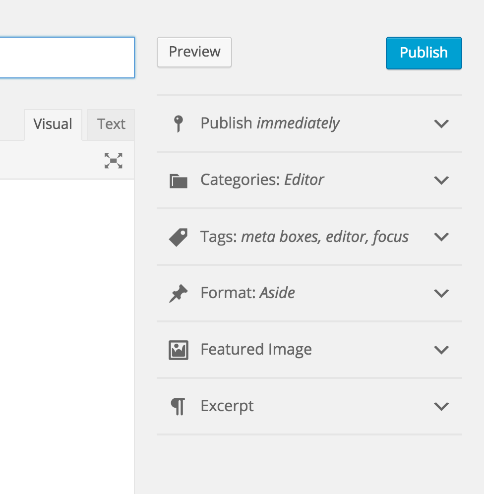
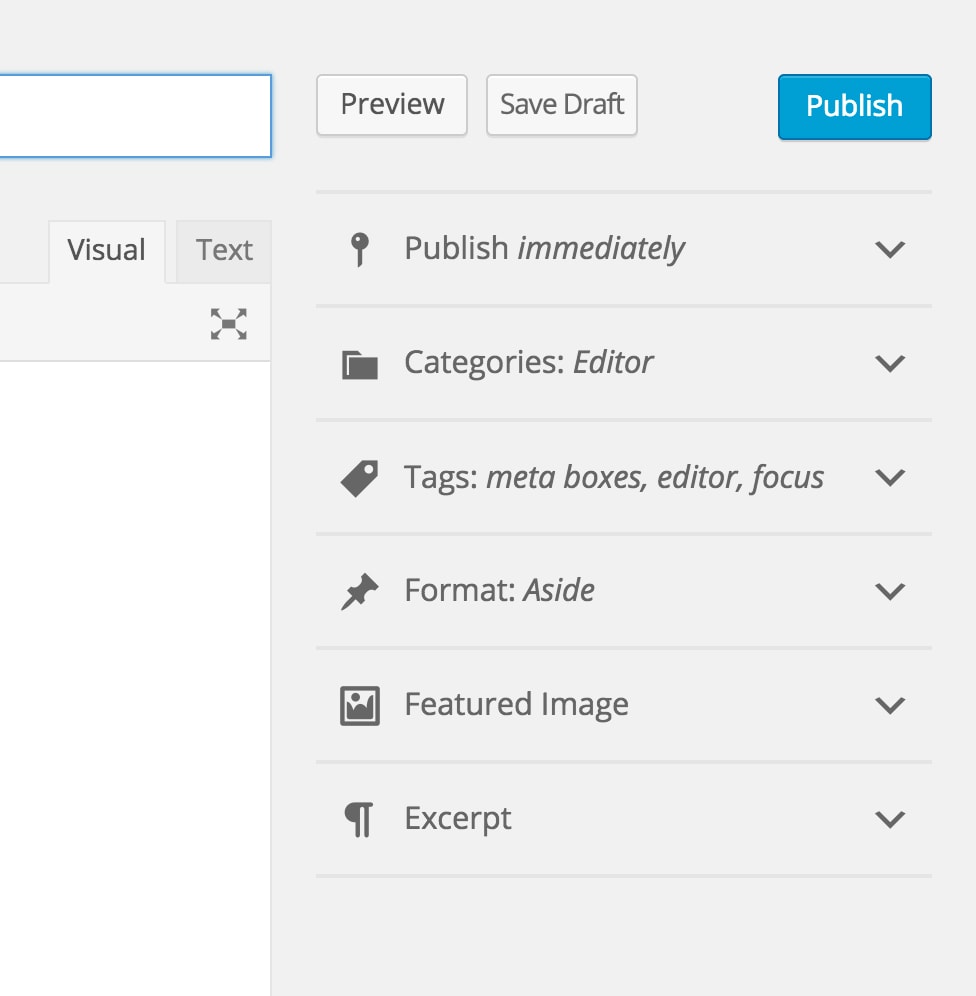
The idea is to collapse meta boxes by default, allowing them to have an icon and some kind of summary. Just like we do now, we would keep opened meta boxes open, closed ones closed, only the default would now be closed.
This is similar to wordpress.com/post.
See Improving Post New by @michael-arestad, Metabox physics.
Related to #17028.
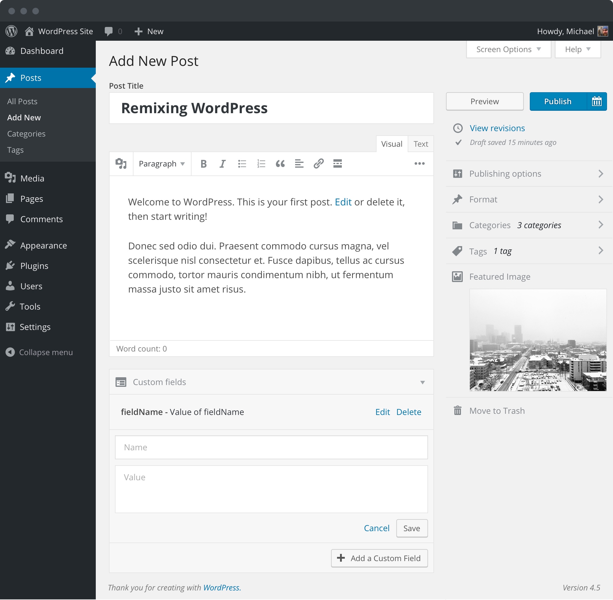
Proof of concept:
Change History (27)
#2
 @
@
10 years ago
This does not apply to dashboard or other meta boxes that or not on the editor screen. And sure, the meta box could perhaps set the default.
#3
 @
@
10 years ago
Your ticket wasn't clear it was for the post screen only, but even so, allowing the developer to set the default makes the most sense I think.
I have a plug that adds a widget to the posts screen and it wouldn't make much sense to have it closed by default if the user had added it to the display.

This ticket was mentioned in Slack in #core-editor by hugobaeta. View the logs.
10 years ago
#6
 @
@
10 years ago
Would love to see some improvement here.
Two concerns I have with the initial accordion-style mockup:
- Requires more clicks to open each section rather than being able to select a category, format, enter tags, etc. quickly. Does it make sense to condense it by default on larger screens where having these all available is less of an issue? On mobile, something like this would be fantastic. Regadless of the direction taken, it wouldn't work to allow some to be open by default and others closed. Consistency is key here so we'd need to live with the consequences of that decision. Items under the editor (main column) presumably wouldn't collapse by default.
- There are several issues with accordion UIs, and the Customizer ended up moving away from them as a result (and also Press This I believe). Might it make sense to reuse an existing UI in core, such as the sliding panels in the Customizer, rather than moving in an entirely new direction (although
accordion.jsis a thing)?
#7
 @
@
10 years ago
Although, I like the tidiness of having them closed by default, I would rather see a means in user profiles to set default open/close states for them (profile templates would be good too!). Ditto the show/hide state too.
Also wonder about the accessibility of having them closed by default. Does the extra step make it more unfriendly?
#8
 @
@
10 years ago
We all know that as soon as you install a couple of plugins, there is too much visual clutter in the editing screen, and I'm assuming that the end goal of this ticket is to address that issue.
It wouldn't be necessarily such a bad idea to have them open/closed by default depending on the specific meta box (e.g. leaving them all closed except one in particular, core or user-defined).
#10
 @
@
10 years ago
I like the idea, and want to give a +1 to all the requests for per user collapsed settings.
Also I do have a concern for compatibility. Many plugins add custom meta panels that simply will not work on the right side bar. IE One of my plugins uses a custom recipe management metabox, there is no forseeable way for me to merge that into the sidebar as there is too much horizontal data. Are there any plans to both facilitate and accomodate metaboxes that fall into that category?
#11
 @
@
10 years ago
Anecdote: I run a lot of posts through both wp-admin and Calypso (wordpress.com/post). In Calypso, I very much like how the boxes are closed for new edit sessions. I like landing on a tidy screen that I unfurl as needed. Keeping boxes of the way until I'm ready for them fits my flow and avoids overwhelm, and the boxes can certainly be overwhelming when several are left open from the previous session. I use Categories & Tags and Featured Image often and do not mind the taps/clicks required to get at them.
I suggest doing a visual record for your typical edit flow through wp-admin, doing a vizrec for your flow adapted to Calypso, and comparing. Take a screenshot for each interaction in your session and publish them as a captioned gallery. These are really help as they capture real flow visually.
https://make.wordpress.org/flow/glossary/#visual-record
There are examples of visual records on https://make.wordpress.org/flow/ and https://test.wordpress.com/.
#12
 @
@
10 years ago
Perhaps it would help to think outside the box a bit more; for example, what if the core UI was moved out of separate boxes and integrated into the editor where that could make sense?
I know @melchoyce had some mockups a long time ago that showed categories and tags in a bar below the editor, and even the publish buttons integrated there. In terms of UX, hiding everything by default seems to solve the problem of too much visual clutter, but it steps around the underlying issue that the UI is perhaps a bit too verbose. Do we need separate boxes for categories, tags, featured image, etc. in the first place or could they be integrated into a more unified UI (whatever that might look like)?
#13
 @
@
10 years ago
There are several issues with accordion UIs, and the Customizer ended up moving away from them as a result (and also Press This I believe).
Press This and the Customizer both essentially still use an accordion-like interface that still requires an extra click. The only difference is that those interfaces isolate the view once clicked rather than allowing other sections to be opened simultaneously. I prefer that as it's more ATM-like (one thing at a time)
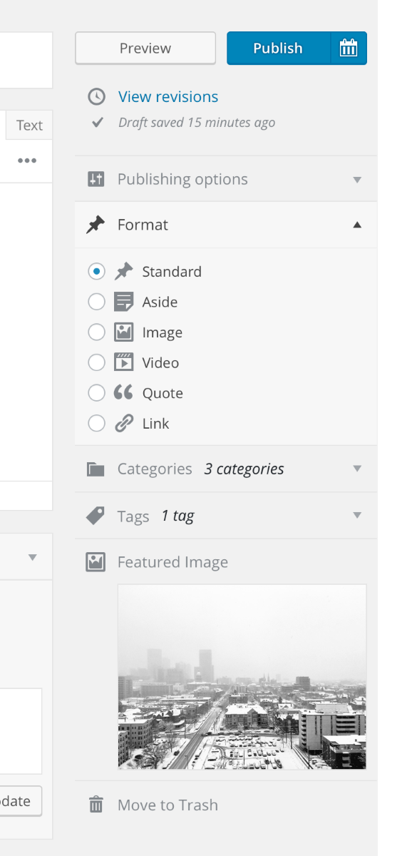
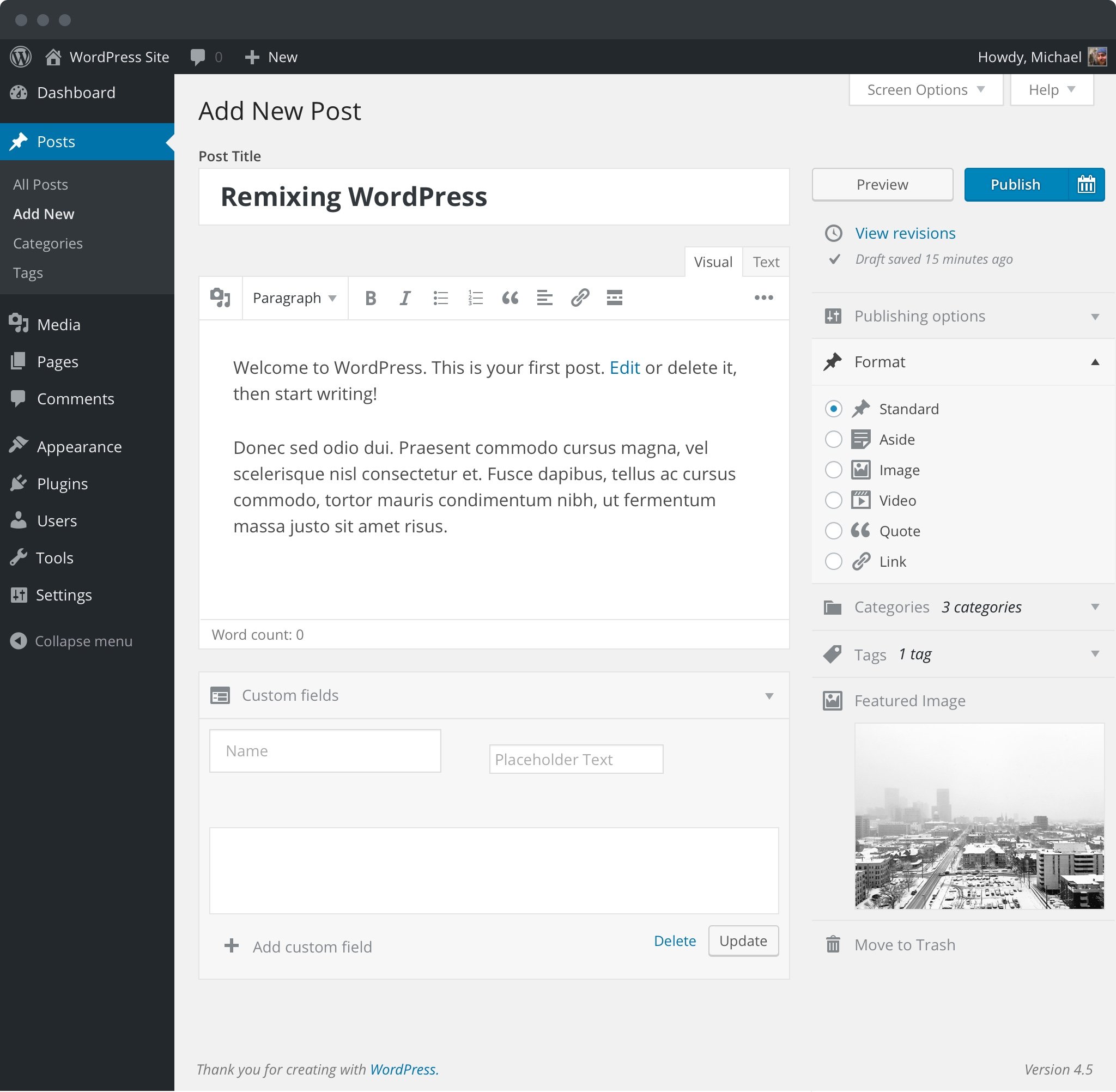
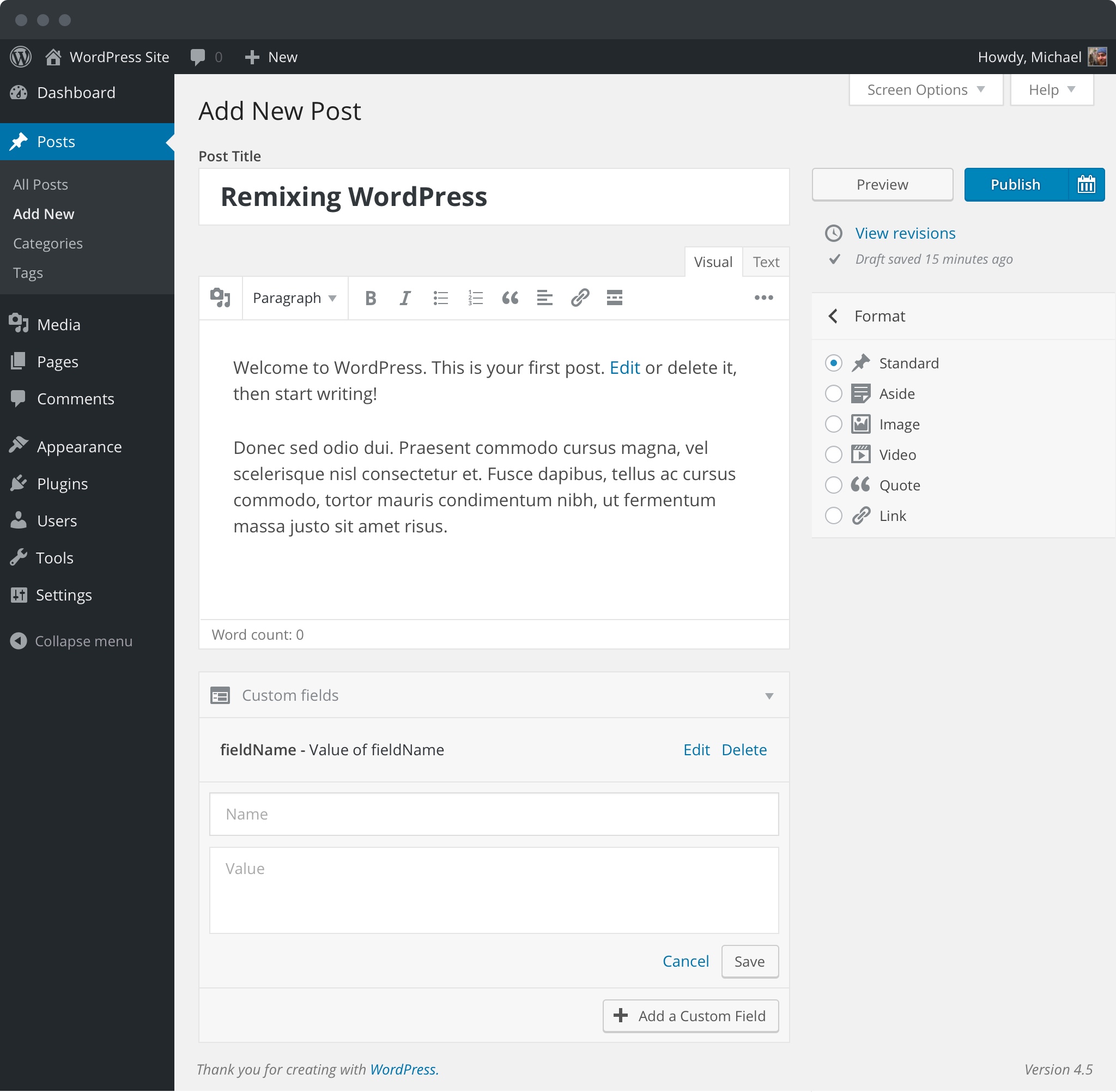
Here is an idea I've been toying with:
And in context (ignore the custom fields as that's in progress):
It could also be modified to isolate each view like Press This and Customizer, but I think having the ability to see more than one at a time is valuable in this situation.
#14
 @
@
10 years ago
@michaelarestad your renderings look pretty nice I like the faded styling, though still has the collapsables.
I think I completely agree with @celloexpressions in that the entire UI needs a rethink. With my biggest plugin I recently did the same thing, reduced nearly a dozen metaboxes (most from extensions) into 3 that all others could be merged into.
IE Reduce & simplify. I think coming up with a creative way to include all of the relevant info into 1 or 2 new boxes would be ideal.
Some things I can see working well
- Publish, preview buttons, post status & scheduling should be collapsed into a smarter UI, @michaelarestad has the right idea moving scheduling into a secondary button off of the Publish button.
- Categories & Tags would be ideal just below the content editor, part of it to be more precise. Some slick interface to tag there would be perfect. Think of how post terms are displayed in the post footer on most themes, makes since thats where you would edit it too.
- That would only leave featured image & post format
None of the renderings so far have included Page Attributes (parent, template) or Author fields, just something to consider.
Side note, I am assuming that Excerpt, Discussions, Trackbacks etc will be left untouched?
#15
follow-up:
↓ 16
 @
@
10 years ago
@danieliser trying the PT/Customizer view slide works pretty well also:
#16
in reply to:
↑ 15
 @
@
10 years ago
Replying to michaelarestad:
@danieliser trying the PT/Customizer view slide works pretty well also:
One thing that concerns me about using the sliding navigation to change panels is that "Back" is "Right", which works well in the Customizer because it's off-screen. Here, "Right" is also into post content, which I can see confusing many users.
#17
 @
@
10 years ago
Here, "Right" is also into post content, which I can see confusing many users.
Worth testing if we want to go that route. Out of context, it could maybe be confusing, but I suspect it would be fine.
#18
 @
@
10 years ago
It may be worth considering a 2 step transition here.
Step 1: Combine the settings into a single recognizable UI
Step 2: Completely change the way the UI looks, works.
My concern with your above interface would be that it not only rearranges years worth of memorizing where things are to begin with (none of these elements have been rearranged in a long time), but also looks completely different than they are used to.
May be too big of a jump, though I could be wrong.
#19
 @
@
10 years ago
If we're going to change it, I would want to be sure that we're doing it right, in a way that we're confident we'll keep for a long time. Which is why I bring up looking at whether the concept of "boxes" is still necessary (I don't have an opinion either way yet, but think we should explore it).
I think the primary reason for using sliding panels instead of accordions in the customizer was that with accordions there is a constant lack of UX consistency because navigational elements (headings) and UI controls (section contents) move around and are mixed together. Separating out the menu of sections (navigation, the top level headings), and then sliding in to each section of UI control keeps the user experience consistent because things are where you would expect them to be with a clear separation of navigation and content. @folletto can speak more to the reasoning behind it.
While my initial though would be that sliding panels could be somewhat annoying in the context of the editor because they break the ability to quickly flow through all of the UI controls sequentially, in terms of UX, it would make a lot of sense. The key is designing the UI so that those ideas are reinforced, and for example it could be much easier to make the entire metabox sidebar visible at once and sticky when scrolling, which could improve navigation.
#20
 @
@
10 years ago
Separating out the menu of sections (navigation, the top level headings), and then sliding in to each section of UI control keeps the user experience consistent because things are where you would expect them to be with a clear separation of navigation and content. @folletto can speak more to the reasoning behind it.
Correct. It was both a consolidation of different patterns as well as an improvement on the existing ones.
I personally would go in the direction started with @michaelarestad's and @iseulde's mockups.
One of the assumptions I'm making here is that different sites AND different people will have a preferred view, or in other words, a preferred sidebar configuration. For example one of the sites I author uses a good category structure, while another has none. One uses featured images, the other doesn't.
Based on this assumption, the folding blocks behaviour would allow a very intuitive way to tailor for this diversity with very little overhead, simply by saving the "latest" configuration the user was working in. This, paired with plugins that will allow user to "save" a specific configuration if they prefer having always the same (not saving the latest) and even site-wide defaults (for more editorial sites that enforce specific workflows) I feel would be an ideal balance between simplicity and flexibility.
Also +100 at keeping the sidebar independently scrollable. I think that's another major improvement.

This ticket was mentioned in Slack in #design by hugobaeta. View the logs.
10 years ago

This ticket was mentioned in Slack in #design by hugobaeta. View the logs.
10 years ago

This ticket was mentioned in Slack in #accessibility by afercia. View the logs.
10 years ago
#24
 @
@
10 years ago
- Focuses accessibility added
Please, always consider to mark tickets that propose relevant UI changes with the "accessibility" focus :)
That might not be a very good in general. While on the post screen it would be fine, other screens like the dashboard, would make little sense with the default set to closed. A first time install of WordPress would provide a dashboard with little information visible.
Likewise many plugins assume "open" is the default and this change would break those as well.
Perhaps instead of changing the default, allow the default to be set on a per widget basis?
That way a developer could determine which is best for a given widget.