#43397 closed enhancement (fixed)
Add columns titles to menu screen and a help text about data saving
| Reported by: |
|
Owned by: |
|
|---|---|---|---|
| Milestone: | 5.1 | Priority: | normal |
| Severity: | normal | Version: | |
| Component: | Menus | Keywords: | has-patch has-screenshots |
| Focuses: | ui, accessibility | Cc: |
Description
Related: #40678
The menu screen is a bit complicated to understand at a glance, and it's even more complicated for assistive technologies users. Since there is two main sections in wp-admin/nav-menus.php I suggest to add titles too clearly identify each section role.
This ticket is a part of a bigger one: #40678. During the last accessibility team meeting, we suggested to separate the different tasks of 40678 in separate tickets to make it easier to commit.
Concerning this ticket, we used screen-reader-text on these titles at first, but it appears to be relevant to make it visible for everyone.
Attachments (9)
Change History (28)
 @
@
8 years ago
Adds columns titles to menu screen and a small hint at the top of the screen concerning data saving in this screen ;)
#1
 @
@
8 years ago
- Keywords has-patch has-screenshots added
- Summary changed from Add columns titles to menu screen to Add columns titles to menu screen and a screen-reader-text hint about data saving
#3
 @
@
8 years ago
Hi @afercia and thanks :)
What kind of help text? On each column?
There is an help text/hint in 43397.diff but it is at the top of the page, just before the "Edit your menu below […]" paragraph.
It would be nice to have some UI/design feedback :)
Sure!
#4
 @
@
8 years ago
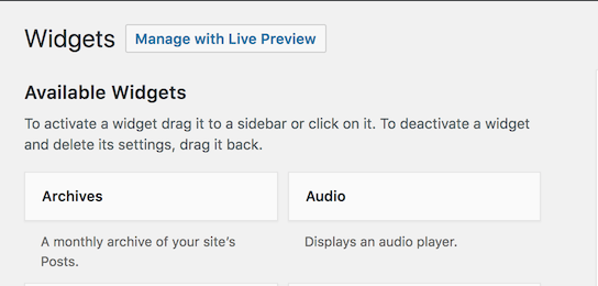
Yes I meant the screen-reader-text used at the top of the page. Mabye consider to move it below the new heading and make ti visible, for consistency with the Widget screen.

This ticket was mentioned in Slack in #accessibility by afercia. View the logs.
8 years ago
#6
 @
@
8 years ago
- Milestone changed from Awaiting Review to 5.0
After discussing this ticket during accessibility bug scrub today, the above screenshot seems fine to us.
Now, we need a design team review to validate the option above is relevant.
Thanks,
Jb
#7
 @
@
8 years ago
- Keywords ux-feedback added
- Summary changed from Add columns titles to menu screen and a screen-reader-text hint about data saving to Add columns titles to menu screen and a help text about data saving
#8
 @
@
8 years ago
- Keywords ui-feedback ux-feedback removed
I'd ditch the white background, since it makes the text look like it should be a dismissible notice. The help text should be fine on grey (I don't believe there's a contrast issue?).
I think the copy could use an update for clarity, maybe:
Edit your menu on this screen, or [create a new menu]. Don't forget to save your changes!
#9
 @
@
8 years ago
Hello @melchoyce and thank you for your design feedback.
In 43397.2.diff, I apply your suggestions to add clarity and to remove the grey box.
@afercia I let a screen-reader-text to keep the hint on "Save menu" button for AT users (then they know the label wording and they can search for the button).
#10
 @
@
8 years ago
@audrasjb thanks, just one thing: depending on the number of menus, this screen changes. When there are more than one menu, there's a select in the top part. The new text should be added there too. However, at this point I'm not sure we'd want to remove the white box, as the select without a white box looks not so nice... :)
See screenshots below with: no menus, 1 menu, multiple menus.
#11
 @
@
8 years ago
Wow, nice catch @afercia
You are absolutely right :)
New patch: 43397.3.diff
[EDIT: damn, I have an issue with my diff file, wait few minutes please!]
[EDIT2: issue fixed, I forgot to rebase my branch with master :)]
 @
@
8 years ago
Adds the text message to this screen when there are several menu available and adds back the background of this box
#12
 @
@
8 years ago
Looks good to me! @melchoyce any objection to keep the white background? Or maybe we could keep it just when there's the select (see above).
#13
 @
@
8 years ago
I'd think we have to keep the background in both case for consistency.
I tested it without box/background when there are several menus and I guess this is not so nice.
See screenshots below for comparison.
#15
 @
@
8 years ago
Good point — definitely needs the container when there's more than one menu. It works better with the spacing that's there now (vs. the spacing in add_help_text_and_titles.png) so let's make sure to leave that as-is.
#17
 @
@
8 years ago
- Keywords ui-feedback removed
Looks good to me, just a couple things I'll change during commit:
- It's recommended to not use the curly quote
’in core. So instead ofDon’tbetter to useDon’t - Language: while "Activate the button" is accurate and device-independent, it can also be potentially confusing. Assistive technologies users use to say "click" too, so I'd rather simplify :)

Columns titles rendering after 43397.diff