#46643 closed defect (bug) (fixed)
Twenty Nineteen: Column block has additional padding on the front end.
| Reported by: |
|
Owned by: |
|
|---|---|---|---|
| Milestone: | 5.2 | Priority: | low |
| Severity: | normal | Version: | 5.1 |
| Component: | Bundled Theme | Keywords: | has-screenshots has-patch |
| Focuses: | Cc: |
Description
The Column block in Twenty Nineteen was originally built to make the front and back end appearance close to identical. At the time of the 5.0 launch, this included some extra-wide spacing between columns on the front end. At some point, columns in Gutenberg were tightened up, and the front and back end no longer match.
The front-end should be adjusted to have the slimmer padding that the back end has.
Editor:
Front End:
Attachments (1)
Change History (5)
#2
 @
@
7 years ago
- Keywords has-patch added; needs-patch removed
- Type changed from enhancement to defect (bug)
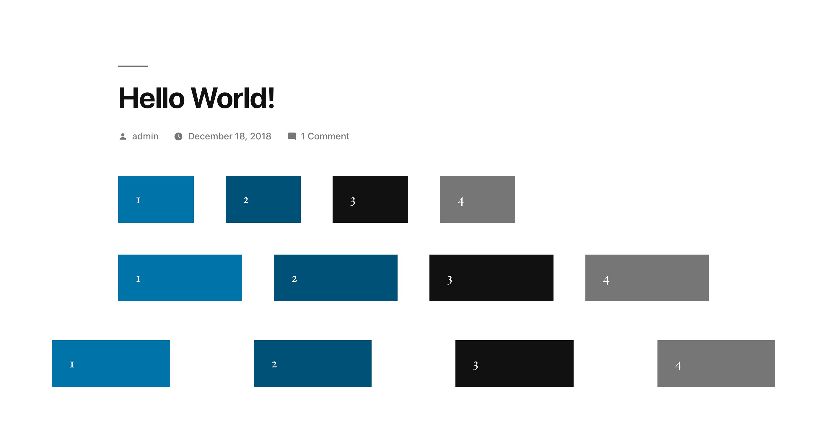
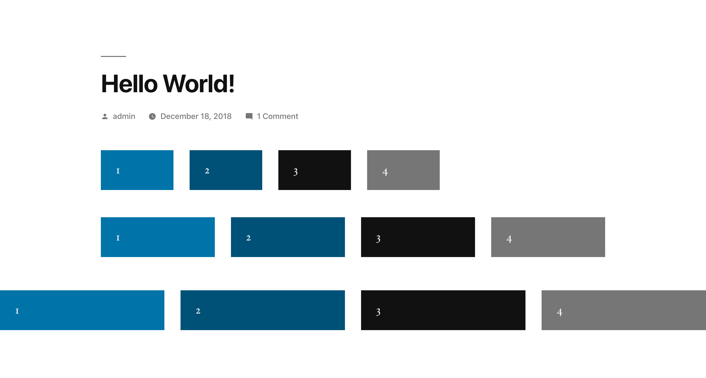
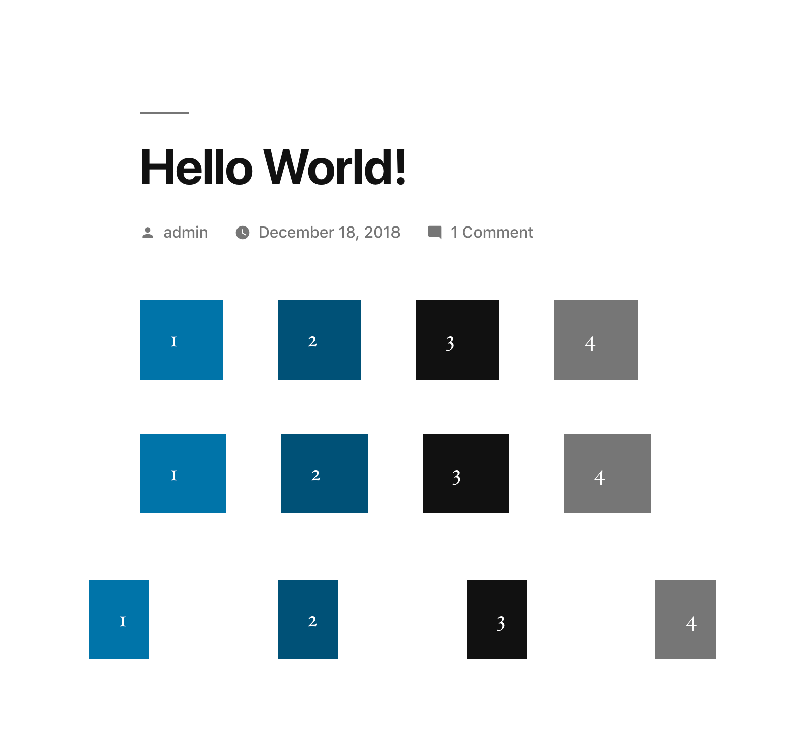
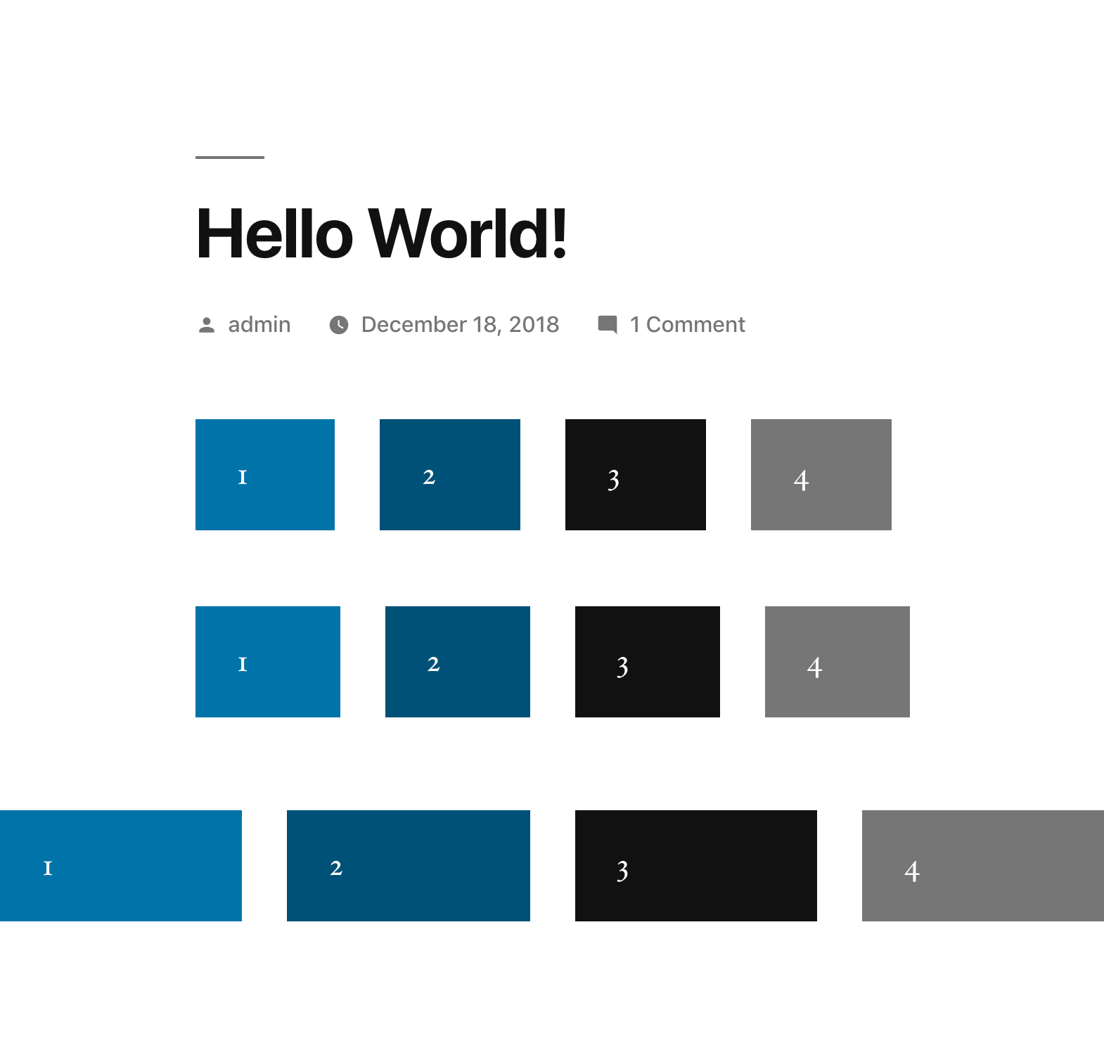
I've uploaded a patch that fixes this discrepancy, as well as the issue in #46999. Both issues are related to the same few lines of code, and this one's a bit more expansive, so I pulled them into one. I'm changing this from [Enhancement] to [Bug] since it includes that fix.
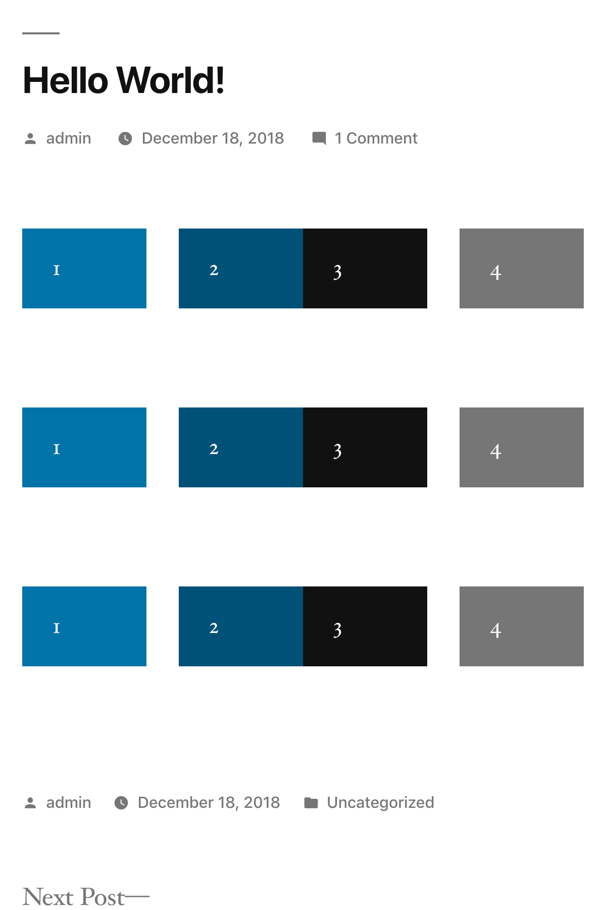
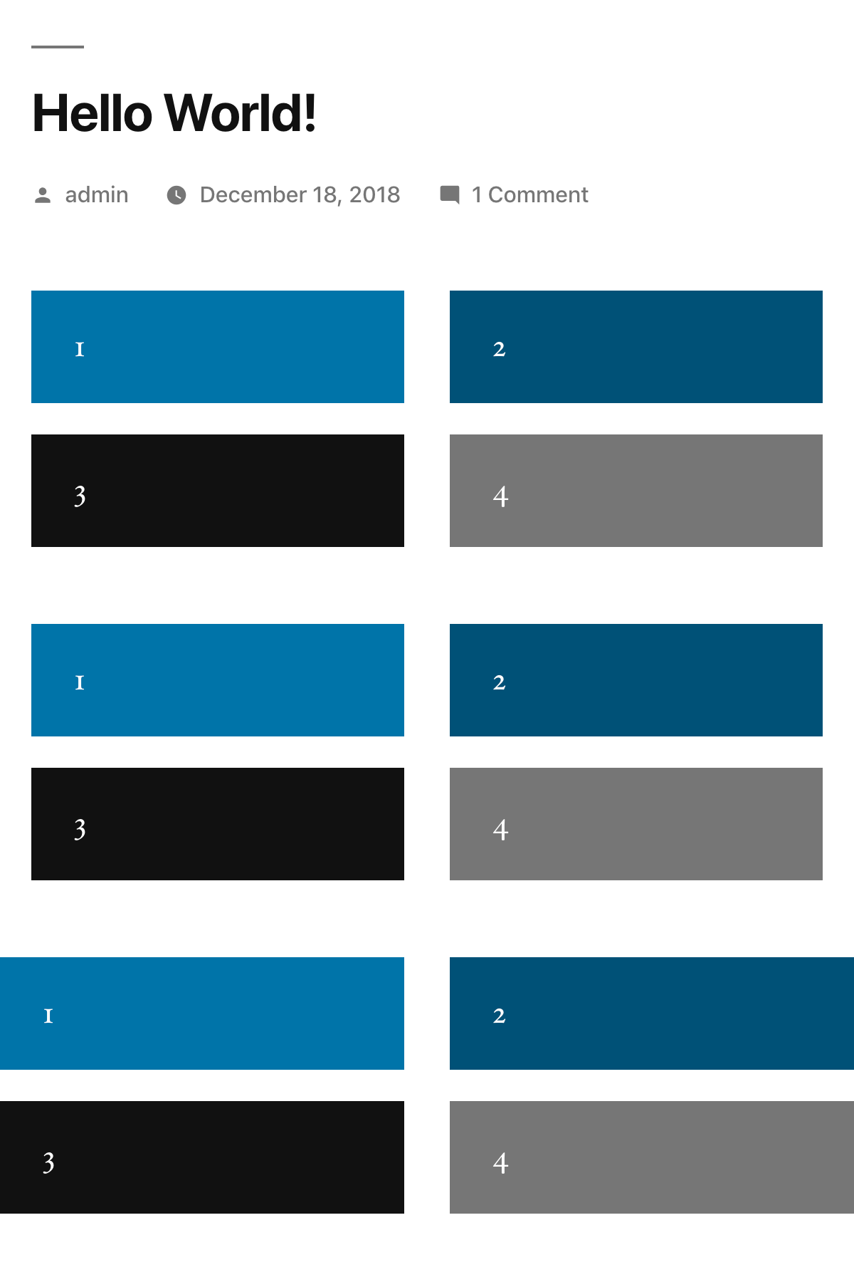
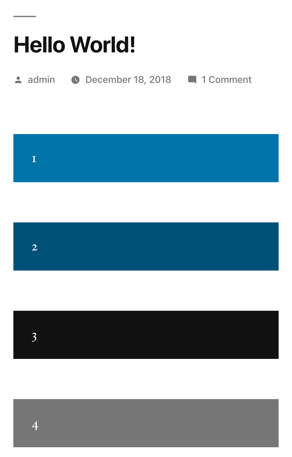
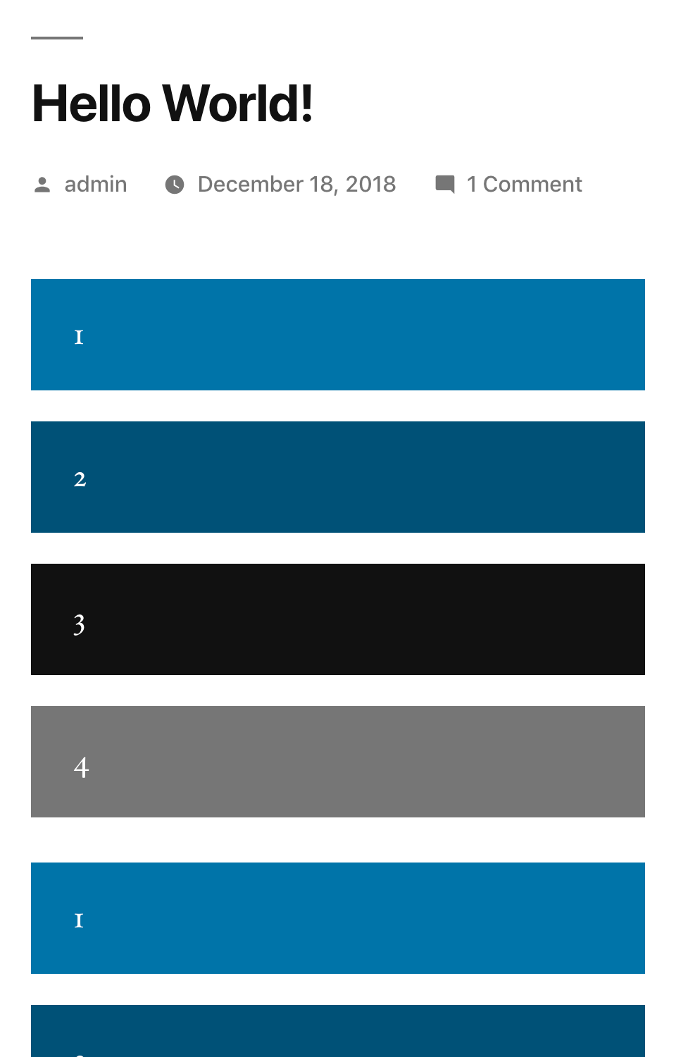
There were also additional top/bottom margins being applied to breakpoints under 768px, so I've migrated the rules to prevent that over to cover all break points as well.
Screenshots:
1400px Wide
Before
After
785px Wide
Before
After
600px Wide
Before
After
480px Wide
Before
After


Background information (screenshots, gif videos) is available here:
https://github.com/WordPress/gutenberg/issues/13061
Originally we though it was a bug in Gutenberg, which is why it was first reported there, but the Gutenberg devs found out it is an issue with Twenty Nineteen.
Sadly this prevents us from upgrading, as our sites use a lot of two column layouts.