Opened 5 years ago
Closed 4 months ago
#48501 closed enhancement (wontfix)
Enhancement: improve tertiary button styles
| Reported by: |
|
Owned by: | |
|---|---|---|---|
| Milestone: | Priority: | normal | |
| Severity: | normal | Version: | |
| Component: | General | Keywords: | needs-design-feedback |
| Focuses: | ui, accessibility | Cc: |
Description
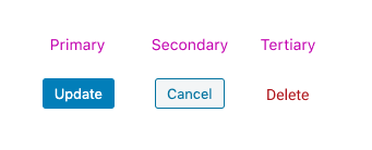
In WordPress, there are primary, secondary, and tertiary button styles, as shown below.
I think there is an opportunity to improve tertiary button styles, and document the rationale. Please forgive me, but I've seen discussions about "link" buttons or "plain text" buttons before, but I can't find them. Otherwise, I'd link them here. The only one I could find is an issue in Gutenberg, where a button was styled to look like a link. I'd like to prevent these issues in the future.
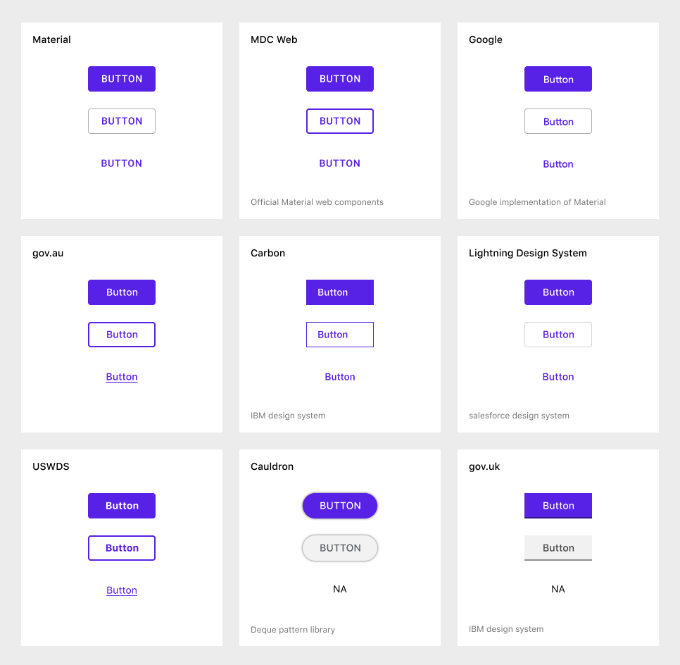
I did a bit of research to see how other design systems implement a tertiary button style:
A note I'd like clarification on, regarding accessibility and WCAG:
I've read that buttons need another visual indicator other that color to appear active/interactive. This is why sometimes you see tertiary buttons with ALL CAPS or an underline.
I've read the success criterion for non-text contrast recently, and it seems that this might not be the case:
This success criteria does not require that controls have a visual boundary indicating the hit area, but if the visual indicator of the control is the only way to identify the control, then that indicator must have sufficient contrast. If text (or an icon) within a button [...] is visible and there is no visual indication of the hit area then the Success Criterion is passed.
But it does seem like a recommendation:
Note that for people with cognitive disabilities it is recommended to delineate the boundary of controls to aid in the recognition of controls and therefore the completion of activities.
Here is the image they provide. Apparently both are ok:
Does this mean that we don't need a visual boundary for buttons?
With this information, I have a proposal for buttons
Here are the options that I see for tertiary buttons:
- Plain text: This is what we currently do, but I believe we could make it look a tad more like a button.
- ALL CAPS: This seems like great solution — it provides another visual indication in addition to color. But there is some debate on whether or not all caps text is ideal. Some studies say it’s generally more readable. For some, it can be harder to read. It has been recommended that we don't use all caps in WordPress.
- Underlined: This makes the button look like a link, which we don't want to do.
- Bold text: This seems like a good solution too. It might be subtle, but I believe it's an improvement.
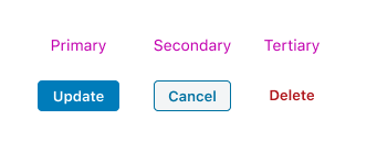
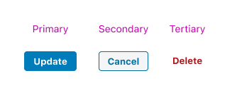
I propose that we go with the last option. Here's what that look like:
Semibold:
Bold:
In addition, I've found this on the use of italic, bold, and ALL CAPS from webaim:
Use stylistic differences to highlight important content, but do so conservatively. Use various stylistic elements (italics, bold, color, brief animation, or differently-styled content) to highlight important content. Overuse can result in the loss of differentiation. Do not use italics or bold on long sections of text. Avoid ALL CAPS.
Please let me know what you think.
Change History (11)

This ticket was mentioned in Slack in #accessibility by afercia. View the logs.
5 years ago
#4
 @
@
5 years ago
Thanks for the cross reference. This ticket focuses solely on on the tertiary button style, whereas the ticket you linked to focuses on a bit of semantics and the relationship between links and buttons.
#5
 @
@
5 years ago
Note about terminology: historically, in core there's no such a thing like a "tertiary" button style. That's a Gutenberg terminology. In core there are only primary and secondary buttons, with size variants.
#6
 @
@
5 years ago
Thank you for the clarification. When I say "tertiary" I mean the third button emphasis level. In Gutenberg it's called "tertiary".
I see at least one place in WP Admin where it's called button-link. I think it's a bit misguided to say it doesn't exist in WP Admin at all. It's there, but it's not called "tertiary" and it's not named consistently.
#8
 @
@
5 years ago
- Milestone changed from 5.4 to Future Release
Noting after the design team discussed this we are putting to a future milestone, we will get to this but right now it's not going to happen in 5.4.

This ticket was mentioned in Slack in #design by estelaris. View the logs.
4 years ago

This ticket was mentioned in Slack in #accessibility by joedolson. View the logs.
4 months ago
#11
 @
@
4 months ago
- Milestone Future Release deleted
- Resolution set to wontfix
- Status changed from new to closed
While there would be some benefit to improving the design of the button-link or tertiary level button design, following discussion in the accessibility bug scrub this week we're recommending this for close.
WordPress is gradually moving towards a complete admin redesign, and while it's valuable to fix specific individual problems; it is not particularly an effective use of time to implement large-scale design changes that would be complicated to implement (due to styling complexity in the admin) and have relatively low impact on the user.
The block editor has been doing some significant work on ensuring consistency in button design; see https://github.com/WordPress/gutenberg/issues/63856.


Related:
Proposal: improve distinction between buttons and other controls: #48452