Opened 6 years ago
Last modified 4 years ago
#48452 new enhancement
Proposal: improve distinction between buttons and other controls
| Reported by: |
|
Owned by: | |
|---|---|---|---|
| Milestone: | Future Release | Priority: | normal |
| Severity: | normal | Version: | |
| Component: | Administration | Keywords: | needs-design-feedback has-screenshots |
| Focuses: | ui, accessibility | Cc: |
Description (last modified by )
New button styles were introduced in ticket #34904.
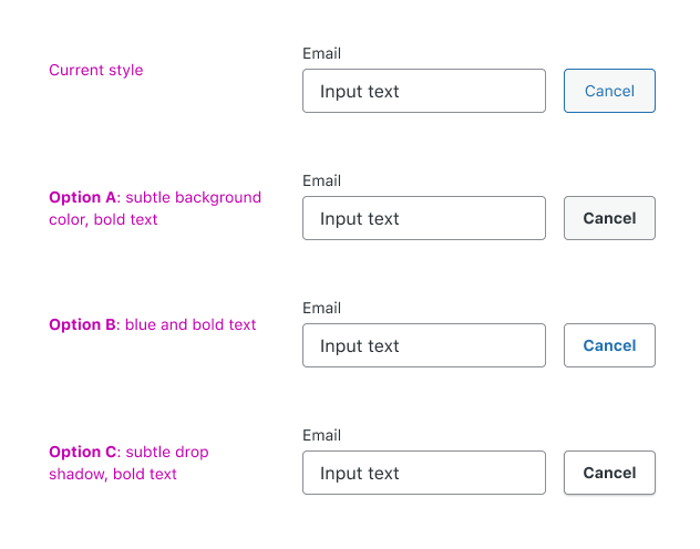
As discussed in the comments on this blog post, Discussion: Higher contrast form fields and buttons, the secondary (or default) button style is no sufficiently distinct from input fields and other similar UI controls.
This ticket attempts to remedy the issue and create a consistent styling of UI controls that is more usable. By seeing a set of UI controls together, we can figure out the best approach holistically.
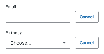
The main concern that was raised is that the new default buttons are styled similarly to inputs, and it could be confusing for folks if they can't differentiate them.
Example:
Proposed solutions, compared directly:
- Option A: subtle background color, bold text
- Option B: blue and bold text
- Option C: subtle drop shadow, bold text
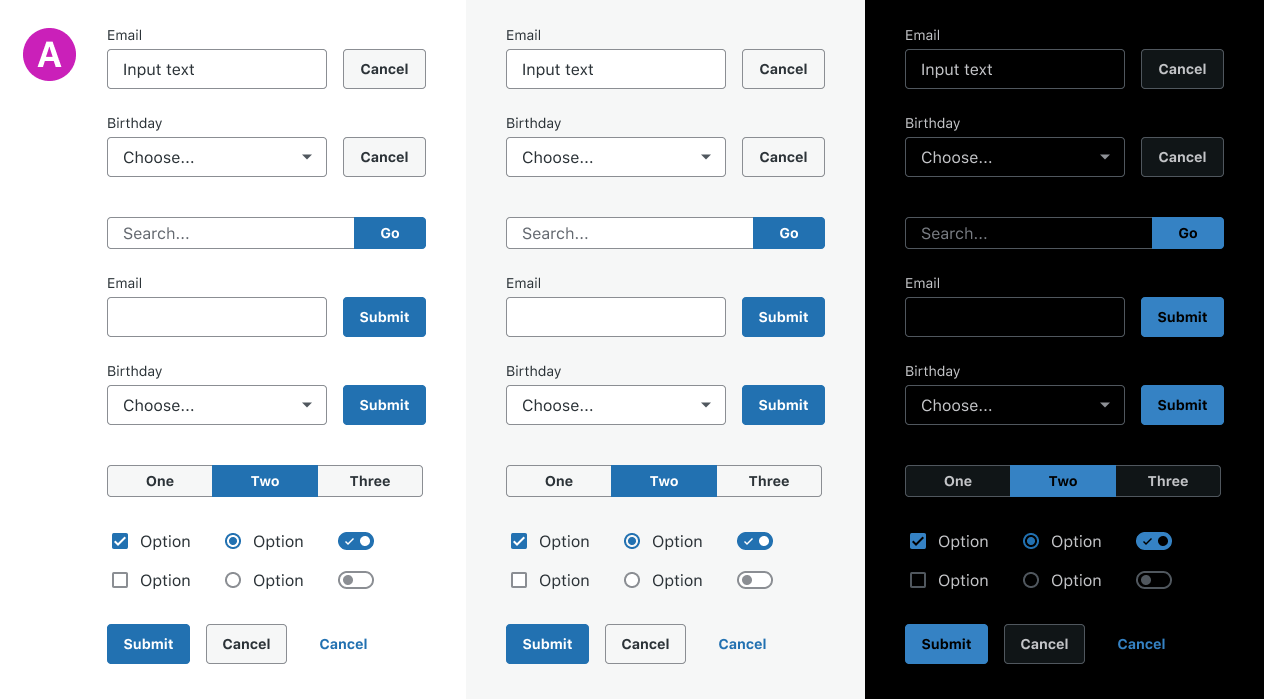
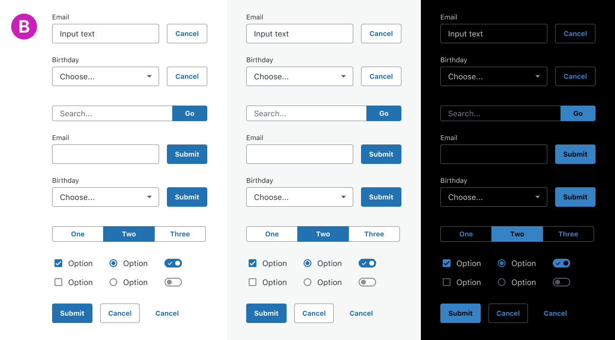
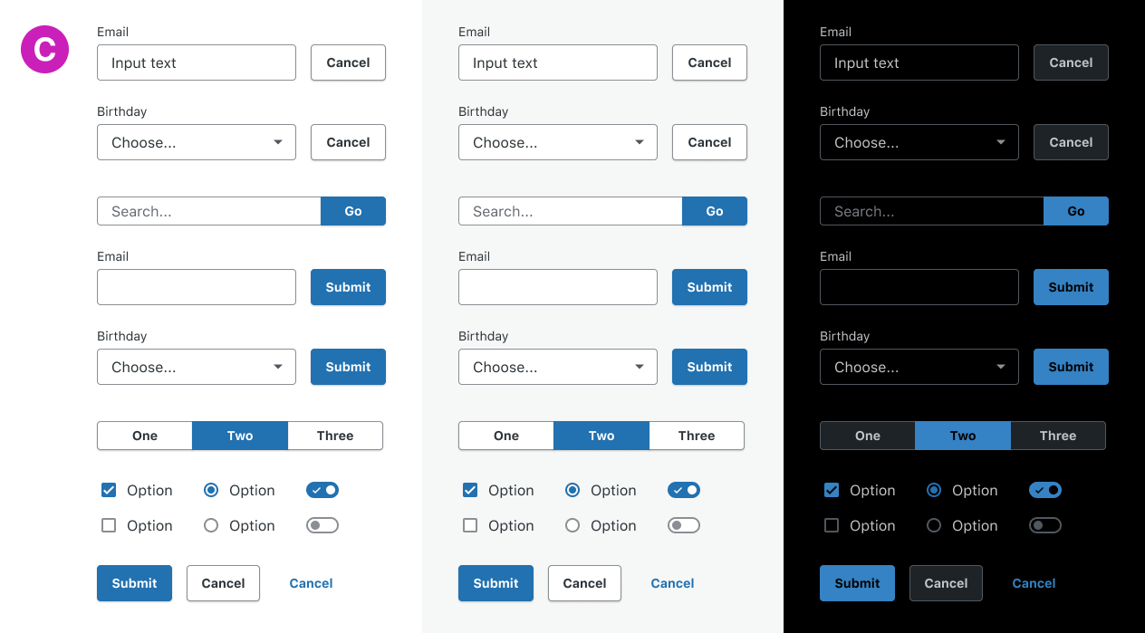
In context, with more UI:
Option A
Option B
Option C
---
Something to be considered separately from color and shadow is shape. What about using square corners for text inputs?
Note:
- These mockups do not include interactive states, although those will need to be explored. I think it's important these styles stand on their own first.
- Testing these styles in the context of a real UI in WordPress will be the next step.
- Please ignore labels and text. This is just to test the UI styling.
- Text is using the default macOS system font.
- Even though dark mode doesn't exist in WP, it's a good test to see how the styles hold up in an inverted color scheme.
- I believe all proposed solutions meet AA color contrast guidelines.
- Shadows will be removed it Windows high contrast mode, and we need some other visual indication other than color to distinguish the UI elements.
This is my first ticket, so apologies if I missed any standard practices.
Attachments (1)
Change History (30)
#8
 @
@
6 years ago
the secondary (or default) button style is no sufficiently distinct from input fields and other similar UI controls
My (probably unpopular) opinion is that a little skeuomorphism is the most effective way to address this, in the context of the broader UI. I like a combination of the colors in A + C, but without the drop shadow, for the reasons Michael mentioned above.
#9
 @
@
6 years ago
Here's the Figma file in case someone wants to experiment with the button styles. Please make a copy if you do. Thanks! https://www.figma.com/file/YU88DD9Q8eGtHxeZ75EZJI/Button-and-input-explorations?node-id=214%3A2134
#11
 @
@
6 years ago
The new button styles were introduced after design feedback on ticket:34904#comment:73. The main purpose was to bring Gutenberg styles to the core admin to improve consistency.
I'm a bit surprised after only a month the design team seems to have changed their minds and now a new design proposal is being evaluated.
As discussed in the comments on this blog post, Discussion: Higher contrast form fields and buttons, the secondary (or default) button style is no sufficiently distinct from input fields and other similar UI controls.
I'm not sure I follow. The concerns expressed in the blog post comments happened before the new blue buttons style was proposed in ticket:34904#comment:73 which is September 26. None of the commenters did even see the new style.
Evaluating improvements is always good but I'd tend to think changing important UI controls style at each release isn't the best path forward to make WordPress users happy. For the future, maybe the design feedback should be a bit more cautious and better pondered.
Regardless, personally I don't see a particular problem with the blue buttons style on WP trunk 5.3. The new style is consistent with the one used in Gutenberg. The blue is traditionally used in core for interactive controls, so it makes totally sense to me.
the new default buttons are styled similarly to inputs, and it could be confusing for folks if they can't differentiate them.
Is there any specific feedback from users on the buttons blue styling? As said, the comments on the blog post relate to previous proposals thus they're not relevant. Is there a real problem with the new style to start with? Any user testing or data to support there's an actual problem?
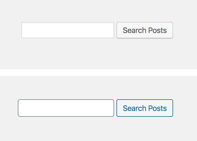
From a quick, simple, comparison between WordPress 5.2 and WordPress trunk 5.3 I wouldn't say it's impossible to distinguish buttons from inputs:
Not opposed to improvements though, as long as contrast is WCAG compliant. To the specific points:
- I'd agree to not use a bottom shadow: it visually alters the buttons height making horizontal alignments troublesome. Personally, I think removing the box-shadow was a good improvement.
- Bold: not sure as it should exclusively be used for emphasis, not for visual purposes.
- No gradients please :)
- I wouldn't make the buttons background white: in my mind that would actually make them too similar to inputs.
- I'd rather consider the shape. Instead of changing the buttons, I'd suggest to consider to change the inputs. Inputs have now rounded corners only for consistency with Gutenberg. Traditionally they have always been squared and maybe this change should have been considered a bit better. Also, a different shape can be distinguished regardless of color which is a win for accessibility. Worth noting the border-radius inconsistency between form controls has been noted in #48420 and should be addressed there, where a specific design feedback on this point has been asked.
That said, personally I mostly care about consistency. Any change should be implemented also in Gutenberg, were inputs and buttons currently look like in the core admin:

This ticket was mentioned in Slack in #design by drw158. View the logs.
6 years ago
#13
 @
@
6 years ago
We discussed this a bit in Slack during today's Design meeting. Here's a bit of a recap:
Codepen demo: Pretty rad to help visualize what the components look like and provides a place to fork and try something different.
Squared inputs vs rounded corner inputs: It seems we came to a consensus on continuing with rounded corner inputs for now.
#14
 @
@
6 years ago
Also noting that there seemed to be some consensus around following Github's example for buttons and inputs:
I'm a fan of simple, boring, but clear UI. I personally always think of Github's as the gold standard (just talking about UI clarity).
inputs have inward shadows. Buttons have a gradient. This is similar to patterns in Mac OS (well.. previous versions of it). Because of that "standardness" / "stockness", it feels more intuitive for me
#15
 @
@
6 years ago
I personally always think of Github's as the gold standard (just talking about UI clarity).
From an accessibility perspective, Github is not the best example and I'd recommend to not take it as source of inspiration.
inputs have inward shadows. Buttons have a gradient.
Seems to me this goes in the opposite direction of the design feedback given by the design team only 4 months ago and then implemented into WordPress 5.3. The "flat" design of inputs and buttons is a clear choice expressed by the design team in ticket:34904#comment:34 and follows the Gutenberg design, see the related issue https://github.com/WordPress/gutenberg/issues/15432#issuecomment-489536288
The flat design was confirmed and agreed by several design team members, see for example ticket:34904#comment:38, ticket:34904#comment:40, ticket:34904#comment:47, and ticket:34904#comment:75
I see now that other design team members seem to have different opinions :) That's not to blame anyone, and I do realize explorations are always good. However, it's not fully clear to me how the design team internal process works. Specifically, I'm not sure what developers and committers should do when they receive design feedback. Changing the UI every few months doesn't seem to me the best path forwards. Not for users, because they would be forced to learn new patterns continuously. Not for coders and committers as well, because everybody's time is limited and can be better spent to implement final decisions rather than continuous changes of direction.
Again, not my intent to blame anyone. Just trying to understand how the process can be improved and what everybody can do to contribute to make it better. Any clarification on this would be greatly appreciated.
On the specific issue this ticket seeks to solve: I'm not sure there's an issue to solve in the first place. Is the exploration here based on actual users testing and feedback? Any data to support that buttons and input fields are not sufficiently distinct? Seems to me no user testing has ever happened. Instead, what I get from this conversation is that most of the points are based on personal feeling and opinions. I'd like to see a more data-driven, user-testing centered process instead. In some cases the design team does an excellent job in user testing. Thinking at the monthly Gutenberg user-testing sessions. I'd like to see the same approach for form controls, as they're a fundamental part of the UI.
#16
 @
@
6 years ago
Also, noting that some of the points in this ticket are already covered in #48420. There's the need of design feedback there, where some points need a specific decision. A timely feedback would be greatly appreciated as #48420 is a continuation of the work made in WordPress 5.3 and it would be great to have the proposed improvements in the next minor release.
#17
 @
@
6 years ago
- Keywords has-screenshots added
Starting very basic, I'd like to discuss the secondary buttons background color change.
In these few days after the 5.3 release, there have been a couple reports from users that the new buttons style makes buttons "harder to read". While I don't necessarily share this perception, feedback from the community (though from only 2 users so far) is something we should listen to.
Specifically, I'm not sure the new #f3f5f6 grey background makes buttons better. I do realise this grey is the one used in Gutenberg (on a white background). However, seems to me it doesn't work very well on the legacy admin pages (with a grey background). For what is worth, personally I do like the blue borders and text but I'd consider to use the previous grey background color.
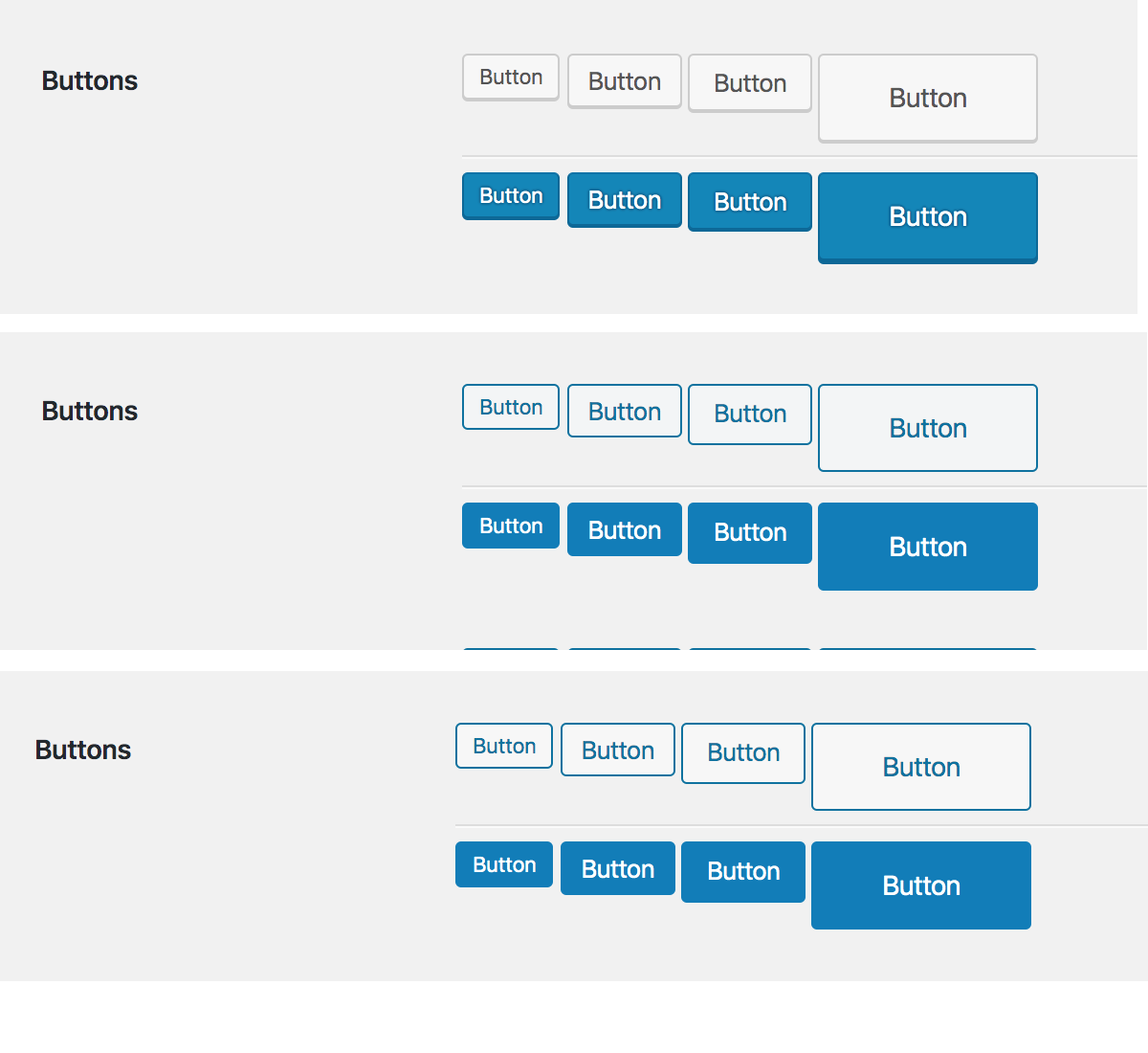
In the screenshot below (please ignore the primary buttons):
- top: buttons in WordPress 5.2 with the
#f7f7f7background - middle: buttons in WordPress 5.3 with the new
#f3f5f6background - bottom: the new 5.3 buttons with the previous
#f7f7f7background
Seems to me the ones at the bottom would work better on the legacy pages and still work well in Gutenberg. I'd greatly appreciate any feedback and thoughts.
Note: #f7f7f7 could be adjusted to turn to a slightly "blueish" hue: the important point is that the secondary buttons grey background should be a bit lighter.

This ticket was mentioned in Slack in #accessibility by afercia. View the logs.
6 years ago
#19
 @
@
6 years ago
"harder to read"
I'm interested to hear any further context around that. Do you think it was a contrast issue? Were you able to clarify that your updated version addressed the problem? I ask because to my (afaik very average) eye those buttons look virtually identical. I don't think I'd recognise the different backgrounds unless it was pointed out to me.
One drawback to changing the background color is that the lighter we go the more likely it is that we run in to the issue where buttons / text inputs look too similar. I'm not sure the blue accent alone is adequate to create the required distinction, considering color blindness. I wonder if a different font weight on buttons might be worth exploring instead of changing the background?
I do realise this grey is the one used in Gutenberg (on a white background). However, seems to me it doesn't work very well on the legacy admin pages
FWIW this is one of the reasons why I think a subtle gradient can work well on buttons.
- It establishes a recognisable pattern that clearly distinguishes buttons / inputs / tags (and other similar elements) regardless of context.
- Increases the likelihood of good performance on a variety of background colors.
#20
 @
@
6 years ago
the lighter we go the more likely it is that we run in to the issue where buttons / text inputs look too similar.
Yep, that was one of the concerns expressed by the design team.
As per the gradient, I wouldn't recommend it: it makes the contrast ratio "variable" depending on where text actually lives within the button, which is a potential problem for persons with vision impairments. Also, calculating the actual contrast ratio would be tricky. From a design perspective (just my 2 cents based on my personal taste) gradients are a bit too much "Web 2.0", a bit outdated.
#21
 @
@
6 years ago
Good point, but couldn't the contrast issue could be addressed by ensuring sufficient contrast exists between the text color, and the color in the gradient that is "closest" to it in hex value? That way the accessibility guidelines would be met regardless of button size or text placement.
Web 2.0
The problem I recall at that time was the overuse of gradients - pretty much every element had one. I agree that's not a good look :) I return to the Github example. Accessibility issues notwithstanding, the design language clearly communicates what is a button, and what is an input. I don't personally think their UI looks particularly "Web 2.0".
#23
 @
@
6 years ago
I agree with three points:
- We should look at font weight to help distinguish button controls from other controls.
- The difference in background color between number 2 and 3 in the comparison image above is incredibly subtle and likely won't make a difference.
- We can come up with a solution without using skeuomorphic gradients, which I think complicates things a bit.

This ticket was mentioned in Slack in #design by karmatosed. View the logs.
6 years ago
#27
 @
@
5 years ago
- Milestone changed from 5.4 to Future Release
Noting after the design team discussed this we are putting to a future milestone, we will get to this but right now it's not going to happen in 5.4.

This ticket was mentioned in Slack in #design by chaion07. View the logs.
4 years ago
#29
 @
@
4 years ago
Associated ticket:
Discussion: links that look like buttons (and vice versa)
https://core.trac.wordpress.org/ticket/48641
I believe this ticket might be interesting for @ryelle and @sarahricker as well as @q
to know about both of these tickets.


I would recommend option C with no shadow. The reason for no shadow is it tends to make the button look lower than the form field. It also raises the button optically to be on a layer closer to the user than the form field.
The bold helps them feel like a button and helps readability.
The white background prevents the button from looking disabled. It also looks good on both grey and white backgrounds.