#34904 closed task (blessed) (fixed)
The design of the focus outline on buttons/elements could be improved
| Reported by: |
|
Owned by: |
|
|---|---|---|---|
| Milestone: | 5.3 | Priority: | normal |
| Severity: | normal | Version: | |
| Component: | Administration | Keywords: | needs-post-mortem color-contrast wpcampus-report has-patch has-screenshots 5-3-admin-css-changes has-dev-note |
| Focuses: | ui, accessibility | Cc: |
Attachments (37)
Change History (162)
#3
follow-up:
↓ 4
 @
@
10 years ago
I totally agree. I want to make sure these focus styles are pretty dang consistent across the board. We might even have to work on links as well.
#4
in reply to:
↑ 3
 @
@
10 years ago
Replying to michaelarestad:
We might even have to work on links as well.
+1 Yep, focus styles should probably be as similar as possible everywhere.
#5
 @
@
10 years ago
This looks way cleaner to me. When the button is blue, I'm wondering if there is enough contrast between the button itself and the outline. Might want to create a stronger difference, either by making the focus state a dotted/dashed line, or by changing the outline color to be more distinctly different.
I may be overthinking this.
#6
 @
@
10 years ago
@mor10 Maybe. The size difference in overall appearance works pretty well even though the colors are similar. We'll see what we can do.
#7
 @
@
10 years ago
Looking at Twitter, I noticed that they have added a 2px space between the button and the outline to clearly separate the focus state indicator from the button itself. This might be a solution here as well: Provide some whitespace to show this is a line drawn around the element to indicate it is currently in focus.
Easiest place to see it is in the "People to follow" area. I'll upload some images later.
#8
 @
@
10 years ago
@mor10 Good find. Might make sense just for the primary buttons. Twitter mostly only uses it on the blue buttons. Gallery of uses: https://cloudup.com/ckMCQgaDLaw
#11
 @
@
10 years ago
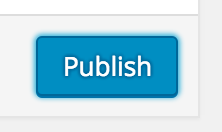
I added an initial quick patch to mess with a non-gradient style. @kellychoffman I tried yours, but it was doing something funky on my external monitor maybe because of the half pixel. Also, we'll need to account for the 3D effect of the bottom (the extra 1px bottom shadow). Will try again in a V2 because I like the idea of the gap for the primary button.
I did maybe get a little overreaching with the focus style on links by adding a border radius. There's another fancy trick I want to try on links, but not quite yet.
Results of the first patch:
#12
 @
@
10 years ago
It works great except for the primary buttons. The contrast between the primary button background color and the border is really low (1.91). We'll need some kind of alternate color so that it is clear there is a :focus being placed on the primary button. Otherwise, a great step forward!
Contrast score: http://snook.ca/technical/colour_contrast/colour.html#fg=008EC0,bg=5EC7E3
#13
 @
@
10 years ago
@michaelarestad Right, the half pixel isn't necessary. A full pixel gap would probably make more sense anyways.
The contrast between the primary button background color and the border is really low.
This could be improved using the (white) pixel gap.
#14
 @
@
10 years ago
@kellychoffman I agree. I just took another stab at it. I added the white gap to just the primary button and kept the shadows from the previous patch elsewhere. The box shadow is nasty, but works. The alternative would be to switch to using a border for the shadows and such which is a bit nastier.
It should look like this:
#15
 @
@
10 years ago
The latest patch, 34904.3.diff, has a simpler box shadow (never drink while box shadowing) than what I cam up with last time. I did, however bump the size of the shadow on the primary button slightly. It now has a single pixel white border and a 3 pixel blue border for a combined 4 pixels total.
It should look like this:

This ticket was mentioned in Slack in #design by michaelarestad. View the logs.
10 years ago

This ticket was mentioned in Slack in #accessibility by michaelarestad. View the logs.
10 years ago

This ticket was mentioned in Slack in #core by ocean90. View the logs.
10 years ago
#20
 @
@
10 years ago
It now has a single pixel white border and a 3 pixel blue border for a combined 4 pixels total.
Do you think 3 pixels is too much? What about only 2?

This ticket was mentioned in Slack in #design by michaelarestad. View the logs.
10 years ago
#22
 @
@
10 years ago
I just want to say that outlining is an subtile effect meaning having a white border and then the blue creates a double effect white and blue. I think that is too much as it goes from subtile over to its own effect which I believe is too strong and takes too much visual space. Perhaps less pixels will help. I think posting some pixels variations can help as well.
I went looking for the pattern library as I would like to test this out but can not find it online. Where can I get a hold of the pattern library?

This ticket was mentioned in Slack in #accessibility by afercia. View the logs.
10 years ago
#24
 @
@
10 years ago
- Milestone changed from Awaiting Review to Future Release
Moving to future release as it is something that should be done and there are some initial proposals here. Hoping there will be some more traction in the next releases.

This ticket was mentioned in Slack in #accessibility by afercia. View the logs.
9 years ago

This ticket was mentioned in Slack in #design by afercia. View the logs.
9 years ago
#28
 @
@
7 years ago
Noting that Gutenberg just implemented a new focus style for the buttons, which is better for accessibility and design-approved. See https://github.com/WordPress/gutenberg/pull/15544
Would be great to use the same style in core as well, for better accessibility and consistency.
#29
 @
@
7 years ago
As I do in Gutenberg, I try to fix button focusing color contrast.
It seems screen options button focus are altered it's not yet perfect…
#30
 @
@
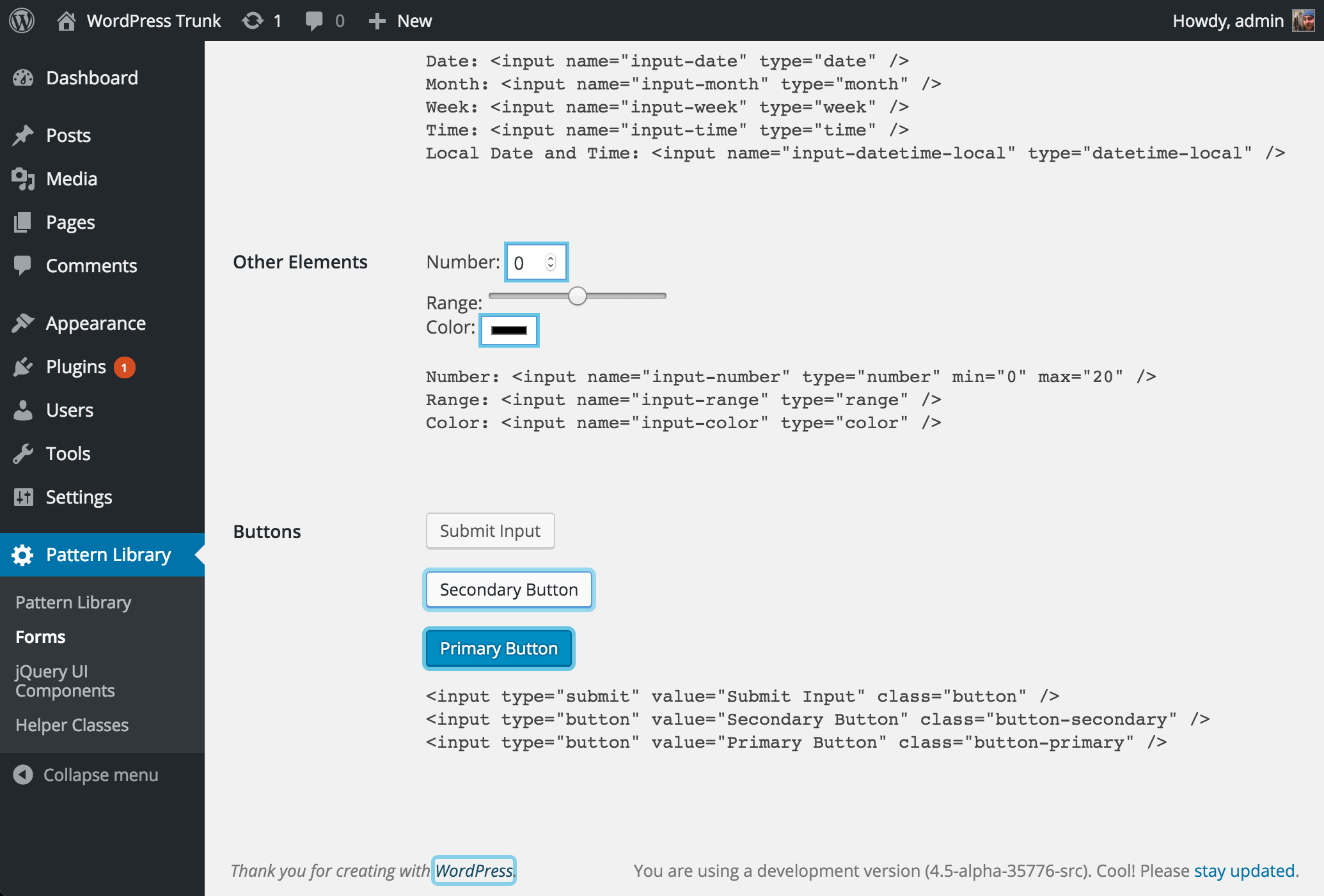
7 years ago
Thanks, @truchot. This is a great start. I added an updated version (34904.5.diff) that adds a couple missing buttons, and also tries this out on form fields for consistency:
I'm not sure if we'd want the state for those to be exactly this, or if we'd want to use the slightly different state from Gutenberg:
(Whatever we choose, I figure we should make the treatments consistent here and in Gutenberg)
#31
 @
@
7 years ago
Great ! It works well.
Maybe input radio and checkbox don't need 1px spacing like secondary button proposed here
#32
 @
@
7 years ago
Worth noting there are other pending tickets for the various checkboxes, radio buttons, select, and inputs. From the oldest to the latest one:
Color contrast: checkboxes and radio buttons
https://core.trac.wordpress.org/ticket/35596
Color contrast: input fields, textareas, select elements etc.
https://core.trac.wordpress.org/ticket/44606
Redesign input fields, checkboxes and other form components for contrast and consistency
https://core.trac.wordpress.org/ticket/44749
Definitely in favor of improving contrast for the form fields but I'd recommend to keep things separated and dedicate this ticket only to the buttons. Any help to make the above pending tickets move on is greatly welcome :)

This ticket was mentioned in Slack in #design by kjell. View the logs.
7 years ago
#34
 @
@
7 years ago
☝️
Added a mockup from a related block editor ticket (https://github.com/WordPress/gutenberg/issues/15432#issuecomment-489536288), worth throwing into the mix for consideration. The key design constraint that inspired the mockup was a reliance on borders instead of drop shadows, both to create consistency between input styles, dropdown widgets and button styles, but to be able to allow the same high contrast focus style for all of them.
Worth also noting that drop shadows alone are removed in Windows high contrast mode, so a focus style made up of only a drop shadow won't show up there. We can hack around that — show a transparent outline, it will be made opaque in that mode — but it would be nice to simplify things and have the same bordered focus style across modes.

This ticket was mentioned in Slack in #accessibility by audrasjb. View the logs.
7 years ago
#37
 @
@
7 years ago
- Keywords wpcampus-report added
Adding the wpcampus-report keyword because #47151 (ticket from the WPCampus report) was closed in favor of this ticket.
#38
 @
@
7 years ago
- Keywords needs-patch blessed added; wpcampus-report removed
- Milestone changed from Future Release to 5.3
Let's implement @Joen's mockups for 5.3. We'll need someone to write a patch that covers all buttons in wp-admin.
#40
 @
@
7 years ago
I've just added 34904.6.diff, which includes the buttons from @joen's mockup above. Those were missing active and disabled states, so I've approximated those.
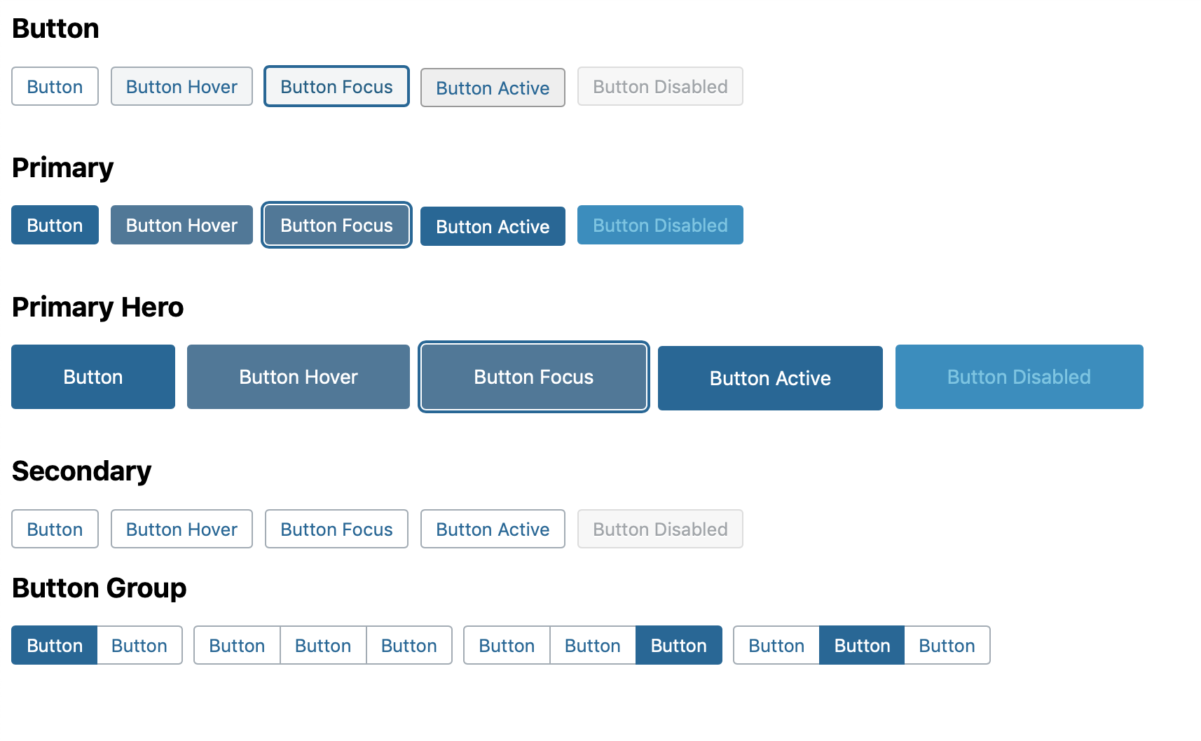
(You can try those live on CodePen: https://codepen.io/kjellr/full/bGbrqyq)
Here are some screenshots with those buttons in the UI:
... and here are the focus states:
In general, this seems positive to me. My hesitancy is around the default buttons — having them appear on a white background gives them an "outline-only" sort of appearance if the end up on a white background (like in Gutenberg), and I wonder if we should pull them forward visually a little more than that?
Also noted above, there area some other tickets in the works. We should consider how new treatments here align to the work being done in #47153 for example.

This ticket was mentioned in Slack in #accessibility by audrasjb. View the logs.
7 years ago

This ticket was mentioned in Slack in #design by kjell. View the logs.
7 years ago
#45
 @
@
7 years ago
As noted, this issue is deeply related to a couple other tickets. The design team is discussing these holistically over here:
https://make.wordpress.org/design/2019/09/06/discussion-higher-contrast-form-fields-and-buttons/
Feel free to weigh in there if anyone else has thoughts. Once we have alignment there, we'll bring any related design changes back into this ticket. 👍

This ticket was mentioned in Slack in #accessibility by audrasjb. View the logs.
7 years ago
#47
 @
@
7 years ago
Just added 34904.7.diff, which includes the button styles in the followup iteration described here:
The colors use:
#ffftext on a#007cbabackground for the primary buttons (Contrast ratio 4.57:1)#555text on a#f1f1f1background for the secondary buttons (Contrast ratio 6.6:1)
Screenshots:
#48
 @
@
7 years ago
- Keywords has-patch added; needs-patch removed
Thanks for the refresh @kjellr ❤
In 34904.8.diff I fixed some small errors:
- double semi-colon ;;
- caps on hexadecimal value
Otherwise, all is looking good to me. Thanks again, you rock :)

This ticket was mentioned in Slack in #design by audrasjb. View the logs.
7 years ago
#51
 @
@
7 years ago
From design perspective looks great to me so adding a +1 for feedback. Thanks for all your work everyone on this. I have tested it so removing testing keyword.
#53
 @
@
7 years ago
- Keywords has-screenshots needs-dev-note commit added
34904.9.diff is looking great on my side too (see screenshots).
Maybe there is some room for disabled state color contrast enhancements in a next commit but it's a really great enhancement as it :)
#54
follow-up:
↓ 59
 @
@
7 years ago
Great, thanks for testing! We also need to make sure this works alright with alternate color schemes. If nobody else gets there first, I'll take a look later today.
Also, some elements (like standard links) still have the "glow" effect on focus:
This ticket seems broad enough to refresh those too — should we replace those with the solid line used in Gutenberg?:
#55
 @
@
7 years ago
I noted this when testing within Slack, so changing the flow effect seems good to me.

This ticket was mentioned in Slack in #accessibility by afercia. View the logs.
7 years ago
#57
 @
@
7 years ago
- Type changed from enhancement to defect (bug)
Discussed during today's accessibility bug-scrub. This ticket is related to other tickets marked as "bug" aiming to improve contrast and focus indication. It's best to change it from "enhancement" to "bug" so that all these related tickets can be handled together.
#59
in reply to:
↑ 54
 @
@
7 years ago
Replying to kjellr:
Also, some elements (like standard links) still have the "glow" effect on focus:
This ticket seems broad enough to refresh those too — should we replace those with the solid line used in Gutenberg?:
I've added 34904.10.diff, which removes that glow hover state wherever I could find it. After some sleuthing, I actually believe that solid color hover state in Gutenberg actually only applies to buttons, so I'm not even sure it's supposed to be applied to buttons that look like links in the first place.
Instead of adopting that, I've brought in the dotted line border that Gutenberg applies to most other focusable, non-button elements:
Happy to reassess that treatment if we decide, but I think it works pretty well, and helps align with what you'd usually see in Gutenberg.
I'm going to dig into the alternate color scheme buttons next and make sure those work nicely.
#60
 @
@
7 years ago
Uploaded a fresh version: 34904.11.diff
This one makes sure the alternate color schemes follow these new button styles focus borders:
A note about that: Not all of the alternate button styles pass contrast tests. But they didn't before, so I think we're fine? Seems like a separate issue, and one that should be considered separately.
This also fixes an issue where the active toggle button wasn't very noticeable. Should be a bit better now:
This patch is getting pretty large, but I think it covers everything it needs to.
The buttons.css file header suggests to edit editor.css as well. I see that file contains some TinyMCE buttons, but I can't find any of them in use, so I'm hesitant to make any changes. I checked the classic editor and it seems to be fine as is. If anyone knows where those are, and can fix them, that would be excellent. Otherwise, I think this is just ready for some solid, thorough testing.
That's probably my last patch in this thread for the day, so feel free to update and build on the patch if anyone finds bugs! Thanks.
#61
 @
@
7 years ago
@kjellr in testing this it feels as good as I think we can get for beta 1. I would note there needs to be some thorough stress testing of this during beta.
#62
 @
@
7 years ago
I tested 34904.11.diff and the patch is looking fine to me as it.
I'd say go for a +1 to commit it and to iterate during 5.3's beta cycle.
I'm going to write a dev-note about those changes once it get committed.

This ticket was mentioned in Slack in #accessibility by audrasjb. View the logs.
7 years ago
#64
 @
@
7 years ago
Thanks for the reviews, folks! Seems like this is probably ready for wider testing.

This ticket was mentioned in Slack in #accessibility by kjell. View the logs.
7 years ago
#66
 @
@
7 years ago
Ready for commit for 5.3 beta 1.
Worth noting it should be committed alongside #47477 darker alternative patch.

This ticket was mentioned in Slack in #accessibility by kjell. View the logs.
7 years ago
#70
 @
@
7 years ago
Hi Friends and thanks for your work here.
I discovered these new designs recently and I have some feedback to share.
- In some screens like the post list, the fact that the default buttons have the same background as the regular screen background make them look like disabled inputs for me, it's very hard to understand that these are in fact buttons.
- In Gutenberg, we didn't try new button designs to stay consistent with Core, so I was really surprised when I saw these buttons commited to Core without trying to bring consistency in Gutenberg. What's the plan for that?
- With the current button size and without any borders or elevation, the primary buttons in the settings screen look very weird to me. They feel a bit "disconnected" from the design of the rest of the page.
#71
 @
@
7 years ago
Hey @youknowriad! We definitely appreciate the feedback. 🙂
Regarding the specific button styles in general: We're hoping to keep iterating, so perspective like that is super helpful. The goal is to keep iterating throughout the beta period, but given all the bugs that need to be sorted out in general, I'm not sure whether or not we'll be able to make substantial changes during this period.
Regarding Gutenberg: these updates will need to be ported over there. I see that @mapk and @karmatosed have begun logging some tickets for those:
https://github.com/WordPress/gutenberg/issues/17585
https://github.com/WordPress/gutenberg/issues/17592
https://github.com/WordPress/gutenberg/issues/17593
... etc.
Given the timeline, making these changes there too is admittedly going to be rough, so any help would be appreciated.
#72
 @
@
7 years ago
Thanks @youknowriad et all for your feedback. As @kjellr mentioned, the primary goal of having these CSS changes in Beta 1 is to make them exposed to a larger community, get feedback, and keep iterating. So any feedback is very welcome.
#73
 @
@
7 years ago
I haven't been watching this too closely so forgive me if this has been tried before. Maybe this mockup I've been working on can help? I've been experimenting with some ideas to try and bring Gutenberg UI styles to the rest of WP Admin. I think the secondary buttons look less disabled, so perhaps it's worth trying.
Please ignore the filler content.
#74
 @
@
7 years ago
@drw158 Very nice proposal, I'd love to see a patch for that one to at least test how it feels in several situations/states (focused, disabled...).
#75
 @
@
7 years ago
Just added a quick patch in case anyone wants to try that out: 34904--blue-secondary-buttons.diff. I had to adjust the colors just a little bit to get the hover/focus styles working nicely, but otherwise it's really similar to @drw158's mockup.
Screenshots:
#76
 @
@
7 years ago
Also! I noticed @drw158 had the "Add New" button as a primary button. I kind of like that too, but I didn't make that change in the patch. Many of the pages that have those "Add New" buttons have no primary buttons currently.
#77
 @
@
7 years ago
I dig it — it brings some nice contrast back. I think we should consider merging it into trunk and sitting with it for a couple days.
FYI, some conversation around the use of primary/secondary buttons in page headers in #41986.
#78
 @
@
7 years ago
Here's a quick codepen in case anyone wants to quickly try out adjustments to the different states:
https://codepen.io/kjellr/pen/VwZNWjq
Edit: Noticed a small active state color bug in the patch, so re-uploaded. 👍
#79
 @
@
7 years ago
- Resolution fixed deleted
- Status changed from closed to reopened
Reopening to consider the last patch.
Btw, it looks great for me. Curious to hear other thoughts.
#80
 @
@
7 years ago
Just wanted to attach customizer-buttons.png. I had seen it mentioned in Slack, but not sure it had been added to a ticket.
The buttons are a different height than the input fields in the Customizer.
#81
 @
@
7 years ago
Just found #48131. Disregard the last comment.
I did forget to mention, though, that the gear icon in the publish button is also not vertically centered.
#82
 @
@
7 years ago
34904--blue-secondary-buttons.2.diff fixes some bugs around the display of icons in buttons.
#85
 @
@
7 years ago
I've added a patch that iterates on @kjellr's from yesterday, applying a few fixes to the Add New button (.page-title-action).
That button previously had only a 2px border radius and was a couple of pixels shorter than other buttons. It should now be the same size (though I don't quite know why I had to use line-height: 26px instead of line-height: 28px. Perhaps because it's a link?)
 @
@
7 years ago
Fixed the vertical centering of the small and large buttons by using the same top and bottom padding.

This ticket was mentioned in Slack in #accessibility by audrasjb. View the logs.
7 years ago
#87
follow-up:
↓ 103
 @
@
7 years ago
- Keywords needs-refresh added
As seen during the accessibility meeting, the best option would be to use @kjellr proposal of solid 2px border.
Colors:
- white border for admin menu items
- blue border everywhere else
See screenshot below:
#88
 @
@
7 years ago
- Keywords commit added; needs-refresh removed
I think there's still work to do but what's on the last patch here, is better that what's currently in trunk. I'm addinig the "commit" keyword. Commiting these updates will allow us to get a full picture about how all the fixes (buttons, inputs, dropdowns) fit all together and we can keep iterating on it.
#91
 @
@
7 years ago
Looking at the latest patches, worth noting this ticket is only about colors, contrast, and focus style. Changes to the elements size should be omitted from this ticket and addressed in #47477 where a patch is already in the works.
Thanks for the patches :) but given the large set of CSS changes it's best to keep things well in order, address specific issues on specific tickets, and keep track of all the committed changes in their specific order.
Will commit last patch from @kjellr.
#94
 @
@
7 years ago
Just attached a patch that does two things:
- It removes the 1px pixel shift on button :active. Given the flat style of the new buttons, this jog is visually incompatible. Additionally it hasn't even been on the buttons in Gutenberg, so it adds consistency.
- It adds a 0.1 second transition to the focus outline. This transition is already applied to the form fields, so this is another bit of consistency.
In https://cloudup.com/ckHvhDJjyNI there are some before and after GIFs to see the difference.
In terms of consistency and contrast, this trac ticket is a welcome step forward. I hope we can take additional steps in subsequent versions, inspired by this change. Many of these have already been mentioned, so take this as an endorsement for additional enhancements, such as:
- Bigger buttons, consistent paddings that are perhaps harmonized to a standard grid.
- More consistent font size across all buttons, perhaps bump to 14px.
- Perhaps add some vibrancy to the blue color, by pushing it towards the purple side of the spectrun.
Not suggesting buttons be purple, but one of the curious properties of the purple side of the spectrum (as opposed to the green side, which the WordPress brand color is leaning towards at the moment), is that contrast to white overlay text skyrockets: https://cloudup.com/cJXNAsoKWyM
In other words, even very subtle shift towards ultramarine/purple can add a ton of color vibrancy without reducing brightness.
#95
 @
@
7 years ago
@Joen thanks for the patch!
Removing the active state shift makes totally sense.
Regarding the focus transition, in core things are a bit different. Some elements have a transition, other elements don't. When tabbing through (or clicking on) adjacent elements, seeing the inconsistency produced by the presence or lack of transition is not that great and feels sluggish. See conversation on #47153 starting from https://core.trac.wordpress.org/ticket/47153#comment:50
Also, I'd tend to think that at the very least the transition should obey the prefers-reduced-motion setting.
For these reasons in https://core.trac.wordpress.org/attachment/ticket/47477/47477.7.diff I'm removing the transition entirely for now and I'd suggest to re-evaluate later. If no objections. I'd commit only the removal of the active transition.
Bigger buttons, consistent paddings that are perhaps harmonized to a standard grid.
I'd totally second this. Having now spent some time on the core CSS I refreshed my memory on all the various core inconsistencies :) Setting and harmonizing new default buttons and input field sizes is something that need to happen sooner or later. I'd start by defining simple values for the normal size heights for example 30px on desktop / 40px on mobile and then elaborate a scale for small and large starting from there. #47477 is the ticket related to sizes. However, this would need some iterations and in depth testing, not sure it can be done now.
#96
 @
@
7 years ago
👍
Worth submitting a Gutenberg PR to make it consistent between the two. I look forward to the day when we can share components and work on individual components ✨
for example 30px on desktop / 40px on
I would recommend a base8 or base12 compatible number, as this will make ongoing grid efforts simpler. Could be 24, 32, 36 and sure, 40.
#97
 @
@
7 years ago
I would recommend a base8 or base12 compatible number, as this will make ongoing grid efforts simpler. Could be 24, 32, 36 and sure, 40.
Totally in favor of a "grid base". Anything that is not like the core current (bit random) rendered values e.g. 21px, 25px, 29px 😬 would be great.
#98
 @
@
7 years ago
👍
Small note on the transition thing, it's worth noting that the transition is currently applied _also_ to form fields. So whatever efforts we should do to include the reduce motion preference should apply to form field and button focus styles both.
#100
 @
@
7 years ago
In a few places, the new focus style removed the "rounded focus style". This is mainly used on toggle icons and similar controls. Not sure this has been discussed and I'd rather keep the previous style.
See attached screenshot: old style and new dotted line style (less visible).
#101
follow-up:
↓ 102
 @
@
7 years ago
34904.12.diff restores the toggles "rounded focus style" using the new blue style. See for example all the post-boxes and meta-boxes. See the Menus and Widgets accordions (also in the customizer).
I'd appreciate design feedback on this change :)
#102
in reply to:
↑ 101
 @
@
7 years ago
Replying to afercia:
34904.12.diff restores the toggles "rounded focus style" using the new blue style. See for example all the post-boxes and meta-boxes. See the Menus and Widgets accordions (also in the customizer).
I'd appreciate design feedback on this change :)
Looks good to me. Thanks, @afercia!
#103
in reply to:
↑ 87
 @
@
7 years ago
Replying to audrasjb:
As seen during the accessibility meeting, the best option would be to use @kjellr proposal of solid 2px border.
Colors:
- white border for admin menu items
- blue border everywhere else
See screenshot below:
I've added 34904-link-and-adminbar-focus-borders.diff, which makes this update.
My main concern on these is that some of these borders look a bit clumsy and oddly shaped in Chrome. Chrome also decides to show these every time you click, so they're pretty obvious there:
#104
 @
@
7 years ago
Spotted a new thing :) The permalink structure buttons lack their "pressed" state. That was the :active / .active style. I think a "pressed / active" style needs to be restored, doesn't necessarily have to be the previous one.
See attached screenshot: before and after.
#105
 @
@
7 years ago
Reminder: for the admin menu there's #28599. Old, long to read, ticket: recommend to directly jump to the latest comments.
On that ticket, a solid outline for the admin menu received a non positive design feedback. At some point the identified solution was a left "border" implemented with box-shadow and currentColor. Worth noting currentColor has the advantage of automatically using the color from the active color scheme. I'd be inclined to not rush changes for the admin menu and consider what the best option is. Not opposed to postpone and work on #28599 during the WP 5.4 cycle.
For normal links: personally, I'd keep using a box-shadow. It is true that 34904.13.diff appears to solve the "odd shape" issue but we're not sure it addresses all the occurrences. After all, using outline instead of box-shadow gives us only the advantage of a slight simplification of the CSS. Instead, box-shadow is more reliable as it is used since years: we know it works across all the UI. For Windows High Contrast Mode the additional transparent outline just works.
I'd like to propose to discuss this during today's accessibility bug scrub on Slack, everybody's welcome.
#106
 @
@
7 years ago
Reminder: for the admin menu there's #28599. Old, long to read, ticket: recommend to directly jump to the latest comments.
On that ticket, a solid outline for the admin menu received a non positive design feedback. At some point the identified solution was a left "border" implemented with box-shadow and currentColor. Worth noting currentColor has the advantage of automatically using the color from the active color scheme. I'd be inclined to not rush changes for the admin menu and consider what the best option is. Not opposed to postpone and work on #28599 during the WP 5.4 cycle.
Thanks for the link — I'd forgotten about that ticket. As long as we have a visible focus state in here in general, I'd be happy to postpone major changes and work on them in the context of that ticket instead.
For normal links: personally, I'd keep using a box-shadow. It is true that 34904.13.diff appears to solve the "odd shape" issue but we're not sure it addresses all the occurrences. After all, using outline instead of box-shadow gives us only the advantage of a slight simplification of the CSS. Instead, box-shadow is more reliable as it is used since years: we know it works across all the UI. For Windows High Contrast Mode the additional transparent outline just works.
Using box-shadow (along with the transparent outline fallback for high-contrast mode) sounds fine to me too. I'm not sure I have time to rewrite that patch at the moment, but if someone else is up for taking it on, that would be excellent.
#107
 @
@
7 years ago
The permalink structure buttons lack their "pressed" state. That was the :active / .active style. I think a "pressed / active" style needs to be restored, doesn't necessarily have to be the previous one.
I've added 34904-permalink-buttons.diff, which borrows the button group's active state for those instead of the standard active state:
#108
 @
@
7 years ago
I wanted to note a couple bugs I'm noticing.
1. Border radii are all over the place.
- Input fields have a border-radius of 4px.
- The "Add New" default button has a border-radius of 2px.
- The other default buttons have a border-radius of 3px.
2. The default button height does not match the input field height.
#109
 @
@
7 years ago
- Keywords commit removed
@mapks thanks for your feedback.
Noting that this ticket is about focus style and contrast :) #47477 is the ticket related to sizes. Saying this just to try to keep things in order.
On your points: whether or not all these changes will stay or will be postponed to next releases, here's some notes that can be good for present or future work:
1 Border radii are all over the place.
I noticed that as well, though the "Add New" button is a pre-existing issue and does have a border-radius of 2px on all previous versions against the 3px of the core-ui buttons. I vaguely remember when it was implemented that was a design choice. I may be wrong, would need some software archeology on Trac.
Can certainly be improved but needs a design decision. I'd tend to think deciding if the radius must be 2, 3, or 4 pixels would need just a few minutes.
2 The default button height does not match the input field height.
On 5.2 and all previous versions:
- The default input field height is the one in the settings pages. About 25px on macOS Chrome. Can vary across operating systems and browsers.
- Some admin pages (e.g. the posts page) use a different input/select height to match with buttons so currently there's not a real "standard"
- On 5.2 and previous: normal buttons have a height of 28px plus a bottom box-shadow that makes them look 1 pixel taller so even in this case form controls and buttons aren't visually aligned:
- On 5.2 and previous: on mobile the small, normal, and large button sizes become all 31px (with various exceptions). Form controls change to a wide range of different heights with no apparent sense.
With the new CSS:
- form controls heights are way more standardized and have way less exceptions
- just needs a decision on the default height of all controls: inputs, selects, buttons. To recap, on desktop - normal size:
- buttons were not changed, they're still 28px
- the inputs are now 30px
- the new select is 28px
We could make it all 28px or all 30px. And on mobile all 40px.
However, @Joen made a very good point on establishing a grid base. I'd totally second that and I'd lean towards a base8. Thus, on desktop the normal size would be 32px and on mobile 40px. This needs a design decision.
Given all heights are now much more standardized, these adjustments would be a matter of very few changes in the CSS.
Lastly: I'd like to note this ticket is not about pixel perfection :)
The main goal here is to remove all the fixed heights and allow all the UI controls to scale with zoom text. Otherwise, text within controls is cut off or overflows, making the controls barely usable.
See for example what happens in Firefox with "Zoom Only Text":
#110
 @
@
7 years ago
Re: color schemes:
A note about that: Not all of the alternate button styles pass contrast tests. But they didn't before, so I think we're fine? Seems like a separate issue, and one that should be considered separately.
Correct; historically, only the default color scheme aims to have a WCAG compliant contrast ratio. All the other color schemes have always been considered options and they don't meet (never met) the contrast requirement.
Re: buttons active state:
I've added 34904-permalink-buttons.diff, which borrows the button group's active state for those instead of the standard active state:
The current active state is barely noticeable as it changes only the border color. It should be improved and also implemented for all the buttons, not only the permalink structure ones. Trying a patch now.
#111
 @
@
7 years ago
34904.14.diff tries to improve the active state.
More accurately, the :active browsers state and the .active class should now be distinguished:
- the former is unchanged and it's used by browsers while clicking a button
- the latter is a CSS class meant to be used for buttons that need to look "pressed" as, for example, buttons that represent a selected setting
See in the attached screenshots: permalink buttons and alignment buttons in the media modal (button group).
The "pressed" style is basically the same one used in WP 5.2 the only change is the box-shadow changed from gray to blue because the buttons have blue borders and text.
#112
 @
@
7 years ago
34904.15.diff improves 34904.14.diff to address the .active class for the color schemes.

This ticket was mentioned in Slack in #design by mapk. View the logs.
7 years ago
#115
 @
@
7 years ago
Re: links focus style:
Thanks for the link — I'd forgotten about that ticket. As long as we have a visible focus state in here in general, I'd be happy to postpone major changes and work on them in the context of that ticket instead.
Using box-shadow (along with the transparent outline fallback for high-contrast mode) sounds fine to me too. I'm not sure I have time to rewrite that patch at the moment, but if someone else is up for taking it on, that would be excellent.
34904.16.diff restores the previous focus style for links, based on box-shadow and removes the new outline: 1px dotted #555d66;. A new focus style for links needs more exploration as the new dotted outline is noticeably lighter than the previous style thus not quite ready to guarantee a good indication of focus.
#117
 @
@
7 years ago
- Keywords needs-post-mortem added
- Type changed from task (blessed) to enhancement
Re: process, this is a low-priority enhancement that shouldn't have been committed during or right before beta.
Changes to the buttons styling affect a lot of other (old) CSS, potentially breaking many many plugins. This type of low-priority tweaks should happen well before beta so they can be tested and refined in time.
#118
 @
@
7 years ago
- Type changed from enhancement to defect (bug)
Re: process, this is a low-priority enhancement that shouldn't have been committed during or right before beta.
I'm sorry but insufficient contrast and poor focus indication are a serious accessibility bug. Worth also noting #47151 was closed in favor of this ticket. #47151 comes from the WPCampus accessibility report on Gutenberg and outlined the contrast issue on buttons.
Being a bug, it can be committed at any time during Beta period.
Changes to the buttons styling affect a lot of other (old) CSS, potentially breaking many many plugins.
I'd appreciate concrete examples of breakages regarding the buttons styling. I haven't seen any so far. Also, plugins shouldn't alter the default styling buttons and if they do, they're just "doing it wrong".
Worth also noting that the changes to the focus style improve accessibility and also bring in consistency with the styles used in Gutenberg. Previously, there were two complete different patterns in WordPress: the Gutenberg one and the legacy admin one. I'm not sure that can be considered a good UI. Harmonization of the styles in the admin needs to happen anyways sooner or later.
Considering this is an accessibility bug, I'd like to change the ticket to "bug" (#47151 was marked as bug). Worth also noting this ticket was changed to "blessed task" by the Editor Tech focus lead for this release cycle @youknowriad and I couldn't agree more :)

This ticket was mentioned in Slack in #accessibility by afercia. View the logs.
7 years ago
#120
follow-up:
↓ 122
 @
@
7 years ago
Discussed during today's accessibility bug-scrub on Slack and agreed to change this ticket back to "task (blessed)" as it was publicly discussed in the Dev Chat last week, and an agreement was reached. With the blessing of @davidb as Triage PM for this release cycle.
#122
in reply to:
↑ 120
 @
@
7 years ago
Replying to afercia:
There is no point in changing the type of this ticket. The fact is that it started as a low-priority bug fix but later the scope was changed and it became an enhancement.
Also, there is no such thing as "blessing" a ticket by "anybody". The type of "Task (blessed)" is an override meant for larger new features (which are always "enhancements" by their nature) where the team working on them couldn't meet the deadlines and complete them before beta. It generally means that the code committed before beta is buggy and needs additional testing and fixes. This is not the case here.
I'm thinking we should remove this type or at least the "blessed" part as it is being misunderstood and misused in all kinds of cases.
#123
 @
@
7 years ago
- Resolution set to fixed
- Status changed from reopened to closed
RC1 is approaching. Closing this ticket as fixed for milestone 5.3.




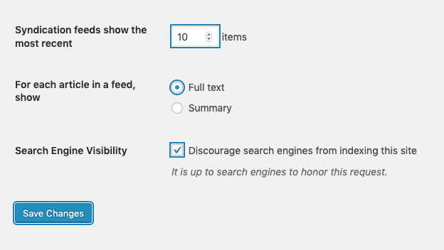

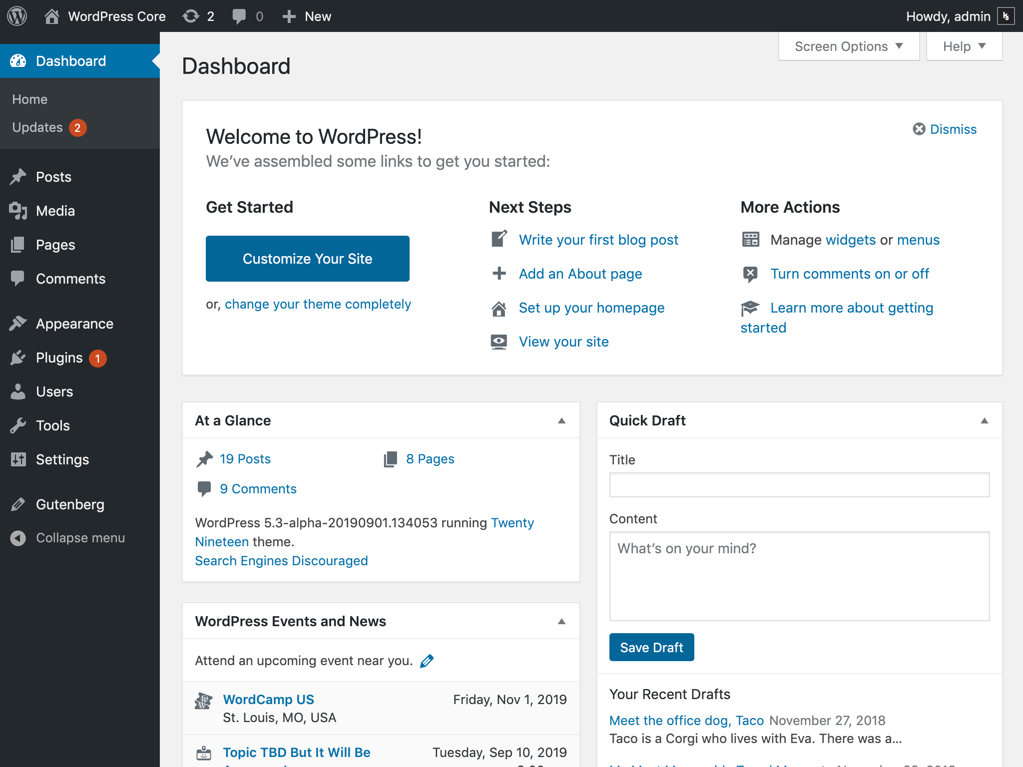
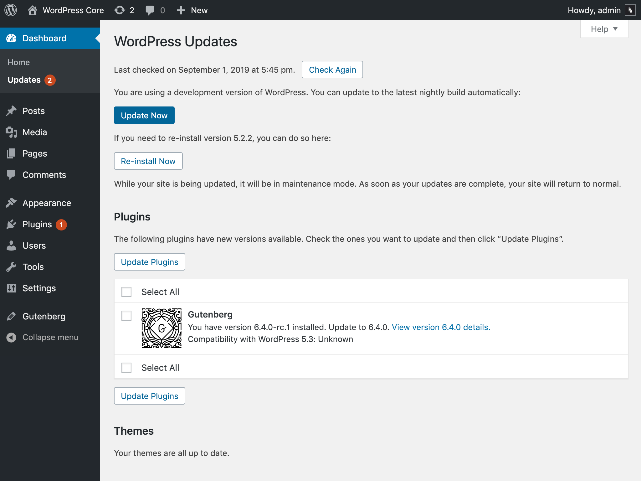
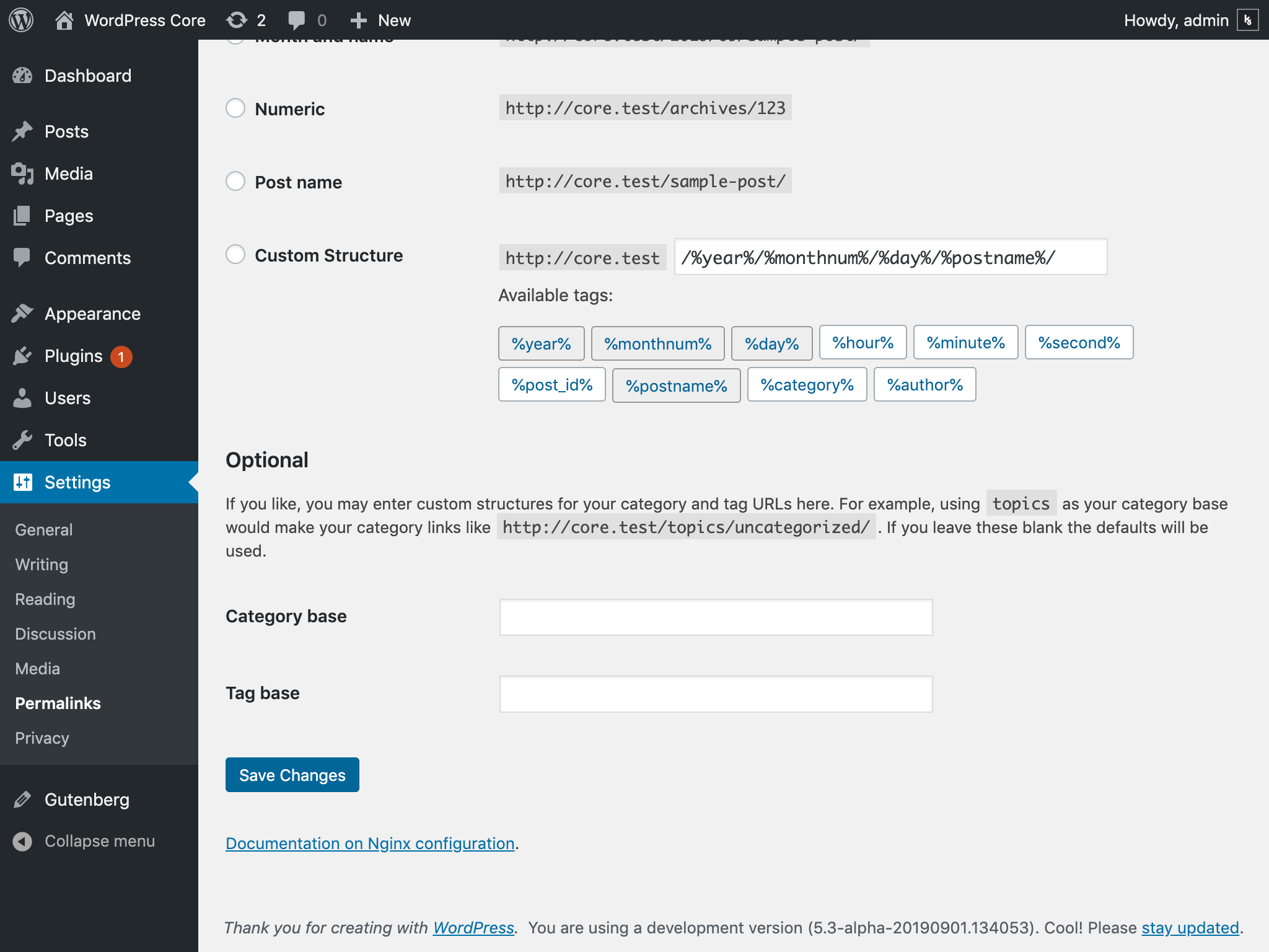
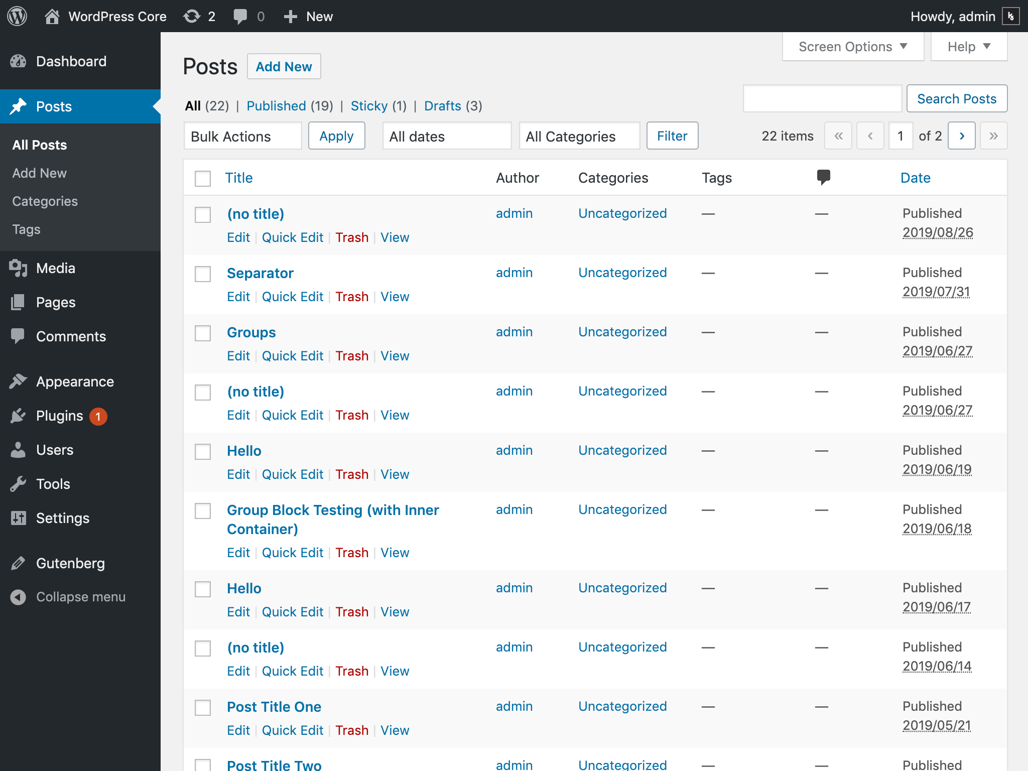
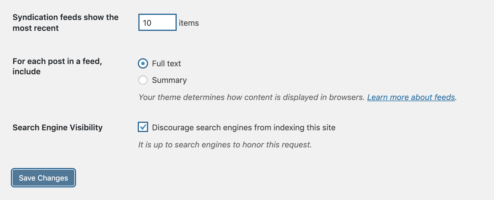
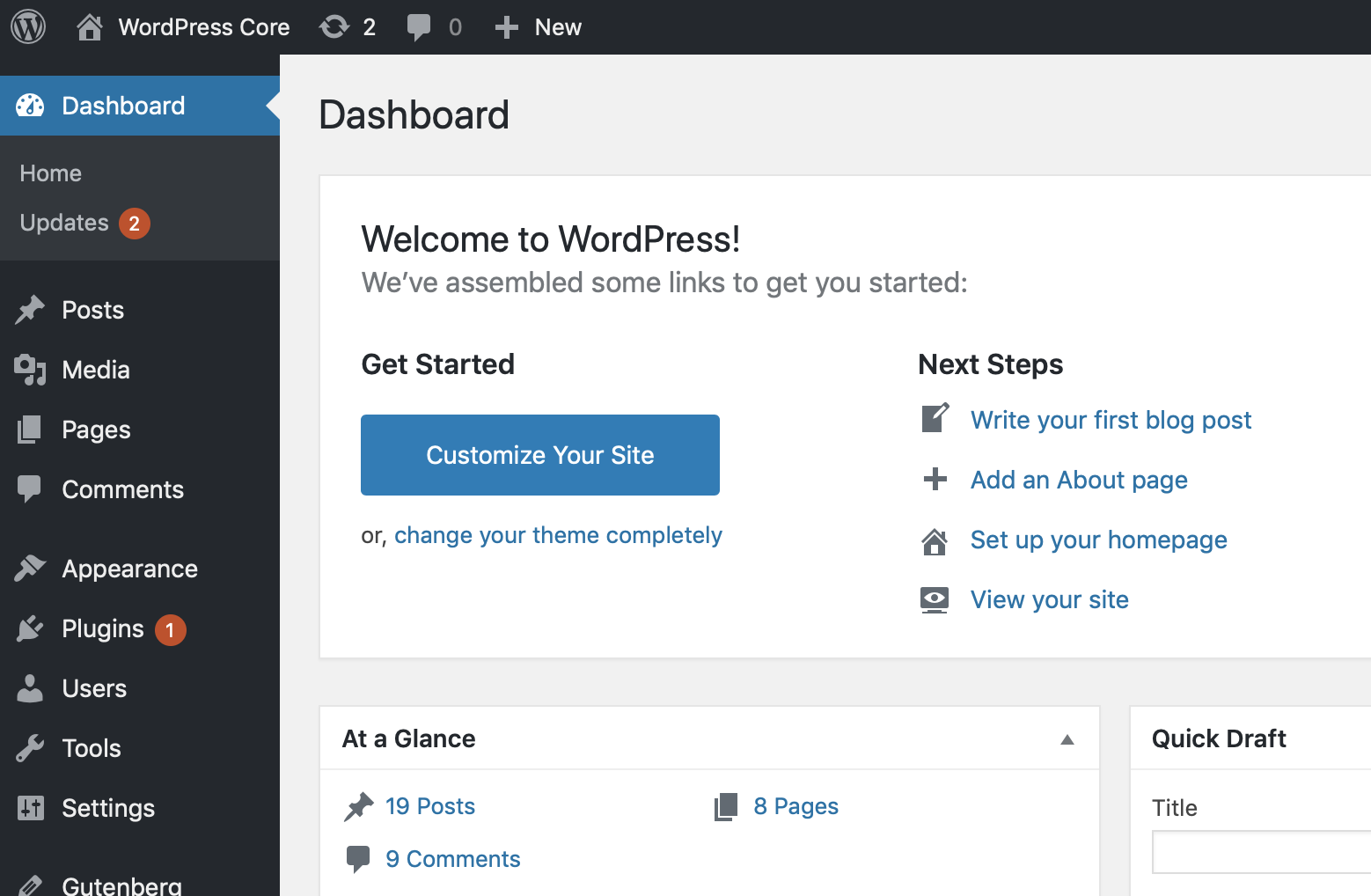
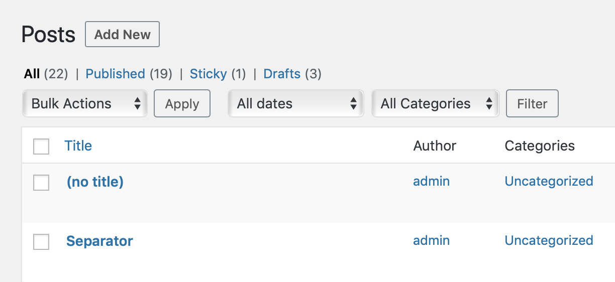
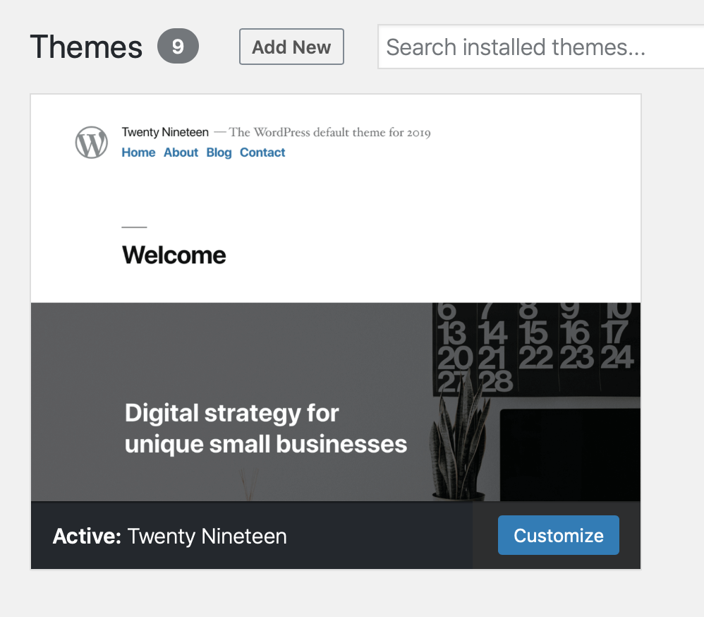
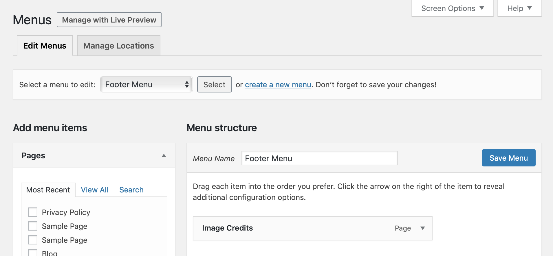


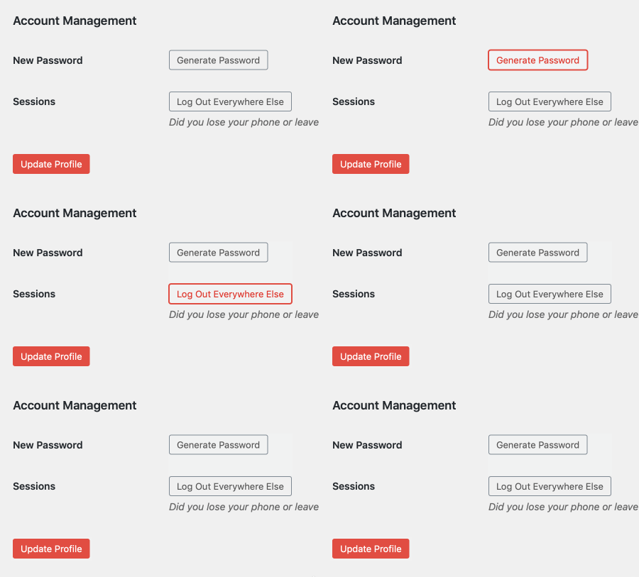


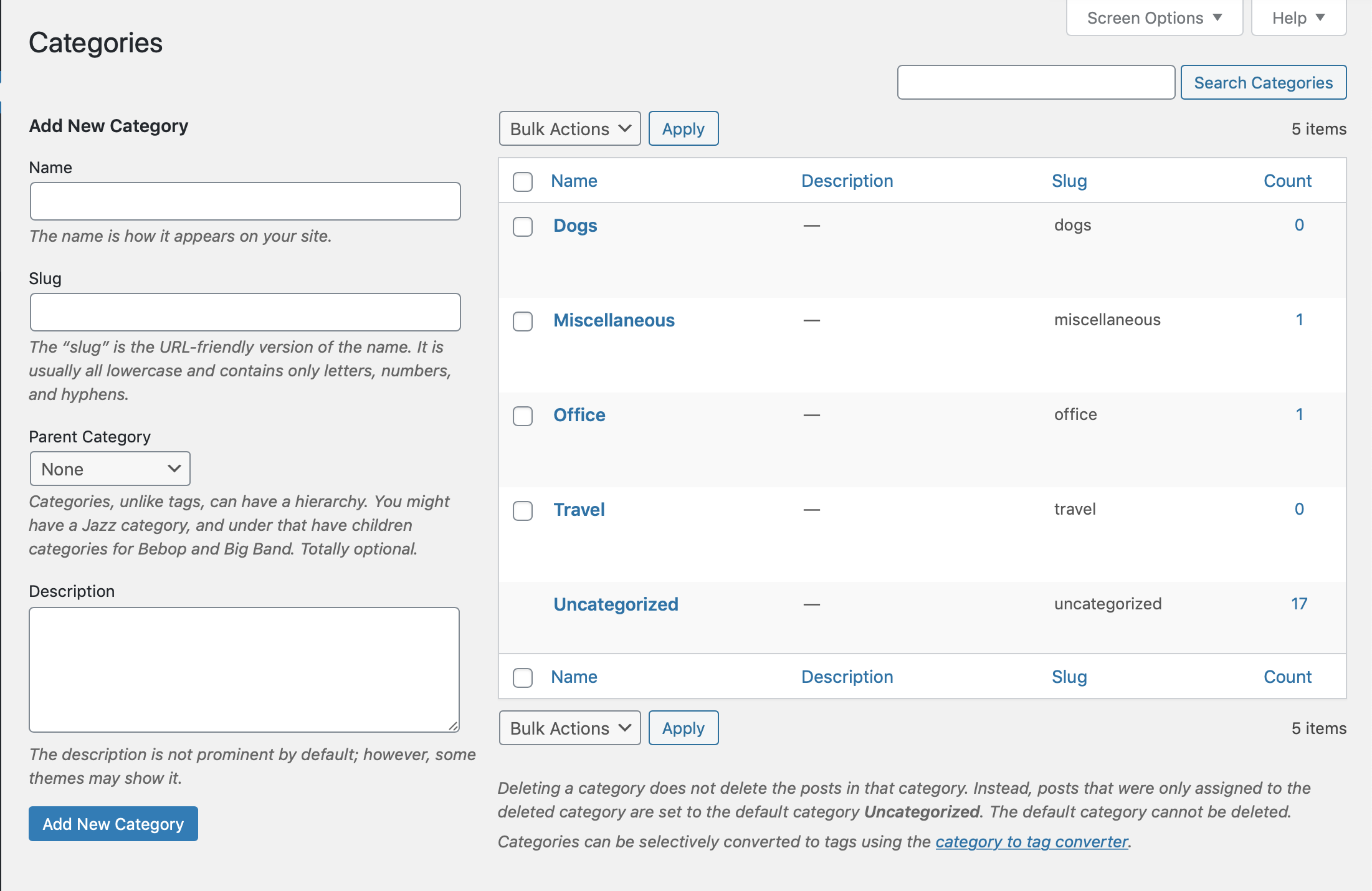
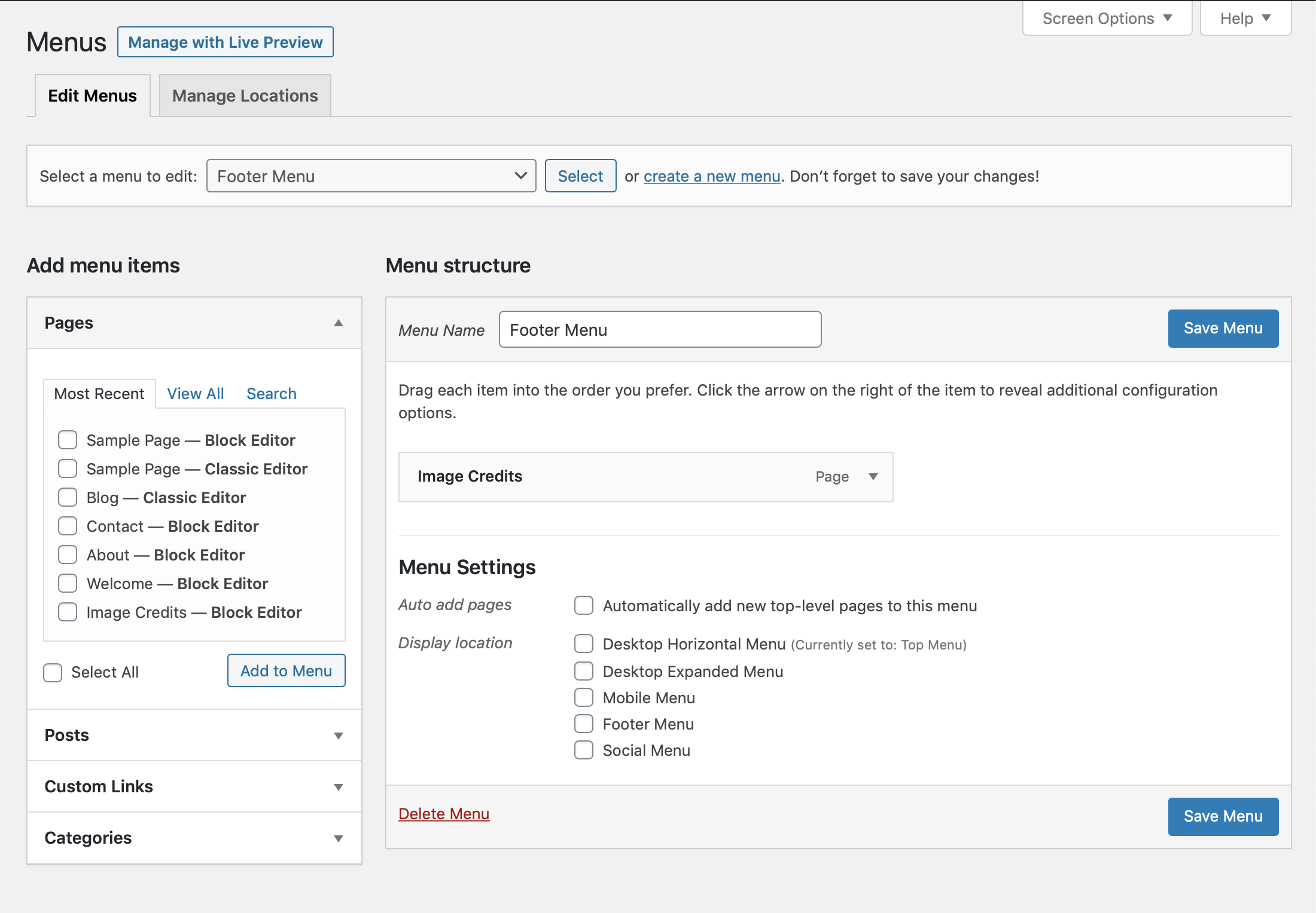


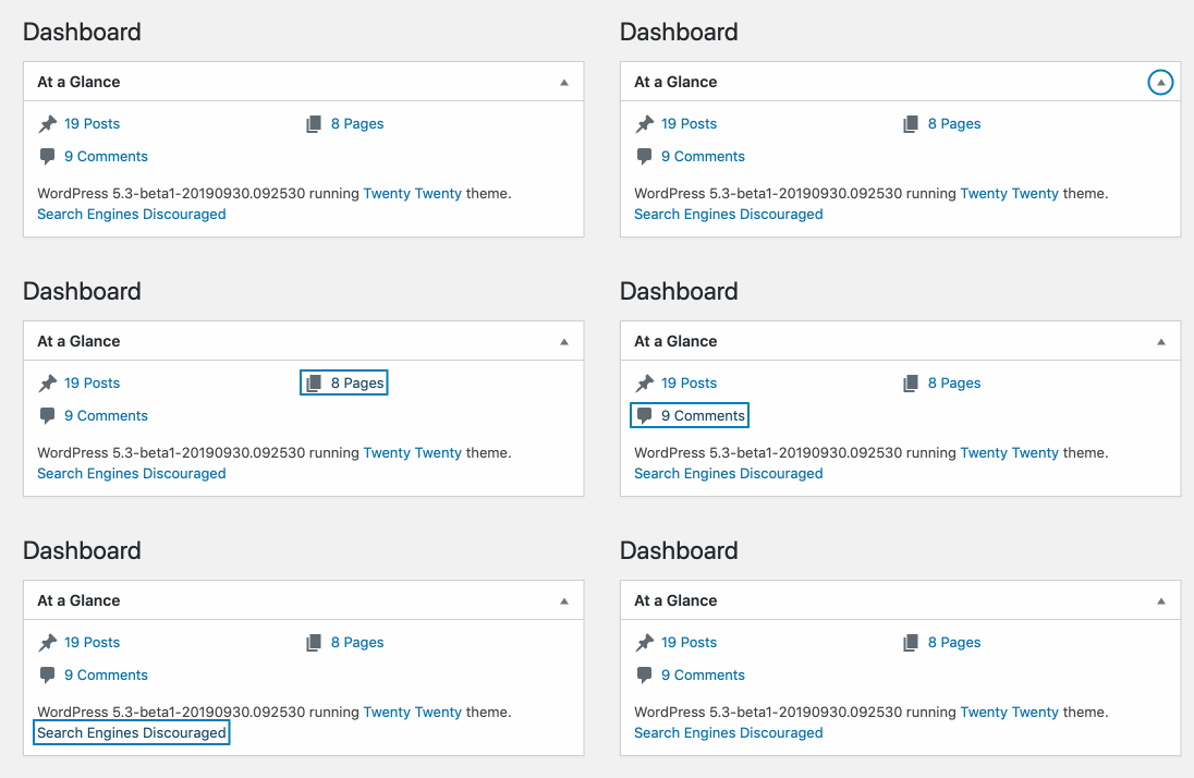
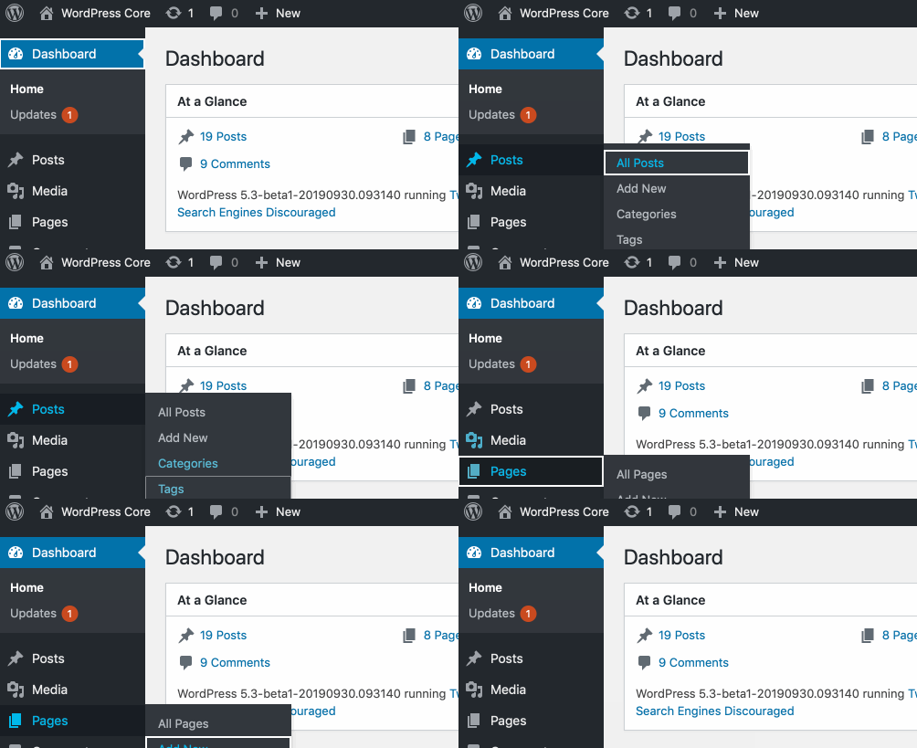
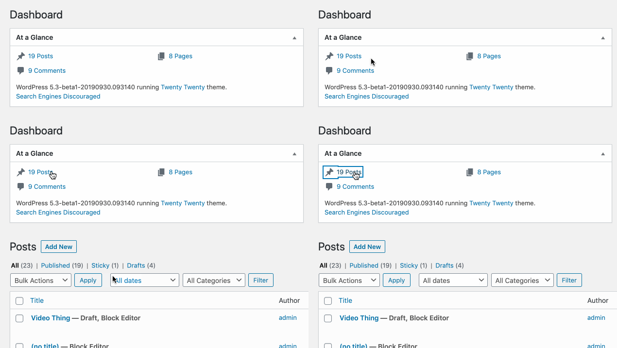


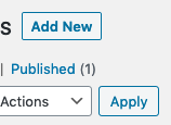


I'm all for improvements to the focus style, by the way I'd suggest to consider the focus style in real use scenarios, for example when buttons are close to other form elements, the focus style should be consistent. See what was done on #32915. Screenshot before and after the changes from #32915: