#48101 closed task (blessed) (fixed)
Use darker table + card borders across WP-Admin
| Reported by: |
|
Owned by: |
|
|---|---|---|---|
| Milestone: | 5.3 | Priority: | normal |
| Severity: | normal | Version: | |
| Component: | Administration | Keywords: | has-screenshots has-patch 5-3-admin-css-changes has-dev-note |
| Focuses: | ui, accessibility | Cc: |
Description
This ticket is a design change to accompany the higher-contrast changes in #47153, #47150, and #34904.
As discussed in make.wordpress.org/design, we should adjust the borders of tables and card elements so that their visual hierarchy is preserved alongside the darker field borders and buttons.
https://make.wordpress.org/design/2019/09/06/discussion-higher-contrast-form-fields-and-buttons/
This patch changes the borders to #ccd0d4 ($light-gray-700).
Effected elements:
- Table borders
- Screen meta links / help tabs
- Notices
- Welcome panel
- Postbox
- Post Status Info
- Card
- Health Check accordion + heading
- Theme + plugin upload forms
I may have missed a spot or two, so please make note of those if you come across anything.
cc @karmatosed, @audrasjb, @melchoyce
Screenshots
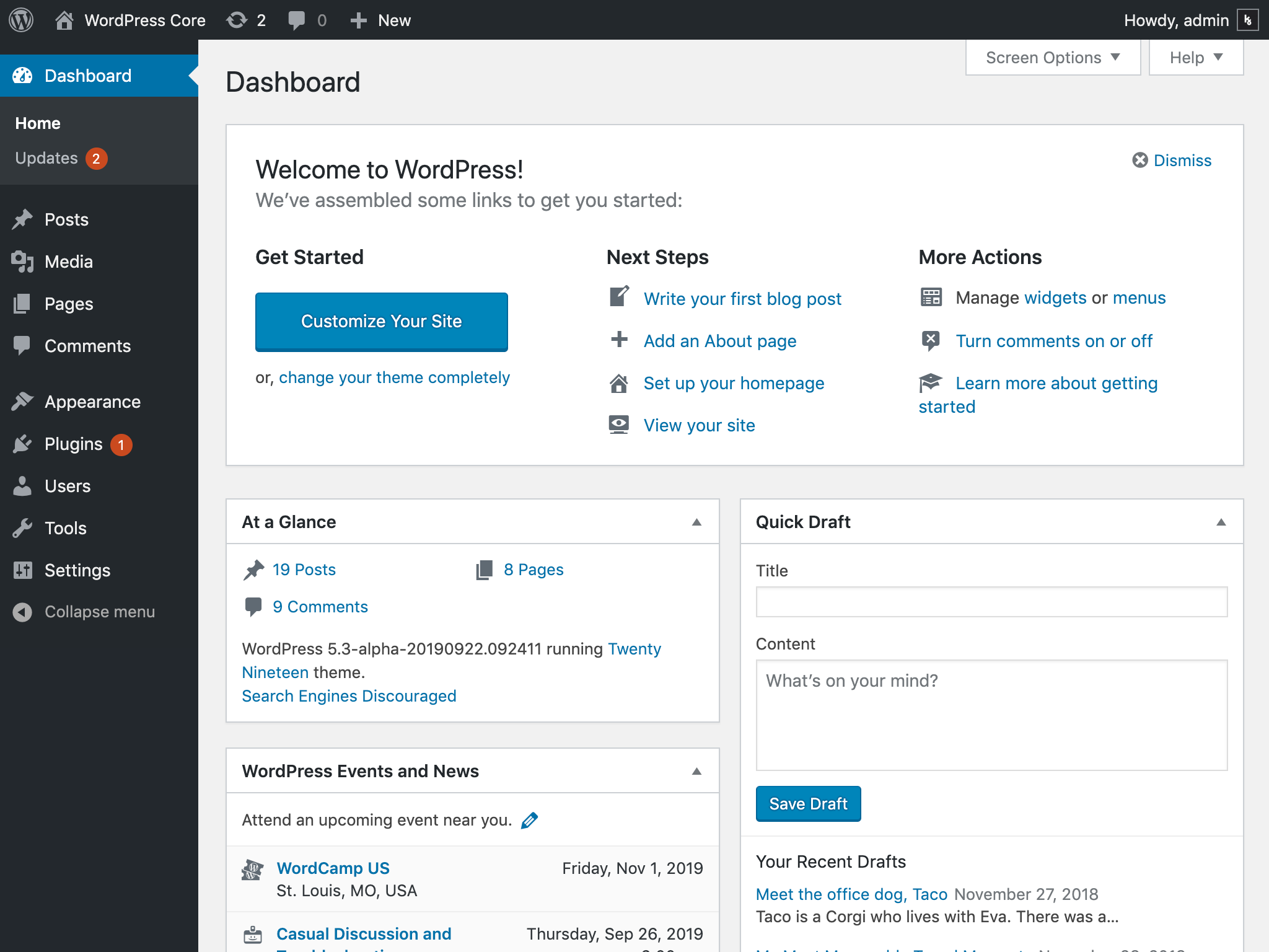
Dashboard (Current)
Dashboard (New)
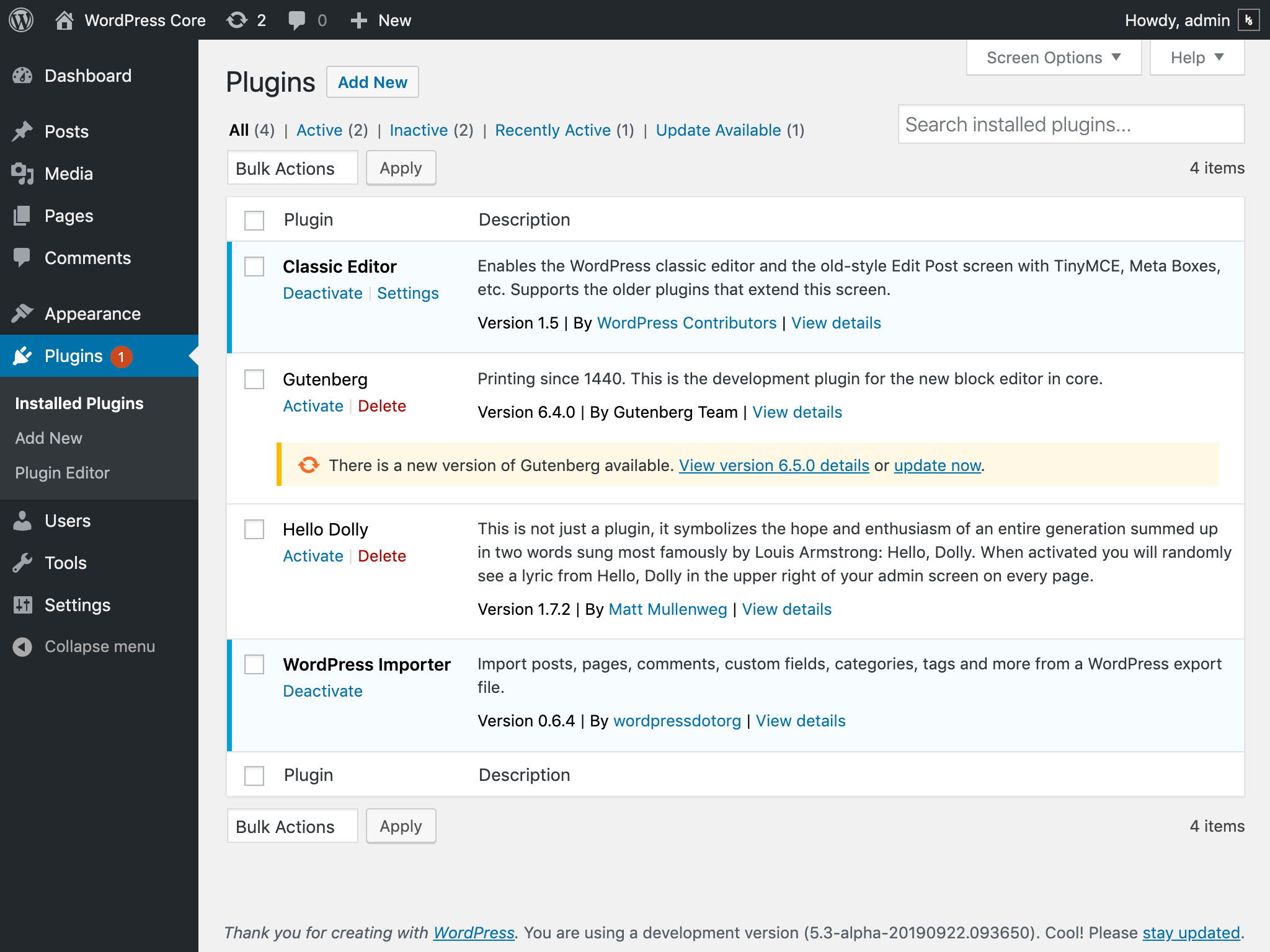
Plugins Page (Current)
Plugins Page (New)
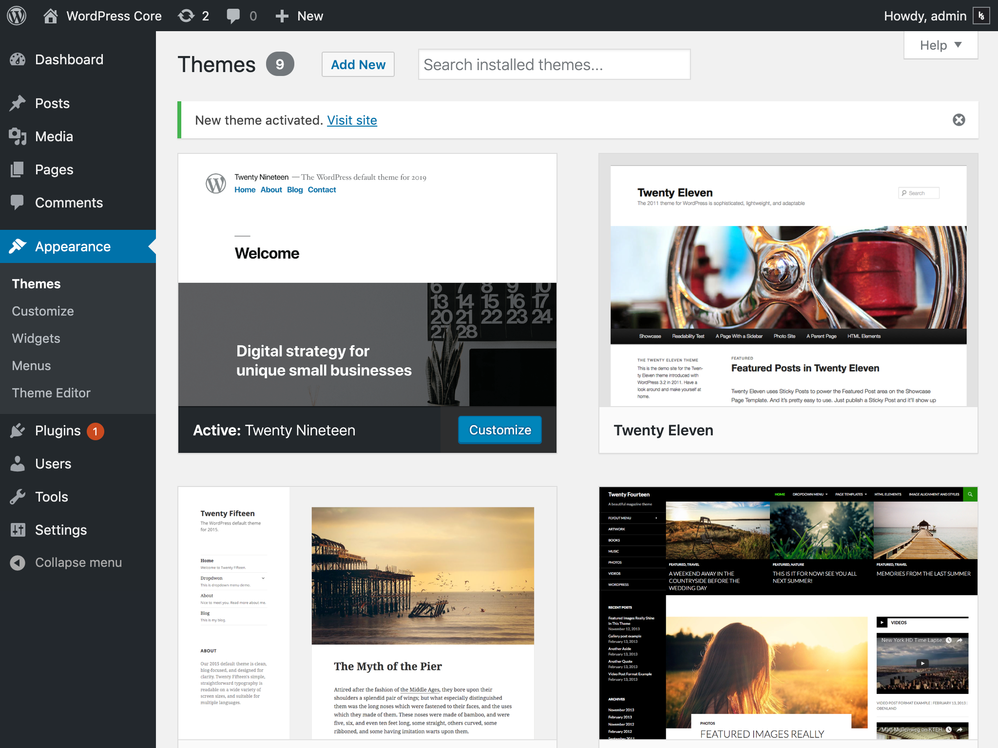
Themes Page (Current)
Themes Page (New)
Attachments (3)
Change History (24)

This ticket was mentioned in Slack in #accessibility by kjell. View the logs.
7 years ago
#4
 @
@
7 years ago
One other quick idea — we could ditch the borders and shadows on the various metaboxes and tables, and preserve borders for elements that need to stand out as interactive, and for elements that would benefit from additional division.
Did you add borders to the notices? I feel like the border looks really weird on those in the "after" version.

This ticket was mentioned in Slack in #design by melchoyce. View the logs.
7 years ago
#7
 @
@
7 years ago
Did you add borders to the notices? I feel like the border looks really weird on those in the "after" version.
I did. I'm not 100% convinced it's necessary, but the notices definitely receded to the background visually without them. That seemed unfortunate, since by definition, they're supposed to be noticed. 😄
One other quick idea — we could ditch the borders and shadows on the various metaboxes and tables, and preserve borders for elements that need to stand out as interactive, and for elements that would benefit from additional division.
I'm torn on this. I really like the feel of having no borders or drop shadows, but I think removing them really pushes the form fields and buttons forward visually... maybe a little too far? I'll try to get a patch going with this variation to try it out across more screens.

This ticket was mentioned in Slack in #accessibility by afercia. View the logs.
7 years ago
#9
 @
@
7 years ago
I did. I'm not 100% convinced it's necessary, but the notices definitely receded to the background visually without them. That seemed unfortunate, since by definition, they're supposed to be noticed. 😄
What if we upped the drop shadow instead?
Also — why is the border in that screenshot grey, not green?
#12
 @
@
7 years ago
Also — why is the border in that screenshot grey, not green?
That's my fault — I was messing with CSS in the inspector. Not a problem with the patch. 😅
#13
 @
@
7 years ago
FWIW I don't mind the new border style on the notices. The existing notices look slightly elevated (or has a slight dimension?), like the existing buttons, which seems strange to me because I think of inline notices as being on the same elevation plane as the rest of the UI (0).
Although, I know that there isn't much elevation in WP Admin, so it's not a huge deal.
The border on the notice does look a bit fuzzy in the update. Here is just a simple css border around the whole thing, no box-shadow:
Example of something similar: https://evergreen.segment.com/components/alert
I think this would also make the notice more resilient in more places, and not require a gray background to stand out.

This ticket was mentioned in Slack in #accessibility by kjell. View the logs.
7 years ago
#16
 @
@
7 years ago
- Resolution fixed deleted
- Status changed from closed to reopened
- Type changed from defect (bug) to task (blessed)

This ticket was mentioned in Slack in #accessibility by audrasjb. View the logs.
7 years ago

This ticket was mentioned in Slack in #core by marybaum. View the logs.
7 years ago
#20
 @
@
7 years ago
- Resolution set to fixed
- Status changed from reopened to closed
This one looks to have been reopened to allow for further updates, but there are no action items here that I can see. Going to close this out in favor of new tickets for follow up changes.


Reviewed/tested on my side and it's a +1 for me.
Many thanks @kjellr 👍
Adding
commitkeyword.