Opened 5 years ago
Last modified 3 weeks ago
#50696 accepted defect (bug)
UI & Accessibility issues in customizer menus section
| Reported by: |
|
Owned by: |
|
|---|---|---|---|
| Milestone: | 6.9 | Priority: | normal |
| Severity: | normal | Version: | 5.5 |
| Component: | Customize | Keywords: | has-screenshots needs-patch |
| Focuses: | ui, accessibility, css, administration | Cc: |
Description
I have found 2 issues in customizer menu section
1) Input box-shadow issue if the input is invalid.
2) Add button properly not display
I have attached an image for better understanding.
Attachments (6)
Change History (11)
#1
 @
@
5 years ago
- Keywords reporter-feedback added
Hi @dilipbheda,
What browser was used to generate these screenshots? Can you explain more what the box-shadow issue is?
#2
 @
@
5 years ago
- Keywords reporter-feedback removed
Hello @dlh
System info:
Server architecture: Linux 4.15.0-88-generic x86_64
Web server: Apache/2.4.29 (Ubuntu)
PHP version: 7.4.8 (Supports 64bit values)
Browser: Google Chrome ( Version 84.0.4147.89 (Official Build) (64-bit) )
Box shadow issue
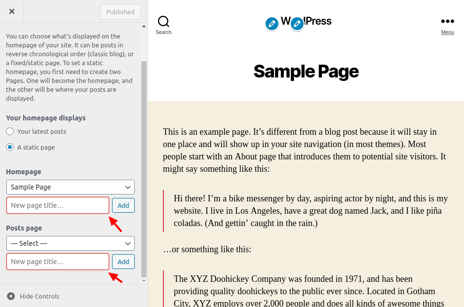
- Red box-shadow proper not displaying if the field is invalid and focus on input.
Go to - customize -> Homepage Settings -> Click on Add New Page
#3
 @
@
4 years ago
- Focuses accessibility added
- Keywords needs-patch needs-design added; has-patch removed
- Milestone changed from Awaiting Review to Future Release
I cannot reproduce the add button alignment issue. I can confirm the box-shadow issue, although the exact display is variable depending on the browser. The issue is that the "invalid" styling (border: 1px solid #d63638;) conflicts with the focus styling (blue box-shadow).
We need to maintain a visually distinct focus style even when the field is invalid. 50696.2.patch won't create enough of a distinction for this focus style. I would suggest using a different style for the invalid state, perhaps with a user notification for improved accessibility.
Can the design or accessibility teams weigh in on a preferred pattern for this?
#4
 @
@
3 weeks ago
- Keywords needs-design removed
- Milestone changed from Future Release to 6.9
- Owner set to joedolson
- Status changed from new to accepted
I'm going to change this to address the general accessibility issues about this input's error state. In addition to the visual indicator not meeting standards, the input does not produce a spoken error message and is not indicated as being invalid to screen reader users, and would be improved by visible error text.
These are both very fixable.
For design, I'd use the invalid state triggered by .form-invalid .form-required, which would be consistent with other similar cases.
Before apply patch