Opened 10 years ago
Closed 4 years ago
#33061 closed defect (bug) (fixed)
List table: colour comment bubble according to the scheme
| Reported by: |
|
Owned by: | |
|---|---|---|---|
| Milestone: | Priority: | normal | |
| Severity: | normal | Version: | 4.3 |
| Component: | Comments | Keywords: | has-patch close reporter-feedback |
| Focuses: | Cc: |
Description
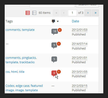
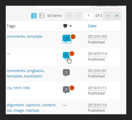
On hover the bubble is dark blue, which looks a bit weird in different colour schemes.
See #32152.
Attachments (4)
Change History (28)

This ticket was mentioned in Slack in #design by iseulde. View the logs.
10 years ago

This ticket was mentioned in Slack in #design by sam. View the logs.
10 years ago
#7
 @
@
10 years ago
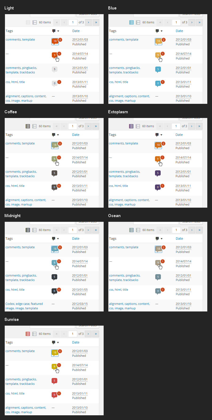
If we use the same variables for the default scheme though, it would be black and red on hover...
#11
follow-up:
↓ 14
 @
@
10 years ago
Thanks for making those screenshots. Yes, I don't think the colours are good.
If we used the same variables for the default scheme the default colour of the bubble would be black (same as the menu background).
#12
 @
@
10 years ago
It's probably better to have a grey variant as the default bubble colour and then the "active" colour for hover.
#13
 @
@
10 years ago
Above patch: keep grey bubble, $highlight-color on hover, $highlight-color for unapproved bubble.
#14
in reply to:
↑ 11
 @
@
10 years ago
Replying to iseulde:
Thanks for making those screenshots.
You're welcome :) Tested last patch and maybe just the Light color scheme would need the color text to be adjusted, maybe always white?
#15
 @
@
10 years ago
Override color: $text-color; with color: $menu-highlight-text; for the Light color scheme. Please double check, not so familiar with Sass here :)
#17
follow-up:
↓ 18
 @
@
10 years ago
I'm not really sure there's anything wrong with blue - links are blue, no matter the color scheme, and those are more directly surrounding and in context with the bubble than the menu chrome.
#18
in reply to:
↑ 17
 @
@
10 years ago
Replying to helen:
I'm not really sure there's anything wrong with blue - links are blue, no matter the color scheme
This is a good point.
I think we should punt this, as RC is imminent.
#19
 @
@
10 years ago
- Milestone changed from 4.3 to Future Release
Let's look at it again in a future release.


Maybe we could even consider colouring the grey too. Same colours as the view switch icons.