Opened 11 years ago
Closed 10 years ago
#33819 closed defect (bug) (fixed)
#a11y-headings - Add Themes
| Reported by: |
|
Owned by: |
|
|---|---|---|---|
| Milestone: | 4.4 | Priority: | normal |
| Severity: | normal | Version: | 4.3 |
| Component: | Administration | Keywords: | has-patch commit |
| Focuses: | ui, accessibility | Cc: |
Description
#a11y-headings
There are a few things happening on this screen:
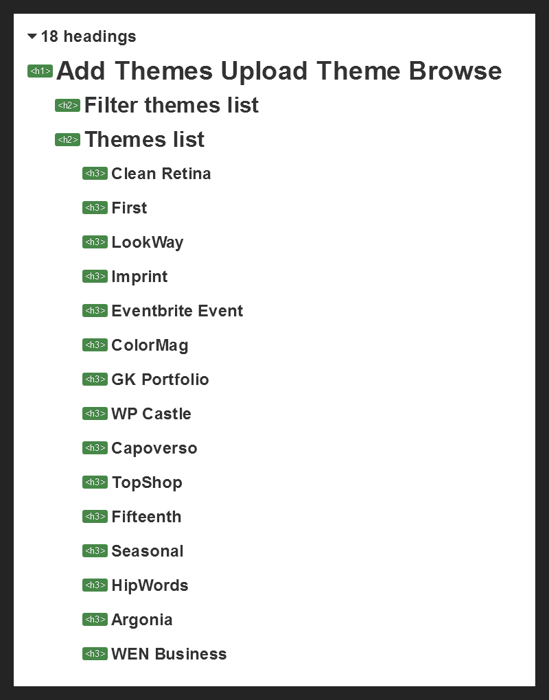
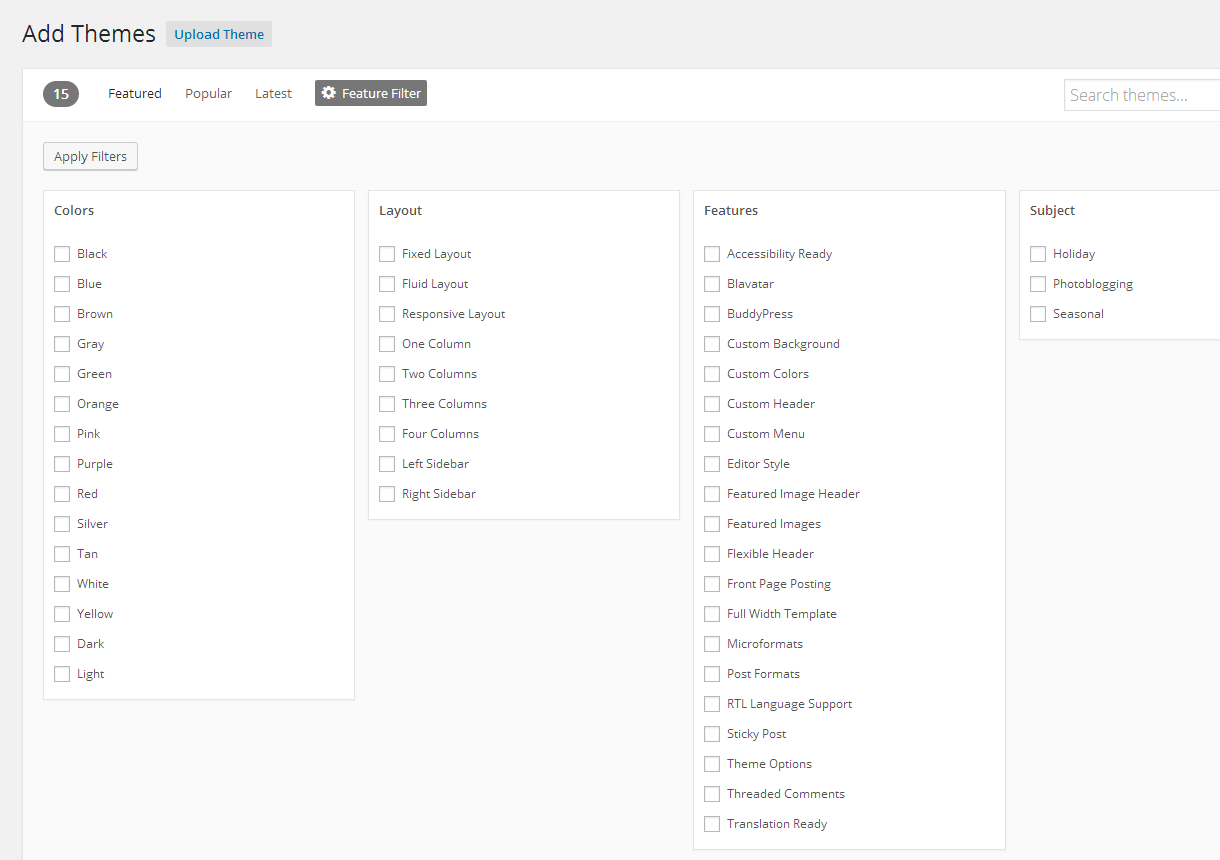
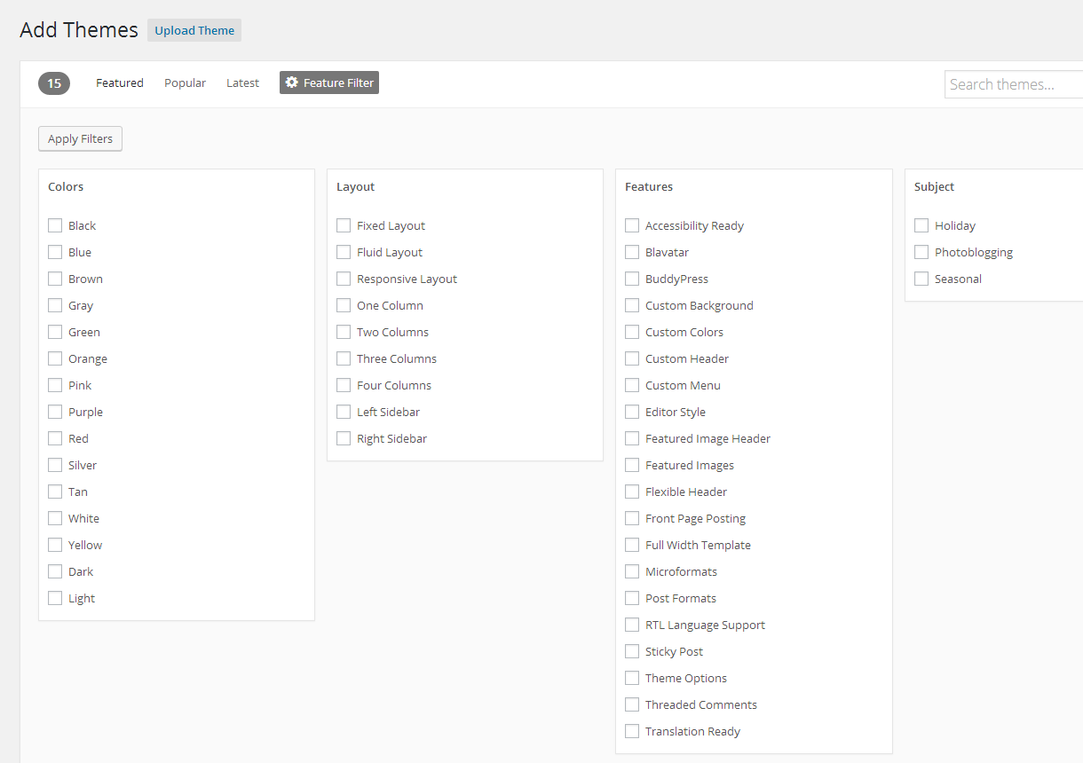
- The feature filter columns probably won't need to be headings. Especially since they are hidden until the Feature Filter button is triggered
- All themes are h3s, should either be removed or bumped up to h2
- Like on the "Add Plugins" page, there's another h2 on the page unrelated to the theme list called "Add New Theme" - which is actually hidden and seems to be a separate block:
When a theme is selected for preview, a new heading is added at the bottom with the name of the theme that's being previewed. Landing it squarely as a subheading under "Add New Theme", which kind of works but seems a little unnecessary:
Not too sure what to do here. Having everything at h2 makes having headings a bit moot.
The hidden "Add New Theme" h2 seems like a good candidate for removal, but I can't say if there is anything on the page that will make it re-appear at all.
Even if it's just removed as a heading, we'll then have duplicate headings whenever a theme is being previewed.
I'm inclined to say to remove all the headings but the h1.
Any thoughts?
Attachments (2)
Change History (25)
#2
 @
@
11 years ago
We should also consider the headings we would like to add and we're discussing in #32147 see the screenshot in the comment 11: https://core.trac.wordpress.org/ticket/32147#comment:11
Same for the Add Plugin screen, see #33818
#3
 @
@
11 years ago
- Milestone changed from Awaiting Review to 4.4
- Owner set to afercia
- Status changed from new to assigned

This ticket was mentioned in Slack in #accessibility by cheffheid. View the logs.
11 years ago
#5
follow-up:
↓ 7
 @
@
11 years ago
That's fair.
So then maybe we add a heading (visibly hidden or otherwise) that says "Available Themes" at h2 for the list of themes. That way we can leave those what they are for the time being.
Changing the feature filters to fieldsets seems reasonable to me too, should clean up the heading list too.
Is there already a similar ticket for the overlays?

This ticket was mentioned in Slack in #accessibility by rianrietveld. View the logs.
10 years ago
#7
in reply to:
↑ 5
 @
@
10 years ago
Replying to Cheffheid:
Is there already a similar ticket for the overlays?
I think there's no ticket yet. Thinking at the Theme preview/installer, the media views modal, the Customizer, and all the other modal dialogs in the admin, maybe we should discuss them a bit and open new tickets.
To move on with this ticket we'd really need a feedback about #32147.
#8
 @
@
10 years ago
Consider for example the Themes install screen before applying the patch from #32147, see the screenshot on the left. The headings hierarchy clearly misses some headings to identify the main sections, most noticeably the Themes list.
Then see the screenshot on the right: the filters section has now its own heading, the Themes list too. We should change just the "feature filter" H4. The new headings are exactly what we'd need and they're already proposed in the #32147 patch. This applies also to the Plugin install screen, see #33818.

This ticket was mentioned in Slack in #core by afercia. View the logs.
10 years ago

This ticket was mentioned in Slack in #core by afercia. View the logs.
10 years ago
#12
 @
@
10 years ago
Forgot one thing: I'd suggest to don't set the feature filter font size to 12px. Is really too small. The default 13px would also better align checkboxes and labels. Any thoughts more than welcome.

This ticket was mentioned in Slack in #accessibility by afercia. View the logs.
10 years ago
#14
 @
@
10 years ago
As far as I see there are a couple of UI things left here that would need some UI feedback:
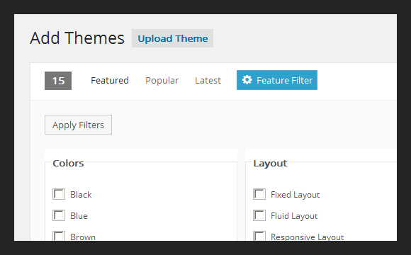
- test in modern IE, especially about the Feature Filter legend position, which is a bit tricky in IE. We could wrap the fieldsets in a
<div>and style the div instead of the fieldset but I'd like to avoid adding markup just to solve browsers bugs. Any thoughts more than welcome. - consider to increase the checkbox labels font size from 12px to 13px (which is the default: i.e. remove the font-size declaration)
cc @helen :)

This ticket was mentioned in Slack in #accessibility by cheffheid. View the logs.
10 years ago

This ticket was mentioned in Slack in #design by afercia. View the logs.
10 years ago

This ticket was mentioned in Slack in #accessibility by afercia. View the logs.
10 years ago
#19
 @
@
10 years ago
I've tested 33819.patch and both the fieldsets and their corresponding legends look fine in IE9, IE10 and IE Edge (tested on Windows 8.1, IE version 11.0.9600.18053).

This ticket was mentioned in Slack in #design by afercia. View the logs.
10 years ago
#22
 @
@
10 years ago
- Keywords commit added
Refreshed patch, agreed with @helen to don't fix the legend color for IE 8 to keep things cleaner and because at some point we have to start accepting small visual glitches in outdated browsers, as long as they don't harm anything.
P.S. any other visual change is out of the scope of this ticket, about the proposed font-size change from 12px to 13px feel free to open a separate ticket.


I'd say this screen is maybe one of the most complicated and has a few issues worth discussing, as @Cheffheid pointed out.
<fieldset>and so the currenth4are perfect candidates to be the fieldsets legend. Also, I don't see the need to have the feature group marked up as an ordered list.<dl>?). I understand this would require to rework many things (PHP and JS templates) so maybe we could just switch the<h3>to<h2>for now.! themes.isInstallin/wp-admin/js/theme.jsh1as done in (almost) all the other admin modals.