#35483 closed defect (bug) (fixed)
Accessibility improvements for the Bulk Edit form
| Reported by: |
|
Owned by: |
|
|---|---|---|---|
| Milestone: | 6.0 | Priority: | normal |
| Severity: | normal | Version: | |
| Component: | Quick/Bulk Edit | Keywords: | has-screenshots title-attribute has-patch commit |
| Focuses: | ui, accessibility, javascript | Cc: |
Description
Splitting this out from #34756.
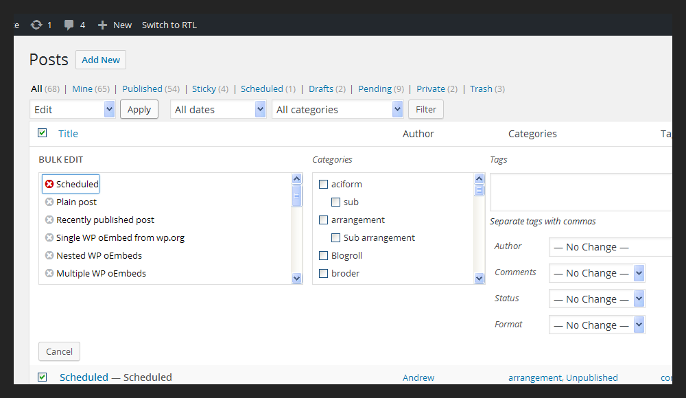
In order to make the Bulk Edit usable with a keyboard, all controls should be built with elements that natively support keyboard interaction. The delete "X" links should be buttons and the actionable area should be a bit bigger, thinking also at the responsive view on smaller screens.
When opening the form, focus should be moved to the first focusable form element:
The list of items should be marked up as a list, so screen readers will announce the total number of items selected.
Title attributes should be removed from the items titles in favor of aria-label attributes that should contain the item title e.g.:
'Remove %s from Bulk Edit'
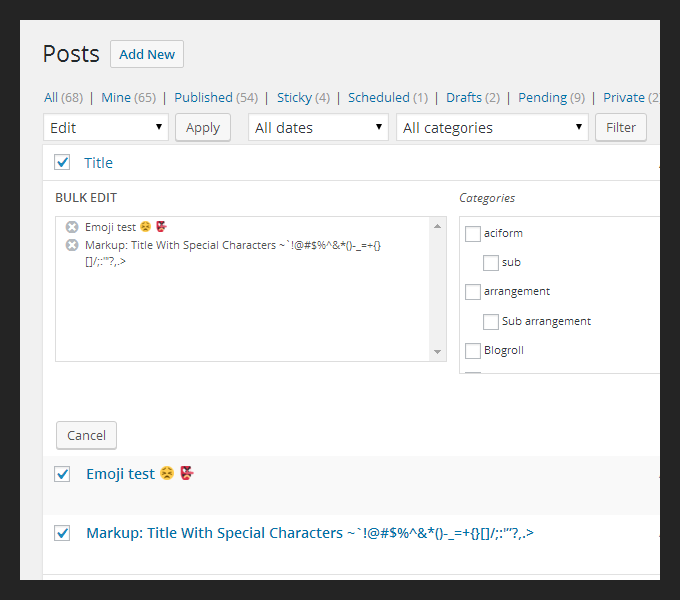
Worth noting post titles might contain emojis and special characters that should be removed or escaped before being used in a HTML attribute:
When removing items from the list, focus should be moved to the previous or next item and when there are no more items, probably to the "Cancel" button.
Adding a role=form and an aria-labelledby attribute will make screen readers announce the "Quick Edit" legend. I'd propose to add a description for the tags textarea, for semantics, accessibility, and also for consistency with other Tags boxes in the admin.
Lastly, I'd strongly recommend to make the font-size a bit bigger :) Currently, it's set to 12px and for some labels to 11px, I'd say definitely too small for today's screens.
Attachments (10)
Change History (49)
#1
 @
@
8 years ago
- Keywords has-patch has-screenshots added
- Owner set to afercia
- Status changed from new to assigned
#2
follow-up:
↓ 3
 @
@
8 years ago
Few things:
- Focusing on the first "remove" button seems wrong. This is far from being the "default" action. Users open Bulk Edit to change some post settings, not to remove posts from there :)
- Making the whole post title inside the bulk edit list clickable doesn't work well. The "active" part there should be only the (x) icon as before. It is too easy to remove a post from bulk editing by clicking the that title by mistake.
- The "structural" css needs a bit more work. I agree the purpose here is not a complete refactoring but making the right half a bit more responsive would be much better.
When removing items from the list, focus should be moved to the previous or next item and when there are no more items, probably to the "Cancel" button.
Thinking we should standardize on either the previous or the next (if both exist). We should probably close Bulk Edit when no more items left. New items cannot be added there.
Would greatly appreciate feedback about the best way to escape and clean up from Emojis the string to use as aria-label.
To escape we only need to do $( element ).text(). Not sure about removing emoji and other special chars from the post titles. They are in the titles in the list-table and will be in the titles on the front-end. Perhaps we should wrap the copied post titles in spans with auto-generated IDs and use aria-labelledby? Then a "row" in the Bulk Edit list would look like:
<li><button aria-labelledby="bulk-edit-1">Remove (hidden offscreen)</button><span id="bulk-edit-1">Copied post title</span></li>
#3
in reply to:
↑ 2
 @
@
8 years ago
Replying to azaozz:
To escape we only need to do
$( element ).text().
Thanks @azaozz will try to address all the points. About escaping/encoding, tried that as first thing but if I'm not wrong characters like ">" will be treated like text so won't be encoded and will be used as ">" within the aria-label attribute, breaking the HTML :(
#4
 @
@
8 years ago
I just wanted to make this form usable with a keyboard ;) but yep, seems there are many usability issues to solve. Will try to be as short as possible and maybe it would be nice to discuss this a bit longer on Slack.
Initial focus
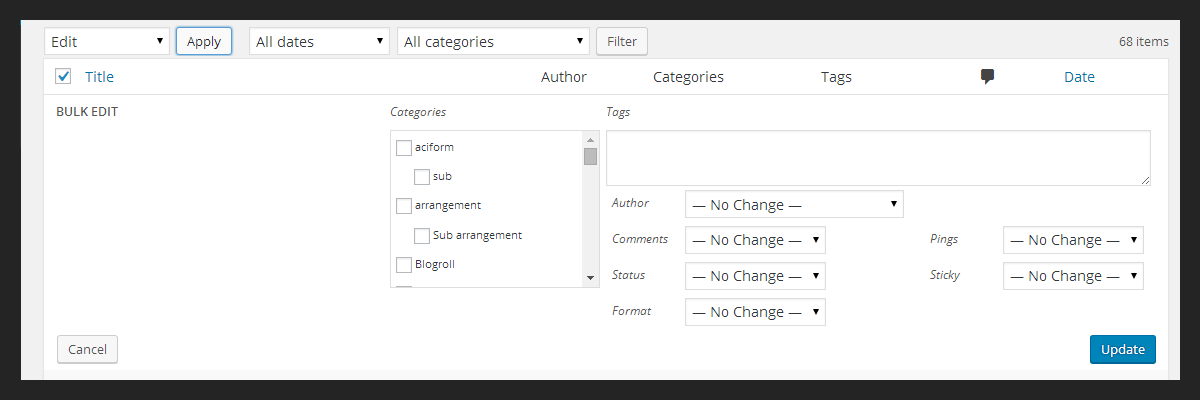
Should be set on the first form element. If in a linearised workflow like when using only the keyboard the remove buttons feel wrong as first thing, then I'd say they shouldn't be the first thing in the form in the first place. It's a bit tricky since many form elements get printed out conditionally, depending on the features supported by the post, user capabilities, how many registered taxonomies... For example, when a post type doesn't support title what is printed out is, err.. this:
Maybe move the titles at the end of the form as a last check to do before saving would make more sense? We're moving towards a complete refactoring though :)
"Remove buttons" size
Sure, they can use just the "x", thinking on small screens they should be at least 40x40 pixels though.
Move focus to the previous or next remove buttons
Thought it's already the previous one by default? If there's no previous one, will use the next one.
Automatically closing the form when no more items left would be a bit confusing for screen reader users I guess, not sure about this but worth experimenting a bit, maybe using also an audible message
The "structural" css needs a bit more work
I agree. Maybe open a separate ticket? Would need a re-think since many elements are printed out conditionally (see above)

This ticket was mentioned in Slack in #accessibility by afercia. View the logs.
8 years ago
#6
 @
@
8 years ago
Second pass:
- the "remove buttons" are now smaller (just the "X")
- when removing items and no more items left, the form closes and an audible feedback message gets dispatched to the WP Speak live region
- first round of CSS improvements, especially for the responsive view
Still to discuss: initial focus and the bulk titles list.

This ticket was mentioned in Slack in #core-editor by afercia. View the logs.
8 years ago
#9
 @
@
8 years ago
- Milestone changed from 4.5 to Future Release
I'm afraid I won't have so much time in the next couple weeks to look at this, moving to future release. If someone wants to take a stab at this, please do feel free to re-milestone.

This ticket was mentioned in Slack in #accessibility by afercia. View the logs.
7 years ago
#11
 @
@
7 years ago
Discussed this in the #a11y meeting today, and agreed that there are only two practical options for an initial focus.
1) Add a 'cancel' button as the first focus item, with text like Bulk editing ''n'' posts. Cancel?
2) Add a focusable paragraph with text like Bulk editing ''n'' posts., to give people context for where they've landed.
This is an important change for usability of bulk editing for accessibility, so this needs to be settled in some way. The focusable paragraph doesn't necessarily need to be visible, as this is primarily to provide a keyboard focus landing point and screen reader context.

This ticket was mentioned in Slack in #accessibility by afercia. View the logs.
6 years ago
#13
 @
@
6 years ago
Identifying the initial focus is definitely challenging, and we need to start thinking a little out of the box. I think we should treat this panels similarly to a modal, and assign an initial focus to 'cancel', constraining focus within the bulk edit panel while it's open. This would give us a clean, actionable initial focus, and potentially simplify the overall editing experience for many users.

This ticket was mentioned in Slack in #accessibility by sabernhardt. View the logs.
3 years ago
#18
 @
@
2 years ago
- Keywords needs-patch added; has-patch removed
- Milestone changed from 5.9 to Future Release
Could switching the set of remove links to checkboxes help here?
(Fixing this in less than two weeks is unlikely, so I'm moving it to Future Release for now.)
#19
 @
@
2 years ago
- Keywords has-patch needs-testing added; needs-patch removed
- Milestone changed from Future Release to 6.0
- Owner set to afercia
Looking back at this ticket, the list of posts to be bulk-edited is still not operable with a keyboard. This needs to be fixed.
The two remaining points that still need to be solved are:
- Initial focus when opening Bulk Edit.
- Escaping of emojis and special characters in the post title.
- Both Bulk Edit and Quick Edit are now wrapped within a new
<div>element with classinline-edit-wrapper. - This new
<div>element:- Has a
role="region"attribute. - It's labelled with and
aria-labelledbyattribute that points to the visible first fieldset legend e.g. 'BULK EDIT'. - Thanks to these two attributes, it becomes an ARIA landmark, which is an added bonus as landmarks can be easily found by assistive technology users.
- Has a
- Initial focus for Bulk Edit:
- As pointed out in the previous comments, there's no clear 'default action' where to move focus to.
- Therefore, the new patch sets initial focus on the ARIA region that wraps Bulk Edit.
- When the ARIA region receives focus, screen readers will announce the region role and label.
- The ARIA region will also show a clear focus style.
- Initial focus for Quick Edit:
- No change: the post title field will receive initial focus.
- I'd recommend to consider to set initial focus to the ARIA region also in this case, for consistency.
- Escaping of emojis and special characters:
- The remove buttons don't use an
aria-labelattribute any longer so there's no need to escape the post title for use in a HTML attribute. - Instead, the buttons now use visually hidden text: this is content, no different from the visible post title, and can contain emojis and special characters.
- The remove buttons don't use an
Some code review and testing would be greatly appreciated.

This ticket was mentioned in Slack in #core by abhanonstopnews. View the logs.
2 years ago

This ticket was mentioned in Slack in #core by abhanonstopnews. View the logs.
2 years ago
#22
 @
@
2 years ago
Update: I'll do some review to see if the issues are fixed, then we can recheck at next week's scrub (28-3-2022).

This ticket was mentioned in Slack in #accessibility by ryokuhi. View the logs.
2 years ago

This ticket was mentioned in Slack in #core by abhanonstopnews. View the logs.
2 years ago
#25
 @
@
2 years ago
- Keywords 2nd-opinion added; needs-testing removed
@afercia In the post title source that theTitle pulls, the emoji is an <img> with an alt attribute containing the emoji character. As a result, calling .replace( /<.[^<>]*?>/g, '' ) removes the emoji. So I'm not sure that problem is solved. Is this replacement necessary? If we can assume that the source is already escaped in PHP, I'm not sure we need to do this.
Other than that, this looks like it works well to me. I'd appreciate a second opinion on the necessity of escaping the JS post title; but if we end up still losing the emoji in the screen reader text, I'd still think this can be committed.
Everything works well as far as I can see.
Tested in NVDA/Chrome, Jaws/Firefox, Jaws/Edge.
#26
 @
@
2 years ago
There aren't a lot of examples of data passed from PHP into JS via wp.i18n, but in plugin-install.js the plugin title is passed without escaping. Also noting @swissspidy's comments on escaping in JS internationalization.
So, overall, I don't think this is necessary.
#27
 @
@
2 years ago
@joedolson thanks for testing. On my side (macOS), the emoji is a Unicode character. See attached screenshot. If I recall correctly, it depends on the operating system / browser native support for emojis. It there's no support, an image is used instead of the Unicode character.
Curious to know how the emoji is rendered within the post title aria-label attribute for you.
Regardless, removing the escaping is fine by me, if there are no objections.
There's one pending item:
- Do we want to set initial focus on the ARIA live region also for the Quick Edit form?
#28
 @
@
2 years ago
@afercia Interesting. It's also rendered as an emoji within the aria-label for me, but is an img in the post title itself.
Re: quick edit. I could go either way, but I think that having the initial focus land on the first editable field makes more sense when that field is the post title for a single post than when it's a removal button for one of a group of posts, as it would be in bulk edit. From a speed perspective, setting focus to the container just adds an extra tab stop and I don't see that you get any helpful extra information from that.

This ticket was mentioned in Slack in #accessibility by joedolson. View the logs.
2 years ago
#30
 @
@
2 years ago
If there are no other opinions on the focus setting for quick edit, we'll just have to decide on one. In my opinion, there are enough differences inherent in the bulk edit vs quick edit interactions that I don't see a benefit to setting the focus the same in both.
I'd really like to get this important change into this release; so if there's no further debate, I'll probably just review & commit soon.
#33
 @
@
2 years ago
- Keywords needs-patch added; has-patch removed
- Resolution fixed deleted
- Status changed from closed to reopened
Noticed that this change affects the Categories / Tags quick edit form. It now misses some padding, see attached screenshot.
Will prepare a patch.
#34
 @
@
2 years ago
- Keywords has-patch added; commit needs-patch removed
In 35483.4.diff : the easiest way to fix the missing padding for terms is by adding the same wrapping <div> element used for posts. This will also bring in some additional benefits, for example a slightly increased font size on desktop and mobile.
I checked all the places in core where the inline-edit-row CSS class is used and I couldn't find other relevant visual glitches.
To test:
- Quick edit a category or tag.
- Check the Quick Edit form does have some padding.


First pass. In the screenshot below, NVDA reading out content while opening the form and navigating and removing items from the items list. Also, the patch uses
wp.a11y.speak()to dispatch to screen readers an audible confirmation message when removing items.Would greatly appreciate feedback about the best way to escape and clean up from Emojis the string to use as
aria-labelcc @azaozz :)