#41612 closed enhancement (fixed)
"URL" field in Media Modal confusing for newer users
| Reported by: |
|
Owned by: |
|
|---|---|---|---|
| Milestone: | 5.2 | Priority: | normal |
| Severity: | normal | Version: | |
| Component: | Media | Keywords: | has-screenshots has-patch commit |
| Focuses: | ui, accessibility | Cc: |
Description
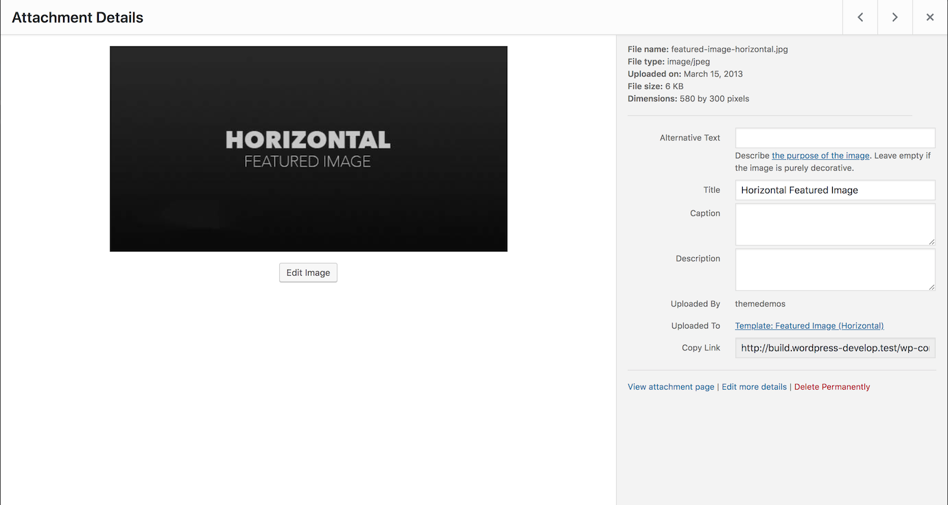
When testing the image widget recently, I found that many of the folks I tested with confused the image URL field with a place to add a link to their image. It says "URL," so people expect they can select and paste a URL into it. It's also is automatically focused when you select an image, which immediately draws some attention to it.
We could consider reorganizing this sidebar so that that the URL is placed either lower down, or in a different location, and have something like “Title” first. We could also, at the very least, consider updating the Image URL label, maybe even just from “URL” to “Image URL?”
Attachments (5)
Change History (57)
#2
in reply to:
↑ 1
 @
@
8 years ago
Replying to afercia:
and maybe move the alt text up, since it's even more important than "Title"
Could also be a good to tell people in a sentence why they should add alt text. Maybe even quickly describe all of the fields and what they do... I'll think about this and try sketching some ideas :)

This ticket was mentioned in Slack in #accessibility by afercia. View the logs.
8 years ago
#5
 @
@
8 years ago
- Milestone changed from Awaiting Review to 5.0
Played a bit with this and re-ordering fields, changing text, adding some info for the alt-text seems doable. However "Image URL" wouldn't be appropriate because there are different kinds of attachments. On the other hand, "Attachment URL" is a bit too long and breaks in 2 lines...
I;d try to limit the changes to text and re-ordering fields though. Thoughts?
#8
 @
@
8 years ago
- Keywords has-screenshots added
Hi @melchoyce @afercia
Here is a first workaround for this ticket (see screenshot above):
- URL field: moved to the bottom. I replaced "URL" label with "Permalink", so it's more relevant, not relative to media mime type and ok for the UI.
- Alt text field: moved just after the title (which is not the title html attribute but the Title of the media in the media library) and I added a description for this field.
If it seems ok for you, I can make the patch. If not… let me know! :)
Cheers,
Jb
#9
 @
@
8 years ago
- Keywords has-patch added
Ok finally here is my first patch for this ticket.
Tested, works as (I) expected :D

This ticket was mentioned in Slack in #accessibility by audrasjb. View the logs.
8 years ago
#11
 @
@
7 years ago
Re: the field being automatically focused, there's a pending patch on #43169 waiting for review since a few months.
I'd also like to remark, kindly, that this ticket was created 14 months ago and still there's no feedback from the Media component maintainers.

This ticket was mentioned in Slack in #accessibility by rianrietveld. View the logs.
7 years ago
#13
 @
@
7 years ago
- Milestone changed from 5.0 to 4.9.9
Discussed during today's accessibility bug-scrub an agreed we'd like to propose this for 4.9.9 consideration.
#14
 @
@
7 years ago
- Milestone changed from 4.9.9 to Future Release
Sounds like 4.9.9 is off, so I'm punting this to a future release.
#18
 @
@
7 years ago
- Milestone changed from 5.0.3 to 5.1
Hello,
5.0.3 is going to be released in a couple of weeks.
It doesn't appear this ticket can be handled in the next couple of weeks (still needs feedback from media/design component maintainers/team). Let's address it in 5.1 which is coming in February. Feel free to ask for changing the milestone if you think this issue can be quickly resolved.
Cheers,
Jb
#21
 @
@
7 years ago
- Keywords dev-feedback removed
- Milestone changed from Future Release to 5.2
- Owner set to audrasjb
- Status changed from new to assigned
#22
 @
@
7 years ago
- Keywords ui-feedback added
Hi,
Adding ui-feedback keyword.
We need a media component and/or design team feedback on https://core.trac.wordpress.org/attachment/ticket/41612/41612.png
Thanks

This ticket was mentioned in Slack in #core-media by audrasjb. View the logs.
7 years ago
#25
 @
@
7 years ago
Noticed a few things that need to be addressed, will try to update the patch.
Re: the URL field label, I'm not sure "Permalink" would be appropriate, as that's a term WordPress uses specifically for the posts links. Considering this URL field:
- is read-only
- its main purpose is to allow users to copy the attachment URL
- users don't need a specific term like "Media URL", "Attachment URL", etc.
- the label text needs to be short
What about to just say what it's meant for? "Copy URL":
/Cc @melchoyce @audrasjb
#26
 @
@
7 years ago
Thanks for your feedback @afercia . I love that idea. Although it is definitely a permanent link (so it's ok to call it by it's name), I think focusing on the main available action (copy-paste the URL) is a great idea.

This ticket was mentioned in Slack in #accessibility by afercia. View the logs.
7 years ago
#29
 @
@
7 years ago
- Keywords needs-refresh removed
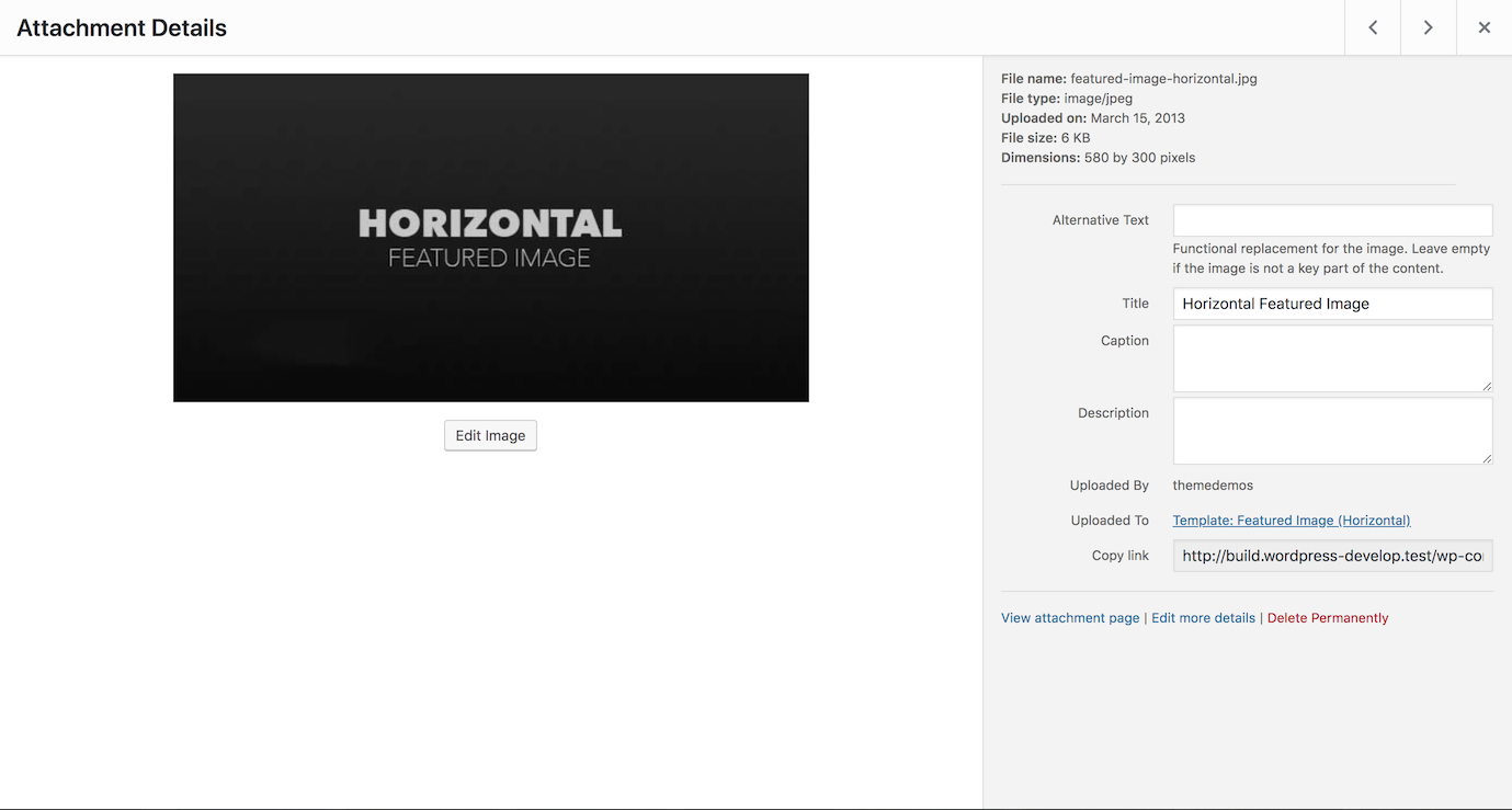
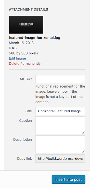
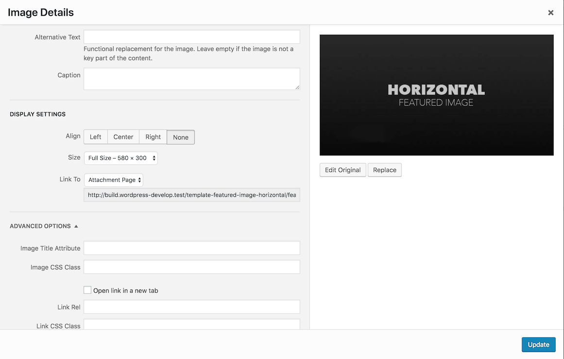
41612.2.diff updates the patch and changes the URL field label to "Copy link".
Additionally:
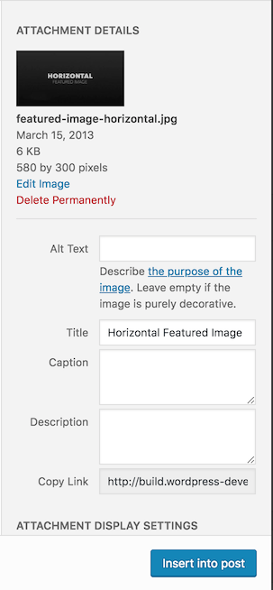
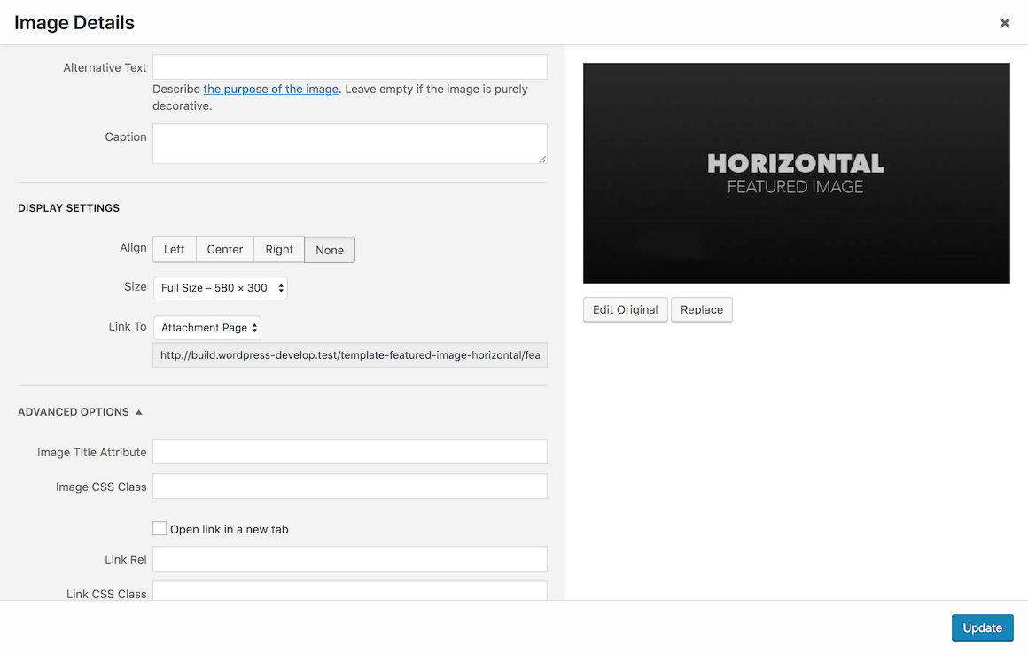
- the alt text field is now the first one in all the 3 templates involved:
- Media Library grid > Attachment Details modal
- Add Media modal (when adding an image )
- Image Details modal (when editing an image)
- removes the initial focus on the field: this also prevented navigation to next/previous attachments in the Media Library modal, see also #43169
- changes the alt text description: this is temporary: a better wording will be proposed by the accessibility team
- moves the description out of the label
- adds
aria-describedbyto target the description - adjusts the CSS accordingly
- updates the QUnit index.html file
#31
 @
@
7 years ago
Looks like the other labels are all title case, so we should make it "Copy Link" to match. Otherwise, visually looks good to me.
#32
 @
@
7 years ago
Screenshots (description text is temporary also, in the patch "Copy Link" is title cased):
🙂I've taken the screenshots before the last refinements and didn't feel like making new screenshots 😝
#34
 @
@
7 years ago
Only thing left here is finding a better text to replace the temporary:
Functional replacement for the image. Leave empty if the image is not a key part of the content.
It needs to:
- clarify that the alt text is not a description of the image
- instead, the alt text needs to describe the function or purpose of the image in its specific context
- only in some cases it can be the image content, for linked images it can be the link destination, for purely decorative images it needs to be an empty string, etc.
- maybe add a link to the W3C "alt decision tree" tutorial
#35
 @
@
7 years ago
For the Alt Text copy, can we just be super direct? I wouldn't belabor it, and just be as clear as possible about the main purpose for including Alt Text. Something like:
Alt Text is a verbal description/explanation of an image. It’s used by screen readers, and allows people with vision impairments to get a sense of the image’s content. Alt Text is recommended for all key images used on a website.
(I prefer "description," but if there's a reason that word isn't appropriate here, "explanation" also works.)
If you need something shorter:
Alt Text is a verbal description/explanation of an image that allows people with vision impairments to get a sense of the image’s content.
#36
 @
@
7 years ago
@michelleweber thanks. To avoid (historical) misconceptions about the alt text, we should really avoid the word "description". See also a related issue for Gutenberg: https://github.com/WordPress/gutenberg/issues/14326
#37
 @
@
7 years ago
See also this comment on a related Gutenberg issue: https://github.com/WordPress/gutenberg/issues/14326#issuecomment-473058366
#38
 @
@
7 years ago
See https://github.com/WordPress/gutenberg/issues/14326#issuecomment-473058366 leaning towards the following text:
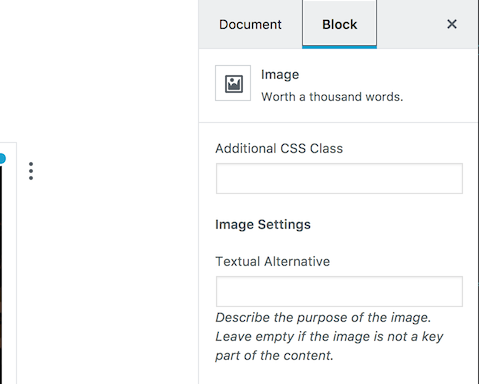
Describe [ link ] the purpose of the image [ /link ]. Leave empty if the image is purely decorative.
where the link points to the W3C alt decision tree tutorial.
#39
 @
@
7 years ago
- Keywords commit added
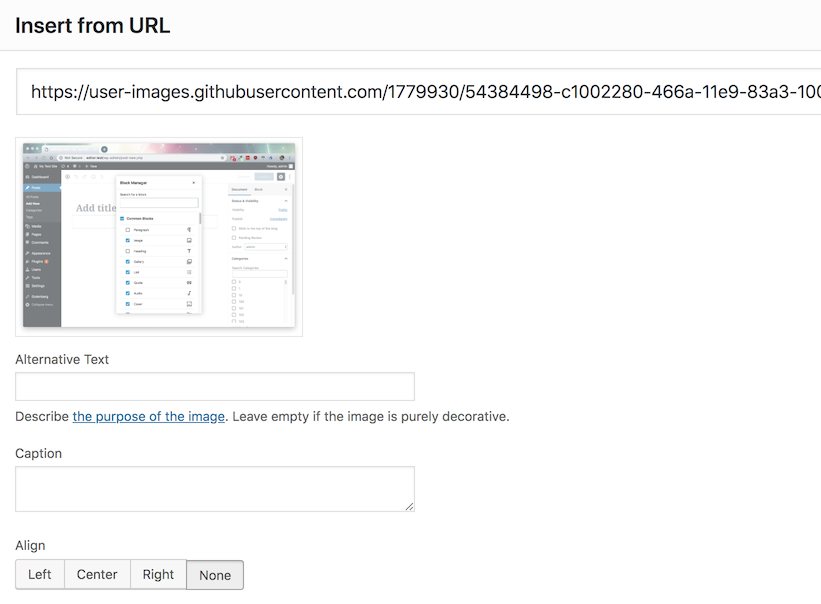
41612.3.diff refreshes the patch with the new alt text description. Also, moves the alt text field to the top and adds the description in the "Insert from URL" template (missed in the previous patches).
Screenshots:

This ticket was mentioned in Slack in #accessibility by chetan200891. View the logs.
7 years ago
#44
 @
@
7 years ago
Does the focus on the "Copy Link" actually copy it to clipboard?
I wonder how many folks will try clicking the label "Copy Link", thinking it is a verb, rather than a noun? Maybe "Copyable Link" would remove the ambiguity?
Further, in terms of linguistic accuracy, a "link" is generally accepted to be an HTML anchor. It has attributes that hold a "URL", maybe a "class" or two, and even a relationship via "rel". The feature here is for copying the URL of the item, not a bit of markup, so "Copyable URL" would seem more correct.
Lastly, the URL is there for user's info - whether they copy it or not. All the other field labels identify what the input value is, not what can be done with it (they can all be selected and copied). So "Source URL" would seem more accurate.
#45
 @
@
7 years ago
Does the focus on the "Copy Link" actually copy it to clipboard? I wonder how many folks will try clicking the label "Copy Link", thinking it is a verb, rather than a noun? Maybe "Copyable Link" would remove the ambiguity?
It does copy the link to your clipboard, so it is a verb.
#46
 @
@
7 years ago
Some good points thanks @GaryJ. Personally, I wouldn't be opposed to explore a "Copy" button, especially considering the manual copy operation is very difficult on mobile devices. Re: the wording: I think one of the points in this ticket is that while "URL" is technically correct, users are not supposed to know what a URL is.
Consistency is also important. For reference, please see in the screenshot below what Gutenberg does in the post-publish panel.
#47
 @
@
7 years ago
I was wrong about "copy link" — I had it in my head we had a copy button inset in the field, since I'd mocked that up at some point. I forgot we'd never implemented that.
#48
follow-up:
↓ 50
 @
@
7 years ago
@melchoyce (et all!) I'm having second thoughts on this change and wondering if a follow-up ticket to iterate would be valuable.
Currently, WordPress uses this in a few places:
Some thoughts:
- is there the need for a readonly input field in the first place?
- are users supposed to be able to actually see the URL in its entire length?
- clicking within the input field and moving to the right to see the URL last part is annoying and hard to do for some users (assuming users know how to do it)
- the label "Copy Link" might suggest the idea that clicking there actually copies the URL to the clipboard, but there's no such functionality
- what about to entirely remove the input field and just use a "Copy link" button?
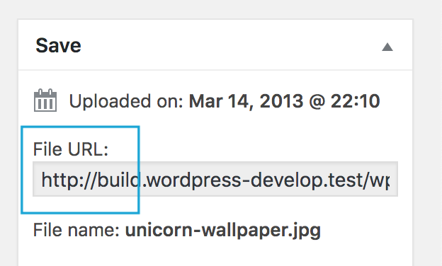
In other parts of the admin, for example in the Edit Media page, this input field is labelled "File URL", where "URL" is still confusing:

This ticket was mentioned in Slack in #accessibility by afercia. View the logs.
7 years ago
#50
in reply to:
↑ 48
 @
@
6 years ago
Replying to afercia:
...what about to entirely remove the input field and just use a "Copy link" button?
You make a lot of good points — I agree this would be a better overall solution throughout wp-admin.


+ 1. I'd like to remove any focus moved programmatically from the media modal, was working on a patch but couldn't find time to finish it 😬
+ 1k :) and maybe move the alt text up, since it's even more important than "Title"