Opened 9 years ago
Closed 8 years ago
#41729 closed enhancement (duplicate)
Code Editors: Better design for folders
| Reported by: |
|
Owned by: | |
|---|---|---|---|
| Milestone: | Priority: | high | |
| Severity: | normal | Version: | |
| Component: | Administration | Keywords: | ui-feedback needs-patch |
| Focuses: | ui, accessibility | Cc: |
Description
This is related to (and relies on) #6531.
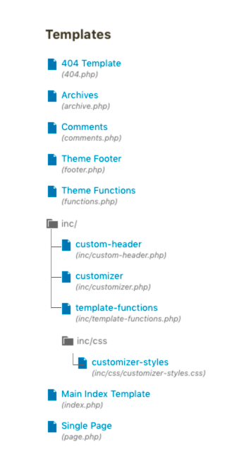
Let's make the file list easier to scan and introduce a way to collapse folders. See attached mockup.
Attachments (2)
Change History (16)

This ticket was mentioned in Slack in #core-customize by melchoyce. View the logs.
9 years ago
#3
 @
@
9 years ago
From a visual perspective, I'd say the currently selected folder/file needs a way to indicate it's the current item that doesn't rely on color alone.
Related: #31604
#4
 @
@
9 years ago
- Priority changed from normal to high
Bumping priority to high for visibility and alignment with 4.9 goals, and given proximity to beta 1 deadline.

This ticket was mentioned in Slack in #design by karmatosed. View the logs.
9 years ago

This ticket was mentioned in Slack in #accessibility by afercia. View the logs.
9 years ago
#9
 @
@
9 years ago
Trying out a v2 in Structure v2.png per yesterday's design triage in Slack.

Adding the accessibility focus because any UI component that is not "native" in HTML and that is implemented as a sort of "widget" with non-standard semantics and interaction needs some special accessibility treatment. Assistive technologies, and people using them, need to understand how a special "widget" works to be able to use it.
Seems to me this should be implemented as an ARIA "Tree View". More details, expected keyboard interaction, and examples available on the ARIA Authoring Practices: https://www.w3.org/TR/wai-aria-practices/#TreeView
Worth noting how keyboard interaction works just with the arrow keys (the whole tree view has just one Tab stop).
From a visual perspective, I'd say the currently selected folder/file needs a way to indicate it's the current item that doesn't rely on color alone.