Opened 8 years ago
Closed 7 years ago
#41858 closed defect (bug) (fixed)
Improve the list table pagination links color contrast
| Reported by: |
|
Owned by: |
|
|---|---|---|---|
| Milestone: | 5.1 | Priority: | normal |
| Severity: | normal | Version: | |
| Component: | Administration | Keywords: | has-screenshots has-patch has-dev-note fixed-major dev-reviewed commit |
| Focuses: | ui, accessibility | Cc: |
Description
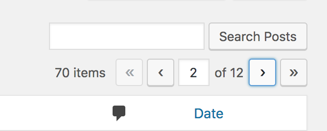
The list table pagination links (the active ones) have a color contrast ratio with the background under the required 4.5:1 to meet the WCAG at level AA. #0073aa on #e5e5e5 results in a ratio of 4.13:1, see https://jdlsn.com/color/?type=hex&color=0073aa&color2=e5e5e5
Also on hover/focus the colors could be improved a bit, since UI controls that change their background to blue on hover/focus are a bit out of the design patterns used in WordPress:
The current official WordPress colors are listed on https://make.wordpress.org/design/handbook/design-guide/foundations/colors/, see alto the codepen linked there for more color variants.
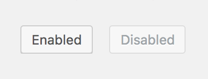
These controls are links that looks like buttons, they could use the same CSS classes (with some adjustments) used for the buttons. The buttons CSS classes already provide colors for enabled and disabled states and using them would also increase consistency. Worth noting disabled controls don't need to meet the color contrast requirement.
Alternatively, a new design could be experimented.
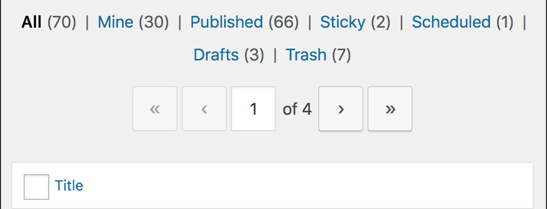
Attachments (7)
Change History (41)
#2
follow-up:
↓ 3
 @
@
8 years ago
- Keywords reporter-feedback removed
@subrataemfluence I think there are no other UI controls in WordPress that change their background to blue on hover/focus, so these links design seems inconsistent to me and I don't see why they should be an exception.
#3
in reply to:
↑ 2
 @
@
8 years ago
Replying to afercia:
@subrataemfluence I think there are no other UI controls in WordPress that change their background to blue on hover/focus, so these links design seems inconsistent to me and I don't see why they should be an exception.
The Add New button.
#4
 @
@
8 years ago
The darker background color could be remove to increase the contrast and to meet the WCAG at level AA with a 4.86:1 contrast ratio.
A significant difference on one property should be enough to differentiate the states.
No change on hover state.
I think it's right to keep the links in blue.
These are really links (like the filter links) and their look should reflect that.
Let me know if you agree. I can try to submit a patch in a few days.
#5
 @
@
8 years ago
The Add New button.
Right, but the Add New button is a pretty unique case. For these pagination links, I'd try the same colors used for normal buttons, maybe except the blue for links as you mentioned @benoitchantre
#6
 @
@
8 years ago
- Keywords has-patch added; needs-patch removed
@afercia here are two directions with their patches.
Preview of 41858-links
Same background color as buttons.
Preview of 41858-buttons.diff
Same styles as buttons: background color, color, rounded corners and shadow.
After having tested the second version (styled like buttons), I think it is better than the first version.
Maybe @melchoyce could give her feedback on that?
#7
 @
@
8 years ago
@benoitchantre nice! Personally I'd prefer the second version but I'll leave this to @melchoyce @karmatosed and all the ui/design team.

This ticket was mentioned in Slack in #core by benoitchantre. View the logs.
8 years ago
#11
follow-ups:
↓ 13
↓ 14
 @
@
8 years ago
- Owner set to afercia
- Status changed from new to assigned
Looking a bit at this, it would make sense to reuse the existing button CSS classes. They can be used for button elements and link elements. 41858.diff is a first try following this approach: it uses the buttons CSS classes and overrides only the properties necessary for the specific design of the pagination links.
I think it could be further refined, so any improvement is very welcome. @benoitchantre mind having a look? :) Worth reminding patches should be generated from the root of a cloned development repo and should not touch .rtl or minified files.
#13
in reply to:
↑ 11
 @
@
8 years ago
Replying to afercia:
I think it could be further refined, so any improvement is very welcome. @benoitchantre mind having a look? :) Worth reminding patches should be generated from the root of a cloned development repo and should not touch .rtl or minified files.
Yes, I'll look at that in the next days hopefully.
Thanks for the reminder about the patches. I now work with Vagrant and Grunt :-)
#14
in reply to:
↑ 11
 @
@
8 years ago
Replying to afercia:
I think it could be further refined, so any improvement is very welcome. @benoitchantre mind having a look? :) Worth reminding patches should be generated from the root of a cloned development repo and should not touch .rtl or minified files.
I have refreshed your patch and revised some properties to be more specific on the changes. I hadn't the time to review all the CSS changes at the moment. This is a first iteration; my plan is to continue the work on it.
41858.2.diff is empty and can be removed if you want. It is the result of a grunt upload_patch command with a git repository (doesn't work).
#15
 @
@
8 years ago
Just came into my mind why these links are using min-width, see https://core.trac.wordpress.org/ticket/32253#comment:23
Seems some plugin authors are implementing their own navigation but trying to still use the default CSS classes. In this case, when the links don't contain arrows but actually use numbers or text, we should make sure the links width can expand.
#16
 @
@
8 years ago
41858.2.diff is a new iteration:
- on desktop, makes the links height 28 pixels so they have the same height of the buttons on the left for better alignment
- makes the links width 28 pixels so they're squared; note: for accessibility this should be changed in the future since the target size is too small, the WCAG 2.1 will require a minimum of 44 by 22 pixels
- add some white space below the links, for balance with the space above
- cleans up the alternate color scheme scss file that used different color and background to the links on hover and focus

This ticket was mentioned in Slack in #accessibility by afercia. View the logs.
8 years ago
#18
 @
@
8 years ago
Re:
WCAG 2.1 will require a minimum of 44 by 22 pixels
This has changed in the final WCAG 2.1 recommendation. It now requires a size of 44 by 44 pixels but it has been moved to the AAA level. See https://www.w3.org/TR/WCAG21/#target-size
#19
 @
@
8 years ago
- Keywords needs-dev-note added; good-first-bug removed
41858.3.diff cleans up a bit the CSS, also removing old, no more used, rules. Final screenshots large screens / responsive view:
I think this change will need a quick dev note post on the Make blog, see the edge case on https://core.trac.wordpress.org/ticket/32253#comment:23 and the screenshots on https://core.trac.wordpress.org/ticket/32253#comment:30. See also the test plugin uploaded there: https://core.trac.wordpress.org/attachment/ticket/32253/paginate-test.php
Basically, if plugin authors use paginate_links() wrapped in some containers with the same CSS classes used for the tables navigation links, e.g.:
<div class="tablenav">
	<div class="tablenav-pages">
	<?php
		paginate_links( ... )
	?>
	</div>
</div>
The links generated by paginate_links() used to inherit the tables pagination links styles. I'd tend to think this is an backwards compatibility edge case WordPress shouldn't support. The CSS for the tables pagination links are specific to the tables and not supposed to be reused this way. On the other hand, paginate_links() outputs unstyled links: styling it's not its responsibility. Plugin authors can provide their own style with a few lines of CSS.
#22
 @
@
7 years ago
- Keywords has-dev-note added; needs-dev-note removed
Dev note has been published: https://make.wordpress.org/core/2019/01/14/new-styling-for-admin-table-pagination-links-in-wordpress-5-1/.
#24
 @
@
7 years ago
For the records, I've realized there's one, very minor, unintended change due to the changes here.
For anyone who remembers the "Old Upload Method" modal, it used to have pagination links in its "Media Library" tab. Those links are now untyled.
Before:
After:
This old modal is still available in core and can be restored with a plugin that came to life in a support forum discussion.
Given this old modal is not available by default since WordPress 3.5 and even when re-enabled can be accessed only from the classic editor, I'd tend to think its pagination links can stay unstyled. The links are still functional, even if the clickable area is smaller.

This ticket was mentioned in Slack in #core by afercia. View the logs.
7 years ago
#26
 @
@
7 years ago
Nice catch, @afercia!
Do you know what kind of effort would be involved in re-adding slightly better styling for the old modal? We certainly don't need to go all out, but it'd be good to avoid making the clickable area so small.
#27
 @
@
7 years ago
@pento I think a few CSS lines in deprecated-media.css targeting only the old modal wouldn't be a huge effort. On it.
#28
 @
@
7 years ago
- Resolution fixed deleted
- Status changed from closed to reopened
41858.4.diff restores a simplified styling for the pagination links in the old upload modal:
The hover and focus styles are the ones for standard links. The relevant CSS is in deprecated-media.css, together with all the other styling for this old modal.
Patched from the 5.1 branch. Should then be backported to 5.0.
To test it, you can install this plugin https://gist.github.com/brasofilo/4570587 then go in the Classic Editor and click "Upload/Insert".
#29
 @
@
7 years ago
@afercia: Why does it need backporting to 5.0? [43019] was only ever in trunk, it wasn't backported to the 5.0 branch.
#31
 @
@
7 years ago
@afercia: I verified the patch works on WordPress 5.1-RC1
Before:
https://drive.google.com/file/d/1NWu3owyao-UO_1kve9s-x5xQ8m-RFNyK/view?usp=sharing
After
https://drive.google.com/file/d/1Ih-b7aPywzSJFVwAOZiJKd6JcZ5mchXx/view?usp=sharing


The following color contrast meets WCGA level AA (4.5:1) https://www.joedolson.com/tools/color-contrast.php?type=hex&color=%230066c5&color2=%23e5e5e5&alpha=1#hex
However the color
#0066c5does not fall inside the list WordPress official colors."Also on hover/focus the colors could be improved a bit, since UI controls that change their background to blue on hover/focus are a bit out of the design patterns used in WordPress:"
Would you mind explaining "out of the design pattern used in WordPress"?