Opened 6 years ago
Last modified 12 months ago
#47682 accepted task (blessed)
The links "hover" color has insufficient color contrast
| Reported by: |
|
Owned by: |
|
|---|---|---|---|
| Milestone: | Future Release | Priority: | normal |
| Severity: | normal | Version: | |
| Component: | Administration | Keywords: | wpcampus-report color-contrast has-screenshots needs-patch a11y-task |
| Focuses: | ui, accessibility | Cc: |
Description
During the contributor day at WCEU 2019, it was proposed to merge #35622 and #47157. They're strictly related and the root issue needs to be tackled holistically across the whole WordPress admin.
Problem
Default links (and "button-links") in WordPress are blue. The ones for destructive actions are red.
Generally, the default colors for their normal state do have a sufficient color contrast ratio of 4.5:1 with the background. However, the colors used for the "hover" (and "active") state don't.
Relevant standard
W3C Web Content Accessibility Guidelines (WCAG) 1.4.3 Contrast (Minimum) (Level AA)
Details
#35622 dived into the red links issue and after some exploration it became clear that finding a color pair (one color for the normal state and one for the hover/active state) that always works across the admin, is nearly impossible given the several, different, background colors used in the admin pages.
Part of the problem is that the hover color is "lighter" than the default one. Worth noting the color used for the "focus" state is darker instead.
More importantly, there are several different background colors, including an arguable amount of grey shades.
Trying to summarise the reason why #35622 didn't progress:
- darkening the "hover" red forced to darken also the default red
- once a new color pair was identified, it worked well on some backgrounds
- however, it didn't work on other darker backgrounds
- started from scratch and further darkened the color pair
- it worked on more backgrounds
- found edge cases
- darkened the color pair again
- at some point the normal red was so dark to look almost "brownish"
- failure
The same problem applies to the blue links, as reported in the WPCampus accessibility report. See #47157.
Some examples
The "hover" blue #00a0d2:
3.02 contrast ratio on white background
2.67 contrast ratio on the admin default grey background #f1f1f1
2.87 contrast ratio on the tables zebra-stripe grey #f9f9f9
The "hover" red #dc3232:
4.62 contrast ratio on white background (which is OK)
4:39 contrast ratio on the tables zebra-stripe grey #f9f9f9
4.09 contrast ratio on the default grey #f1f1f1
4.16 contrast ratio on media views grey #f3f3f3
3.98 contrast ratio on customizer grey #eee
Note: these are just a few examples. There are more background colors to take into consideration and also edge cases, e.g. the yellow background for unapproved comments.
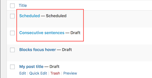
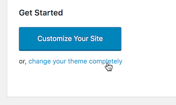
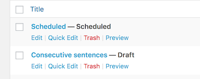
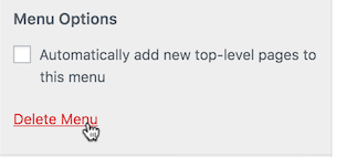
Some screenshots
Questions and possible options
- Does the hover state needs to be communicated with a color change in the first place?
- If so, does the hover color needs to be "lighter"? Using the darker color already used for the "focus" state may help. Generally, the color used for the hover state shouldn't be "lighter", as that reduces contrast right in the moment when users need it the most.
- Are there better ways other than a color change? For example: toggling the link underline, or using a border, or an additional shape, would allow to use just one color and greatly simplify things.
Background colors
Background colors are an important part of this problem. I do realise design considerations led to use different background colors in different parts of the WordPress admin. For example, the media views and the customizer made some autonomous design choices for their background colors. There are historical reasons for that. However, this led over time to a great inconsistency across the admin.
For the greater good of maintenance, consistency, and simplification, I'd strongly suggest to start by exploring a way to drastically standardise the shades of grey used as background in WordPress. Ideally, there shouldn't be more than 3-4 shades of "light" grey used for the background. Some work in this regard was done in #35783 but there's still a lot of work to be done.
Note on accessibility standards for links
According to the WordPress accessibility coding standards:
When links can be identified as such by the context, for example because they're part of a menu, or a set of links clearly identified as user interface controls, they don't necessarily need to be underlined. In all the other cases, especially for links surrounded by other text (in a line or block of text), links need to be always underlined.
Attachments (3)
Change History (52)

This ticket was mentioned in Slack in #design by afercia. View the logs.
6 years ago

This ticket was mentioned in Slack in #accessibility by afercia. View the logs.
6 years ago

This ticket was mentioned in Slack in #accessibility by audrasjb. View the logs.
6 years ago
#7
 @
@
6 years ago
- Milestone changed from Awaiting Review to Future Release
As per today's accessibility team bug scrub, let's move this one to Future release.
Would be a good candidate for 5.4. That would be nice to handle it early, since it will need design, accessibility and css code :)

This ticket was mentioned in Slack in #accessibility by afercia. View the logs.
6 years ago

This ticket was mentioned in Slack in #accessibility by afercia. View the logs.
6 years ago
#10
 @
@
6 years ago
- Milestone changed from Future Release to 5.3.1
Discussed during today's accessibility bug-scrub: agreed that fixing only the hover color could be a quick improvement for 5.3.1. It's just a color change, for example the hover color could use the same color used for focus. Further improvements to the links default styling should be explored in a separate ticket.

This ticket was mentioned in Slack in #core by audrasjb. View the logs.
6 years ago
#12
 @
@
6 years ago
- Milestone changed from 5.3.1 to 5.4
As per today's bug scrub, we found this ticket doesn't fit very well to a rapid release cycle like 5.3.1 as it's not a regression from 5.3. Moving it to next major.

This ticket was mentioned in Slack in #accessibility by afercia. View the logs.
5 years ago

This ticket was mentioned in Slack in #accessibility by audrasjb. View the logs.
5 years ago
#16
 @
@
5 years ago
- Milestone changed from 5.4 to 5.5
Hi, given 5.4 beta 1 is planned for tomorrow, let's move this ticket to milestone 5.5 :)

This ticket was mentioned in Slack in #accessibility by afercia. View the logs.
5 years ago

This ticket was mentioned in Slack in #accessibility by audrasjb. View the logs.
5 years ago

This ticket was mentioned in Slack in #design by mapk. View the logs.
5 years ago
#20
follow-up:
↓ 21
 @
@
5 years ago
After following both Design and Accessibility discussions on this ticket, we agreed that accessibility should move forward and make a decision on this according to accessibility needs.
#21
in reply to:
↑ 20
 @
@
5 years ago
- Keywords needs-design removed
Replying to joedolson:
After following both Design and Accessibility discussions on this ticket, we agreed that accessibility should move forward and make a decision on this according to accessibility needs.
This sounds right to the Design Team. Thanks!

This ticket was mentioned in Slack in #accessibility by audrasjb. View the logs.
5 years ago
#24
 @
@
5 years ago
Some admin scheme colors adapt the link color using the $link and $link-focus SASS variables, should we ensure the changes in this patch adapt properly to such color schemes? (Best way to check is if these colors are correct when using the "modern" color scheme)
#25
 @
@
5 years ago
Sorry, I added the patch with no comment and no explanation, so that it could be reviewed today during the Accessibility Team bug scrub. Below are a list of the points that guided me in the choice of the color outside of the standard WordPress palette.
The shade of blue I used for :hover links is built with accessibility in mind, but it was chosen so that it could fit into a replicable color scheme. Here is the logic behind my choices.
- I checked all existing color schemes for the difference between the anchor element color and the
a:hoverone. In almost every admin color scheme, the:hovercolor is a tint of the standard link color, obtained using the SASSlighten($link, 10%)function. There are two exceptions: the default color scheme, where the:hovercolor is not a tint of the "normal" link color, but it's a lighter variant, and the new Modern color scheme, where the:hoverlink color is a tone of the "normal" link color, built using the SASSdarken($link, 10%)function. Because of that, I decided to look for two colors for standard and hover links respectively: these colors have the same hue, the same saturation, but their lightness is different and the difference is 10%. - When selecting the hue, I checked for links color in the default theme: the "normal" link hue is 194°, the
:hoverhue is 199° and the:focushue is 200°. Old colors for "normal" and:hoverlinks used hues of 197° and 196°, respectively. On average, the hue is 197°, so I decided to use this hue for links. - Most of link colors had a saturation of 100%, so I stayed with that.
- When choosing the lightness, it was important that the contast between all link colors (whether "normal" or
:hover) had a contrast of at least 4.5 against all possible backgrounds. The darkest light background in the WordPress admin dashboard is the Customizer one, which is #eee. The color with hue 197°, saturation 100%, minimum lightness and a contrast of at least 4.5 against #eee background is HSL(197°, 100%, 31%), or HTML color 00719e. The tone of this shade of blue with lightness reduced by 10% is HSL(197°, 100%, 21%) or HTML color 004d6b (which is exactly the shade I used for:hoverlinks). - Most WordPress admin color schemes (apart from the new Modern one) use the lighter shade for
:hoverand the darker for standard links. Anyway, the lightness of the darker shade of blue is 21%, which means this blue is very dark. If we use the same approach for other link colors of the interface (the red for spam/delete/trash buttons/links, and the green and yellow/orange links for approving/unapproving comments), and we decide to use the darker shade for "normal" links, all standard link colors would be very dark and very difficult to distinguish from one another. Also, the description of this issue suggested to use a darker shade for :hover instead of a lighter one. This is the reason why I used a lighter color for standard links and a darker color for:hoverlinks.
All of the above shows the reason for the new shade of blue. As this ticket addresses only :hover colors, I decided not to edit other colors (apart from the ones strictly related to the changed ones), but, once all :hover link colors are fixed, discussion can continue in issue #49999, in order to uniform all colors of the admin interface.
In my opinion, the modern color scheme should be a completely independent color scheme and should overwrite all default colors according to its own rules, without affecting the standard color scheme.
In any case, during the meeting, it was pointed out that all new colors added to the palette should be discussed with the design team, which I didn't know. As Beta 1 for WordPress 5.5 is planned for tomorrow, there is no time to discuss this ticket with the Design Team, so I'll refresh the patch later using a tone of blue that is already part of the palette.

This ticket was mentioned in Slack in #accessibility by ryokuhi. View the logs.
5 years ago
#27
 @
@
5 years ago
- Keywords commit added
@ryokuhi I'd totally second your comment. Thanks for the patch!
47682.diff builds on the previous patch and avoids to change unrelated colors. It only changes all the occurrences of #00a0d2 when used for :hover (and in some cases also for :active and :focus).
The only usages of #00a0d2 in core are for borders and backgrounds. There's at least one case where the #00a0d2 background doesn't have a sufficient color contrast with white text but this should be addressed in a separate ticket.
#28
 @
@
5 years ago
I think this ticket should be changed to a task, as the work to address all other cases will likely span across other release cycles. For now, the last patch should address the vast majority (all?) of the blue links :hover color.
Note: The new color #006799 is one of the blue shades in the official WordPress color palette (see the extended palette in the Codepen linked there).
#31
 @
@
5 years ago
@whyisjake 👋 Will discuss during today's accessibility meeting. In my opinion should be moved to 5.6 and:
I think this ticket should be changed to a task, as the work to address all other cases will likely span across other release cycles.

This ticket was mentioned in Slack in #accessibility by afercia. View the logs.
5 years ago
#33
 @
@
5 years ago
- Keywords has-patch commit removed
- Milestone changed from 5.5 to 5.6
- Type changed from defect (bug) to task (blessed)
This ticket was discussed during today's accessibility bug-scrub: there was large consensus to change it to task and move it to the next release cycle.

This ticket was mentioned in Slack in #accessibility by nrqsnchz. View the logs.
5 years ago

This ticket was mentioned in Slack in #core by meaganhanes. View the logs.
5 years ago

This ticket was mentioned in Slack in #accessibility by audrasjb. View the logs.
5 years ago
#37
 @
@
5 years ago
- Keywords needs-patch added
- Milestone changed from 5.6 to Future Release
Moving this ticket to Future release as it didn't move during 5.6 alpha cycle.
#38
 @
@
20 months ago
- Milestone changed from Future Release to 6.5
- Owner changed from ryokuhi to joedolson
- Status changed from assigned to accepted
Adding this to 6.5 to review the status of this task.

This ticket was mentioned in Slack in #accessibility by joedolson. View the logs.
20 months ago
#41
 @
@
17 months ago
To make this a bit easier to test, I created a bookmarklet for testing color contrast during hover states.

This ticket was mentioned in Slack in #accessibility by joedolson. View the logs.
17 months ago

This ticket was mentioned in Slack in #accessibility by joedolson. View the logs.
13 months ago
#45
 @
@
13 months ago
- Milestone changed from 6.6 to Future Release
Punting to future release. We've got a lot to focus on for 6.6 right now, and this isn't going to make it.
#46
 @
@
13 months ago
The color palette was updated in #49999 (though it is not yet on the Design handbook page):
https://codepen.io/ryelle/full/WNGVEjw

This ticket was mentioned in Slack in #accessibility by joedolson. View the logs.
13 months ago

This ticket was mentioned in Slack in #accessibility by alanfuller. View the logs.
12 months ago
#49
 @
@
12 months ago
@ireneyoast and I tested the hover contrast of links and buttons on all the pages in the Appearance section. We found only 3 items that need improvement. We also documented 7 instances of acceptable low contrast in disabled buttons and links. Testing was done using Hover Contrast Bookmarklet by Joe Dolson.
Items that need improvement:
- Where: Appearance/ Themes/ Theme details
What: the active arrows have 4.2 score
- Where: Appearance/ Editor/ Navigation/ Edit: > make changes to one of the navigation items > come back to the Navigation overview > click one of the navigation items so it becomes blue.
What: kebab menu (three dots) with score: 2.85
- Where: Appearance/ Editor/ Patterns
What: the sync status buttons has a score of 4.04
See more details about our findings in the following document: https://docs.google.com/document/d/1kIb185oBjsahcWmbE5aJRa7j9NL-55Gsqsr1w7-q5zA/edit#heading=h.e93y8r9sjbtl


Note: Props inherited from the superseded tickets: nrqsnchz, ronakganatra