#47157 closed defect (bug) (duplicate)
Insufficient contrast on link text on 'Media Dialog' and 'Block Types'
| Reported by: |
|
Owned by: | |
|---|---|---|---|
| Milestone: | Priority: | normal | |
| Severity: | normal | Version: | |
| Component: | Administration | Keywords: | wpcampus-report has-screenshots color-contrast has-patch |
| Focuses: | accessibility | Cc: |
Description
Moved from the WPCampus accessibility report issues on GitHub.
Severity: Medium
Affected Populations:
- Low-Vision
- Cognitively Impaired
Platform(s):
- All / Universal
Components affected:
- Block Types
- Media Dialog
Issue description
When the "Featured Image" modal is open, there are two controls coded
as links which have insufficient color contrast, below the minimum
threshold of 4.5:1 for text:
"Upload Files" and "Media Library" blue hover color: blue (#00a0d2) on white (#fff): 3.01:1
Sufficient color contrast is important for users who have low-vision or
are color-blind, because text with a low contrast ratio may be difficult
or impossible for such users to see.
Issue Code
.media-frame a:active, .media-frame a:hover {
  color: #00a0d2;
}
Remediation Guidance
Darken the hover color to match the focus color, or otherwise to provide
a contrast ratio of 4.5:1 or greater.
Recommended Code
.media-frame a:active, .media-frame a:hover {
  color: #124964;
}
Relevant standards
[https://www.w3.org/TR/WCAG20/#visual-audio-contrast-contrast
1.4.3 Contrast (Minimum) (Level AA)]
Note: This issue may be a duplicate with other existing accessibility-related bugs in this project. This issue comes from the Gutenberg accessibility audit, performed by Tenon and funded by WP Campus. This issue is GUT-43 in Tenon's report
Attachments (3)
Change History (15)
#1
 @
@
6 years ago
Relevant Github ticket: https://github.com/WordPress/gutenberg/issues/15276
#2
 @
@
6 years ago
Quoting comments from the GitHub Issue:
@afercia:
Worth noting this applies to all the links in WordPress but only to the blue used for the hover state.
I'd like to discuss this a bit more in depth, as I'm not 100% sure the hover state needs sufficient contrast,
@StommePoes
I would say hover needs sufficient contrast for the cases of low-viz screen-mag users for whole avoiding a hovered state can be difficult (depending on zoom level and the size of the control of course).
#3
 @
@
6 years ago
- Component changed from Media to Administration
- Keywords has-screenshots color-contrast added
#5
 @
@
6 years ago
- Keywords has-patch needs-refresh added; needs-patch removed
@nrqsnchz @ronakganatra thank you for the ticket and the patch.
As mentioned in a previous comment, the hover state insufficient contrast applies to many other places in WordPress where controls (links, link-buttons, etc.) use the color #00a0d2 for hover. For completeness, also the controls that use a red color may have an insufficient color contrast on hover.
Worth also considering the background color is not always white. Various shades of gray are used across the admin, for example in the Customiser the grays are different from the ones used in the standard admin pages. See #35622.
Generally, the color used for the hover state shouldn't be "lighter" than the one used for the normal state. Instead, it should be darker to increase contrast.
I guess before any patch, this issue probably requires some broader discussion.
Note for anyone willing to test contrast: if you're using the Chrome dev tools, be aware that sometimes the calculated contrast ratio is inaccurate because the Chrome color picker contrast checked appears to be unable to get the background color when set on ancestors that are very far in the DOM.
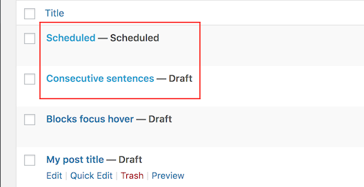
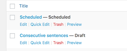
Some screenshots to illustrate the hover state on different background colors:
Zebra-striped tables:
Default WordPress background #f1f1f1:
Red links:

This ticket was mentioned in Slack in #core by marybaum. View the logs.
6 years ago

This ticket was mentioned in Slack in #accessibility by afercia. View the logs.
6 years ago

This ticket was mentioned in Slack in #design by karmatosed. View the logs.
6 years ago
 @
@
6 years ago
For this particular case, we should probably update the tab styles to match the rest of core. That would take care of the contrast issue here, and we can explore all lighter blue hovers in a new ticket.
#9
 @
@
6 years ago
Thanks @melchoyce for looking into this! There's a (historical) problem to consider though:
- the "tabs" in the about page, or for example the ones in the Menus page, are actually just links that point to a different page: clicking on them triggers navigation
- instead, the "tabs" in the media views toggle the visibility of "in-page" content
Although the interaction and semantics are very different, historically these two patterns always used the same styling. Instead of using the same styling, it would be great to differentiate it to convey also visually these are two differents UI patterns with very different behavior.
Also, the Site Health page introduced a new design for the (link) tabs. I do realize differentiating the design would probably require some major refactoring. Ideally, core should just provide templating functions for these two patterns, so that also plugin authors would be able to just use the patterns that core provides. For now, I'd rather suggest to not use the same design.
#10
 @
@
6 years ago
- Keywords needs-refresh removed
- Milestone 5.3 deleted
- Resolution set to duplicate
- Status changed from new to closed


Screenshot of the Media Library UI, highlighting the link text on the tabbed navigation