#35622 closed defect (bug) (duplicate)
Color contrast: audit all the "#f00" and "red" reds
| Reported by: |
|
Owned by: | |
|---|---|---|---|
| Milestone: | Priority: | normal | |
| Severity: | normal | Version: | |
| Component: | Administration | Keywords: | color-contrast has-patch has-screenshots |
| Focuses: | ui, accessibility | Cc: |
Description (last modified by )
See related #31713.
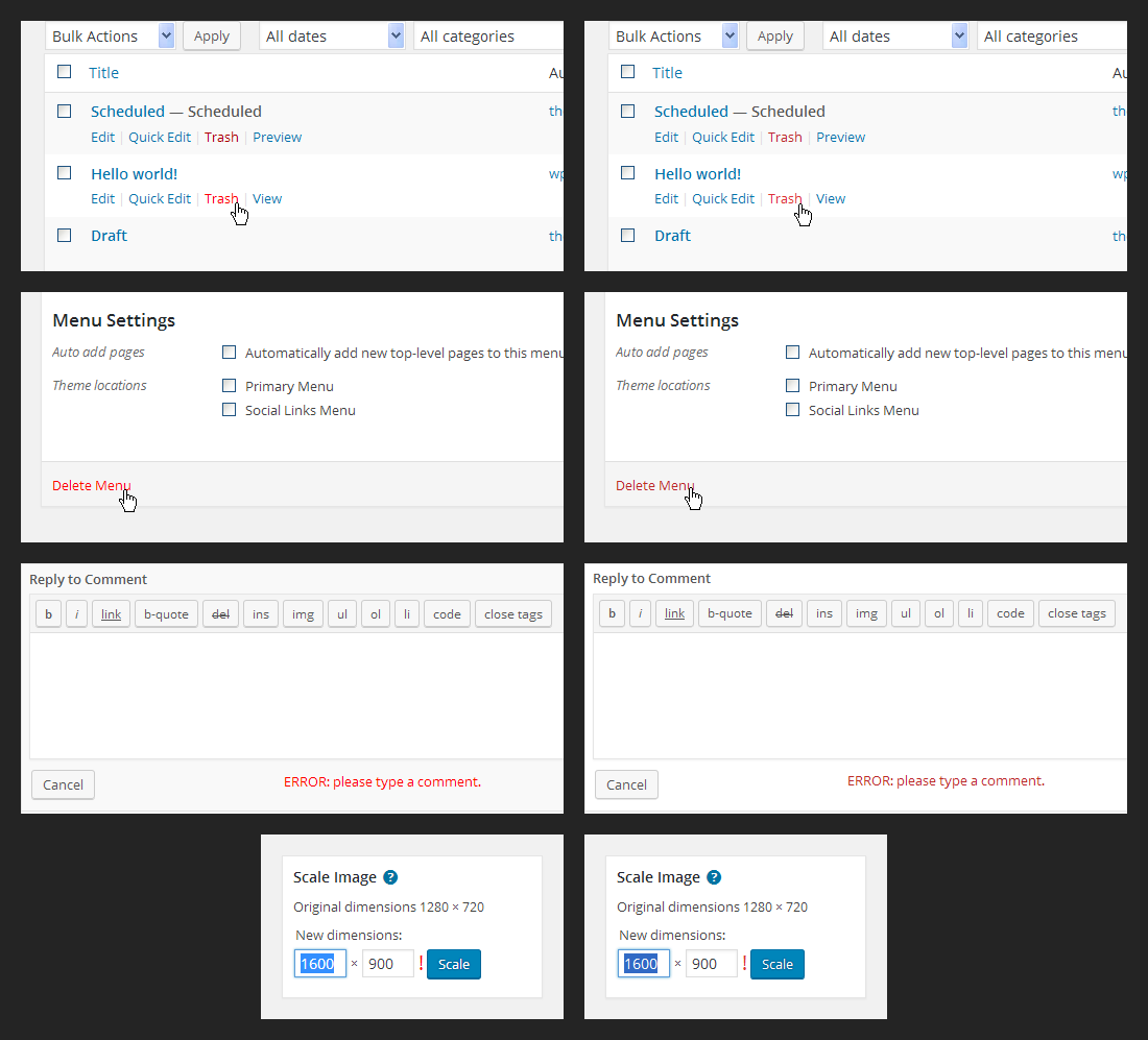
In various admin screens there are some occurrences of #f00 and red reds mainly used for error messages. These reds don't guarantee a sufficient color contrast ratio when combined with a white background (or text if they're used for background). They should be probably all replaced with the new red #dc3232.
Attachments (6)
Change History (47)

This ticket was mentioned in Slack in #design by afercia. View the logs.
9 years ago

This ticket was mentioned in Slack in #design by afercia. View the logs.
9 years ago

This ticket was mentioned in Slack in #design by afercia. View the logs.
9 years ago

This ticket was mentioned in Slack in #accessibility by afercia. View the logs.
9 years ago
#12
 @
@
9 years ago
We discussed this in the #accessibility Slack channel and this is our recommendation on the red color:
Both colors used should have a contrast ratio of 4.5 or more.
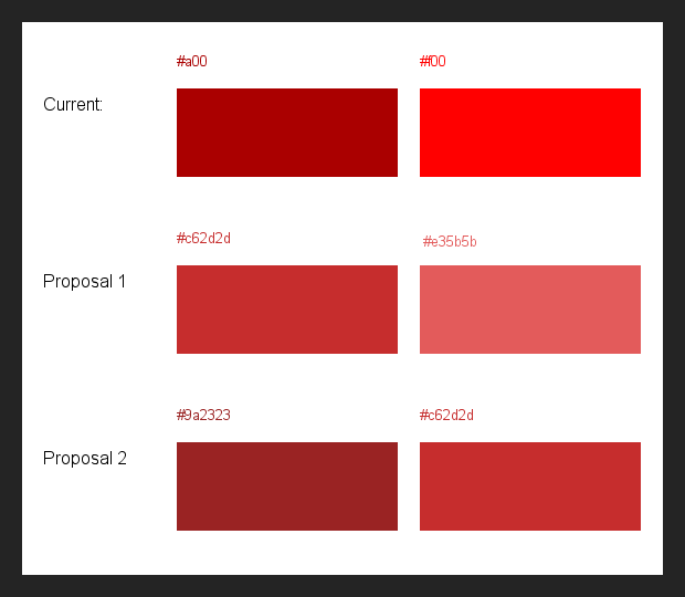
Using the WordPress colors this would be for example #9a2323 and on hover/focus #c62d2d.
The link on hover status needs to have sufficient contrast with the background, but not necessarily with the normal link state or with neighboring text.
#13
 @
@
9 years ago
- Keywords commit added
Refreshed patch to use the new official reds. Thanks to @hugobaeta there's now a nice #c62d2d red which has a sufficient contrast ratio with one of the darker grey backgrounds used in the admin: #eeeeee. This red can be used on several backgrounds as default red, for example for error messages or normal red text.
About links
The current convention in the admin is that the :hover state uses a "lighter" color. I'd propose to discuss this point in the future, together with the slightly inconsistent usage of text-decoration: underline. So, to keep the "hover-lighter" effect, the normal state of red links needs to be darker than #c62d2d. See in the screenshot below.
Currently. most of the red links (there are exceptions here and there) are #a00 and #f00 on hover. A first proposal suggested #c62d2d and #e35b5b for hover but the latter is under a contrast ratio of 4.5:1. This leads to the second proposal, implemented in the refreshed patch and IMHO also the closest one to the current colors.
Any thoughts more than welcome.

This ticket was mentioned in Slack in #design by afercia. View the logs.
9 years ago
#15
 @
@
9 years ago
We talked today in slack about the idea of doing block hovers for things like this, since contrast is a big problem here. I created a test on codepen to see how it could work. What do y'all think? http://codepen.io/hugobaeta/full/zrLwLM/
#16
follow-up:
↓ 19
 @
@
9 years ago
The removal of the underline feels super weird, but it does get the point across. The background hover could work, but only in very specific scenarios — I don't think it would work with a line of links (like in list tables).

This ticket was mentioned in Slack in #core by chriscct7. View the logs.
9 years ago

This ticket was mentioned in Slack in #design by melchoyce. View the logs.
9 years ago
#19
in reply to:
↑ 16
;
follow-up:
↓ 20
 @
@
9 years ago
Replying to melchoyce:
The background hover could work, but only in very specific scenarios — I don't think it would work with a line of links (like in list tables).
Why not? The background would really only show up on hover anyway...
I'm totally down with the option of add/remove underline on hover tho. It's more subtle/polished, and serves its a11y purpose.
#20
in reply to:
↑ 19
;
follow-up:
↓ 21
 @
@
9 years ago
Replying to hugobaeta:
Replying to melchoyce:
The background hover could work, but only in very specific scenarios — I don't think it would work with a line of links (like in list tables).
Why not? The background would really only show up on hover anyway...
Because all the other links just change color. It would be weird if just the red link had a background on hover.
#21
in reply to:
↑ 20
 @
@
9 years ago
Replying to melchoyce:
Because all the other links just change color. It would be weird if just the red link had a background on hover.
Gotcha. That makes sense, yes.
For what it's worth, I think the underline idea could work for everything. Looking at the screenshots @afercia posted above, none of the links actually have an underline to begin with, so adding one on hover would work for every link (but probably a bigger and more complicated patch).
I added that to the codepen (second row) for us to preview: http://codepen.io/hugobaeta/full/zrLwLM/ - there's still the subtle color change, but if we want to, we could move the red link to the lighter hue - #c62d2d - (that still passes AA contrast ratio) and do no color change (just the underline change) (third row).
#22
follow-up:
↓ 23
 @
@
9 years ago
In regards to the background changing on red links; I think that seeing as most of them are destructive actions, that having them be different than the rest of the links is preferable. Maybe the order of the links would need the change though with the destructive action being last.
#23
in reply to:
↑ 22
 @
@
9 years ago
- Keywords commit removed
- Milestone changed from 4.5 to Future Release
Replying to picard102:
Maybe the order of the links would need the change though with the destructive action being last.
Yep, that's something that should be considered, there's also a bit of inconsistency about the links order across all the admin screens. By the way, the general issue about links color/hover state etc., should probably be considered holistically for all the links, blue ones included. There's no consensus on a proper solution yet, though the one using underline mentioned by @hugobaeta seems the most logical to me. Tomorrow is beta 4 day so, punting.

This ticket was mentioned in Slack in #design by afercia. View the logs.
9 years ago

This ticket was mentioned in Slack in #accessibility by afercia. View the logs.
9 years ago

This ticket was mentioned in Slack in #accessibility by afercia. View the logs.
8 years ago
#31
 @
@
8 years ago
@karmatosed can we discuss this on the contributors day in WCLND?
About the consequences of having link on hover and focus underlined?
#33
 @
@
8 years ago
Pending decisions, in the meantime I'd propose to change all the occurrences of #f00 and red in core to the official #dc3232 red, see https://make.wordpress.org/design/handbook/design-guide/foundations/colors/.
While this doesn't address all the contrast ratio issues, it fixes the reds against a white background and removes from core colors that are not part of the official palette.

This ticket was mentioned in Slack in #accessibility by afercia. View the logs.
7 years ago

This ticket was mentioned in Slack in #accessibility by afercia. View the logs.
7 years ago

This ticket was mentioned in Slack in #accessibility by afercia. View the logs.
6 years ago
#39
 @
@
6 years ago
- Milestone Future Release deleted
- Resolution set to duplicate
- Status changed from assigned to closed


Refreshed patch, trying to be a bit more accurate. There are 5-6 selectors to move to deprecated media or completely remove, would appreciate some feedback and review.
deprecated-media.css$contextparam, should be probably removed.file-errorand.plugins a.delete:hover)