#48715 closed defect (bug) (duplicate)
Add New buttons on Posts/Pages/Media don't adhere to Admin Color Scheme
| Reported by: |
|
Owned by: | |
|---|---|---|---|
| Milestone: | Priority: | normal | |
| Severity: | normal | Version: | |
| Component: | Administration | Keywords: | has-screenshots needs-design-feedback 2nd-opinion |
| Focuses: | ui | Cc: |
Description
As @drw158 pointed out in Slack, and I've now confirmed on a clean install.
The Add New buttons found on the Posts/Media/Pages/Themes/Plugins/Users screens all fail to comply to the Admin Color Scheme as they don't utilize the .button class which is how the colour scheme is applied to other buttons.
All the best,
Cheers
Attachments (7)
Change History (25)
 @
@
5 years ago
Markup for the Add New buttons is missing .button class which is standardly how the Admin Colour Scheme styling gets applied.

This ticket was mentioned in Slack in #design by garrett-eclipse. View the logs.
5 years ago
#2
 @
@
5 years ago
- Keywords has-screenshots needs-design-feedback added
Some prior conversation on the "Add New" button happened on #34904.
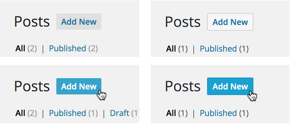
Historically, this button has always had its own specific styling. Before WordPress 4.5 it used a medium grey and no border. Blue on hover / focus. See screenshot on the left.
The contrast was not sufficient so it was changed in WordPress 4.5 to use a lighter grey plus some border. See screenshot on the right.
This change made the Add New button very close to secondary buttons, but still different on hover / focus. See relevant discussion on #34864. See also #34876 and the related changeset [35791].
Among other things, this button has also a different border-radius compared to the standard buttons.
That's not to say it can't be changed :) Personally, I'd be in favor of making it a standard secondary button. I don't see strong reasons why it should be different from all the other buttons and I'm not sure why it should be bold and blue on hover / focus. Also, simplifying the CSS and removing exceptions is always a good thing in the long run. /Cc @michaelarestad
#3
 @
@
5 years ago
Thanks for the history @afercia I tend to agree with you on making it consistent and removing the exceptions there. Along with falling in line with the new Admin CSS, accessibility improvements and any futher improvements to the UI it ensures that button will also reflect the user Admin Colour Scheme preference.

This ticket was mentioned in Slack in #core by garrett-eclipse. View the logs.
5 years ago
 @
@
5 years ago
Using a colour scheme the focus outline on the Add New uses the scheme while the Apply/Filter don't
#6
follow-up:
↓ 7
 @
@
5 years ago
- Keywords 2nd-opinion added
Thanks for the patch @melchoyce
Upon initially reviewing was expecting the button colour to change with the colour scheme but that doesn't seem to be the case on this button and looking at the Apply/Filter for comparison it appears to conform so I guess these buttons don't change colour with the scheme.
That being said another difference I noticed was the focus state, when using the default colour scheme the Add New has the same focus as the Apply and Filter (blue outline). But when using a colour scheme the Add New got a different colour than the Apply and Filter (see screenshot) it seems the focus is colour scheme specific but only on Add New and not the other buttons. Not sure if this is an issue or intentional.
#7
in reply to:
↑ 6
 @
@
5 years ago
Replying to garrett-eclipse:
Upon initially reviewing was expecting the button colour to change with the colour scheme but that doesn't seem to be the case on this button and looking at the Apply/Filter for comparison it appears to conform so I guess these buttons don't change colour with the scheme.
From this recent Make post it seems this was intentional for secondary buttons;
https://make.wordpress.org/core/2019/12/10/alternate-color-schemes-changes-in-wordpress-5-3-1/

This ticket was mentioned in Slack in #design by estelaris. View the logs.
5 years ago

This ticket was mentioned in Slack in #design by paaljoachim. View the logs.
4 years ago

This ticket was mentioned in Slack in #design by chaion07. View the logs.
3 years ago

This ticket was mentioned in Slack in #core-css by paaljoachim. View the logs.
3 years ago
#13
 @
@
3 years ago
- Keywords close added
Since this ticket was created, the "add new" styles have had some iterations. These links now user a style very similar to the secondary button (ex, "Apply" the bulk actions) In most color schemes this means the buttons have a colored border and get darker on hover. Some of the schemes are considered "low contrast", so the secondary buttons are grey, and the Add New has a different focus style (see Ocean or Coffee).
I've automated taking a bunch of screenshots from all the color schemes, so here are 5 images for each color scheme:
- The default state
- Add New is hovered
- Add New is focused
- Apply (bulk actions) is hovered
- Apply (bulk actions) is focused
https://cloudup.com/ciynZYbbZAz
Given that these buttons now do have color scheme styles, I think this ticket can be closed, if design doesn't have anything to change here.

This ticket was mentioned in Slack in #design by chaion07. View the logs.
3 years ago
#15
 @
@
3 years ago
- Resolution set to fixed
- Status changed from new to closed
Given that these buttons now do have color scheme styles, I think this ticket can be closed, if design doesn't have anything to change here.
I agree. This ticket can be closed for now. The button looks good across color schemes and matches color scheme styles.

Unstyled Add New on Posts